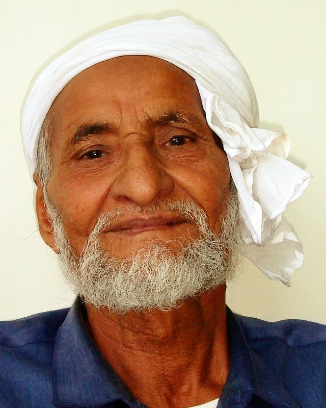
A 70 year old Pakistani gentleman in Dubai
When was the photo taken
31st March 2006, 2pm
Where was the photo taken
In a bank waiting room in Dubai UAE.
Why was the photo taken
In Dubai you see some faces from a far, you see the typical European expat in the malls, however when you really look, you see many more faces. This competition forced me to really look for the shots to take. This charming elderly man was 70 and had been in Dubai for over 30 years. Duabi as we know it today has really looked the way it has for max. 20 years, maybe 10. He has seen it all. And most likely had a hard time of it. His face told all. Yet he was very happy for me to take the shot. I have to say, the very nicest person to meet…
Why was this composition chosen
Simply because it was the only option available. This was an old stranger sitting in 35 degree heat. I had one chance to take a shot and did. The background was thankfully plain, the light was difficult in that extreme sunlight outside, yet dark interior room. Only option I had was to use flash.
How was the photo taken
I really had to think and take the shot fast, I was intruding on his time after all. I crouched down below his eye level, shot up, took one shot and thanked him. The intention was to frame him tight and in detail so as not to have to crop too hard with only a 4.1 meg camera.
How was the photo processed
ISO 200, f/3.5, 1/125s, focal length 8mm Levels balanced using histogram method. Flash shadow removed from behind shoulders. Colour tweaked to bring out colours. Sharpened with smart sharpen. Alternative b&w version created by removing selected colour channels and creating a desaturated layer with 20% opacity to allow a hint of colour to remain.
(This may end up being in the competition,but for now I am assuming I'll take more shots...)

3 comments:
Hi there,
Here is my rating for the Spinney's Man.
Impact - 6
This photograph did not have a huge impact on me, although there was some. The impact came from the colours rather than the subject or composition.
Composition - 6
The portrait is well framed, with the head pretty much dead centre and the shoulders cropped (either before or after the shot) so not to reveal the slope to the arms or much of the chest. It is not, however, an exciting or unusual composition. Fairly safe. But, given the difficult circumstances, it is a good shot. The plain white background very much adds to the shot, and helps to bring out the colours.
Light/Colour - 7
I really like the colours in this photo, and it is that which had an impact on me, rather than the subject/composition. The blue shirt, the dark skin, the white white head dress and the clean white, although slightly darker, background create a really nice contrast; each colour complements each other. I don't like the B&W version for two reasons. First, because of the safe composition, it is the colour that makes this photo. Second, it is not really B&W; there is some element of colour (almost greenish on my screen) that I find distracting.
Technical skill - 6.5
What does 'Colour tweaked to bring out colours' mean. What did you do to tweak the colours? Given the difficult shooting conditions (light and subject) the photo was well taken. The photos is not sharp sharp but close. The colours are good. The removal of the shadow seems well done leaving some shadow to create a blend from the white white head dress to the background, but is not distracting.
Originality - 5
It is not original. The composition is safe but I appreciate the circumstances the photo was taken in.
Total score - 6.1
I like the photo because of the great colours and the clean whiteness. It is a good photo given the shooting conditions.
Damian
Grant,
I wouldn't say the photo was lacking in emotion and I apologise for not mentioning this. The photo definitely speaks emotion (in the eyes) but for me, unfortunately, the chap is too posed for the full emotion to come out. I can see it in his expression but it feels a little staged for me. Again, I am being very critical here; you were in a difficult position and I congratulate you on the photo. But as a critic (and a harsh one), I prefer a more relaxed, not staged image.
D
Impact - 5; I know this is a grab shot, but it didn't have much impact for me. The framing looks a bit like a passport photo. I'd have cropped in much more tightly (I sound like a broken record, I know...).
Composition - 4; very safe, head and shoulders shot. But lot's of dead white space around the head that distracts. Would have had a higher score if creatively cropped post picture.
Light/colour - 5; not dramatic in either parameter, so average score from me.
Technical Skill - 6; a nice understanding of channels and some attempt to create a soft colour, but I dislike photos that are neither colour nor black and white, as the picture is better as the colour original, and a true black and white, showing better the crags and wrinkles, would have been better than a half-way house. So, I need to be harsh in that any technical proficiency was not well used in this case, and the two go hand in hand.
Originality - 4; Not original at all! Sorry!! Had to score this low.
Overall - 4.8. I think this is abour right, maybe a tad on the harsh side, and it's an area that we each know less about (portraits), so this reflects that. I don't think we should be too lenient even in areas we know little about - it's the harsh, no-punches-pulled stuff that makes us better. Hope you take it in that way.
Cheers
Ivan
Post a Comment