Tuesday, December 04, 2007

Hi there,

Sorry for being absent for so long but work became quite heavy. I feel like I can breathe again and hence post an image or two.

Sable Island, sometime in the past


I forget when I took this shot but it was on film. I do however remember the moment. The light was intense for just a split second; and it was very stormy.


Another black and white treatment. I like this image because of the large snow covered dune and the gulls in the foreground.

Hope you are all well...

Damian

Print Porfolio choices

Next week is the Print Portfolio competition; 5 prints on a recognisable theme is the only limitation.

So, my portfolio is a collection of live performance images, taken at a session at Cambridge Junction venue about two and a half years ago. In fact, I had just got the 350D, and had also just come back from a week with Damian and Sue in Halifax, so that dates it to about April 05. So, no new pictures here, but I have worked on them pretty extensively.

The print portfolio also requires that you define both an order and a layout plan. For the digital portfolio, clearly it's only the order that can be varied, so this adds another complicating dimension (literally) to the task. So, below I present my selections in the correct order (1 through 5). The layout is:


This gives a rather pleasing arrangement of 4 landscape orientation images on the corners of the "X", with a fairly strong dominating portrait image in the centre. In addition, I think I have a bluey and a reddy image on opposite corners too, as I thought that would balance it better, again with a more greeney one in the middle.

The files I've used here are quite small, low res, but you get the idea. Comments welcomed as usual.

Images 1-5, in order:


Norfolk Coast; Beach Walkers revisited

After some mixed comments on the Beach Walkers series of pictures, I tried to beef up one of the images, but using a sky from the same photoshoot, to add drama. The result is below. I think it works very well, esp in black and white.


The sky is very dramatic, so I wanted it to dominate 2/3 of the image. I feel that this creates greater sense of scale with the small people against the sky and the sea is also in there too. The shapes and textures of the water, beach and sky all have ones interest, but the sky is the main focus after resting on the figures.

I listened to critique, and removed the distant people over the right shoulder of the main pair (per Gareth).

Comments welcomed as ever.

Ivan

Friday, November 30, 2007

Happy St Andrew's Day!

St. Andrew's Day is the feast of Saint Andrew, celebrated on 30 November each year. Saint Andrew is the patron saint of Scotland and St. Andrew's Day is Scotland's official national day, although Burns' Night is more widely observed. In 2006, the Scottish Parliament designated the Day as an official bank holiday.

What a miserable looking f--ker, though...


I know who should be our Patron Saint...


Have a great St. Andrew's Day!!

A nice pic to end the week on...

Chaps

A happy wee face from the time of life before real worry sets in!! Joking apart, shame she's oblivious to that fact, but I guess that's the magic of childhood!


Have a great weekend. I'll start posting some images again next week. Had some recent images I worked on be 'corrupted'; when I went to open them up in PS, the .psd files were corrupt! Argh.

Anyway, see you online next week.

Ivan

Monday, November 19, 2007

Projected Portfolio entries

Dear All

Below, by five entries for next week's projected portfolio competition. No idea how these will do, but wanted to get in a set of related images. Have dumped the Deal Pier idea, since feedback was mixed and I trust you guys.

Comments welcomed, but it's a done deal - have emailed them off, as today is the deadline, and I'll likely not be there in person tonight (Abby was coughing half the night and we are both pooped...).

Ivan


Friday, November 16, 2007

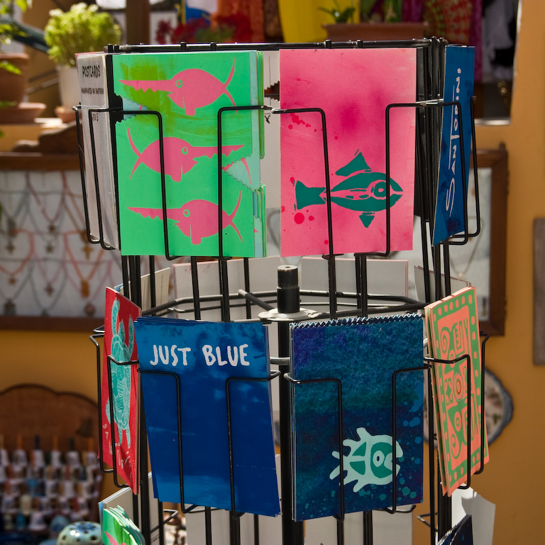
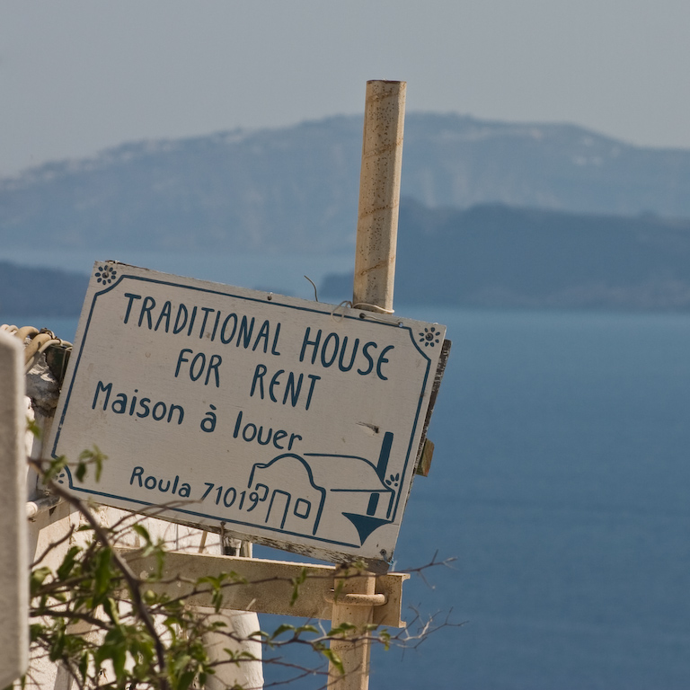
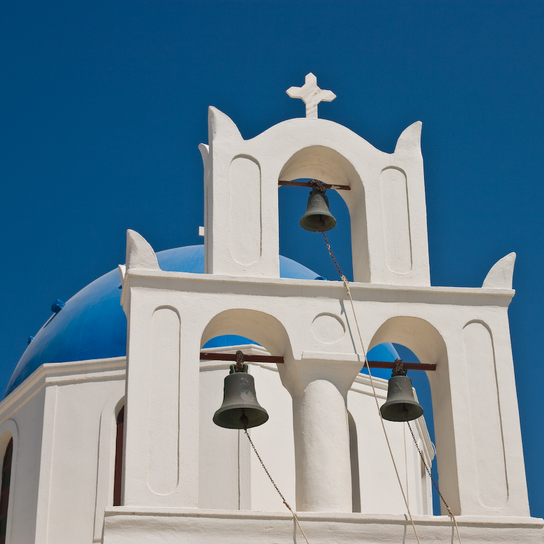
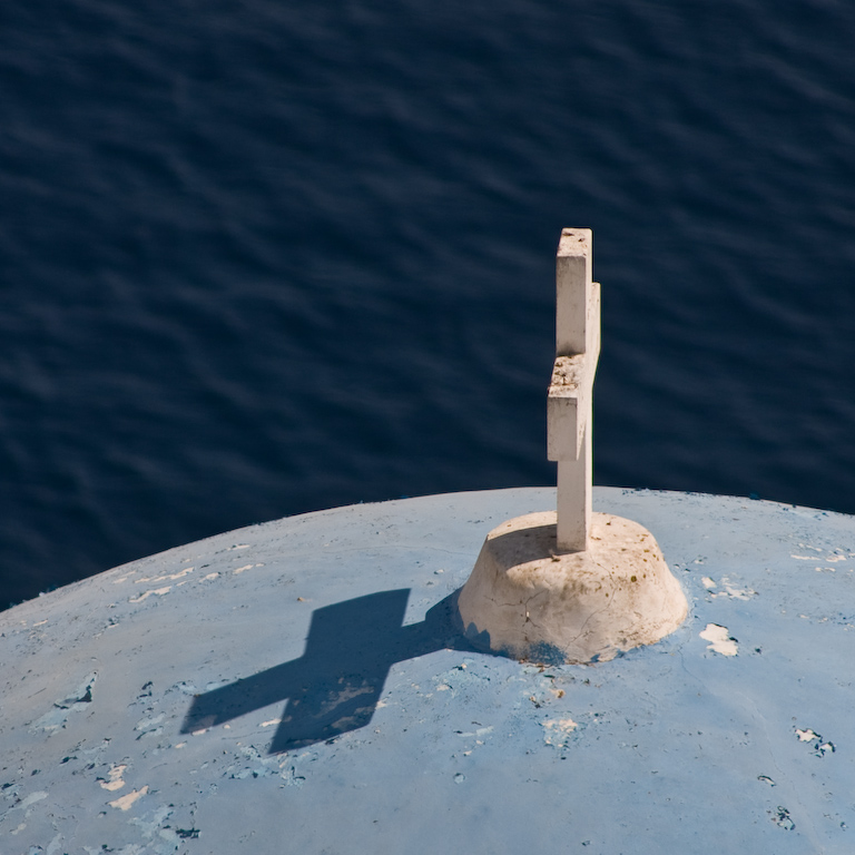
Just Blue


Guys, sorry these are so big - blogger won't let me upload them as images for some reason, so they're coming straight from my web hosting and therefore full size already. Hope this doesn't screw up the page but if it does I'll try to delete the post. edited I've created them as clickable thumbnails now.

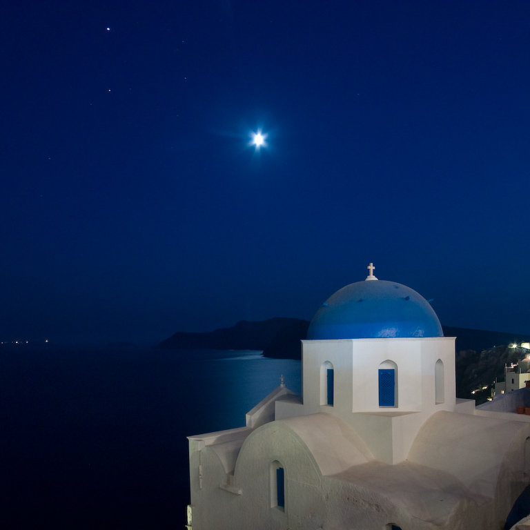
This is my portfolio selection for the projected image competition at the Camera Club, deadline Monday. Title "Just Blue" - they're all images from Santorini. I chose a square crop which is a bit different. Thoughts?

Thursday, November 08, 2007

Norfolk Coast - a couple more images...

Another image of the walkers on the beach. Different composition, and the figures a bit larger in the scene than the other one.


Also, I have cropped the other image to be even more letterbox - improvement or not?


Comments welcomed as usual.

Ivan

Reviews!

Chaps

Please feel free to post reviews (brief, if need be) on any of the following items/topics;

- new equipment i.e. camera, lenses, accessories
- new software i.e CS3
- software that the group may not have used
- digital imaging techniques you have tried

I am thinking of upgrading the PC sometime, and may also be interested in an A3+ printer, as well as upgrading to CS3! Could be an expensive time for me (but then, my 40th is in February 08)....

Ivan

2nd Print Competition Entries

Below are my entries for Monday's print competition at the Cambridge Camera Club. I can't make it that evening due to a work trip Mon-Wed, but Gareth will let me know what happened...

I held over the first image "Bath Crescent" from the last competition, submitting "Window and Chair" instead (which got a First), so fingers crossed for this one.


The next image is one from the potential Deal Pier portfolio. I have abandoned this portfolio, but this image was quite positively received on the blog, so I'm going to submit it.


You may have commented on these images before, but would welcome any thoughts, esp from Adam and Colin...

Cheers
Ivan

Tuesday, November 06, 2007

North Norfolk Coast - a recent photo trip...

For the first time in ages, I went on a photographic trip at the weekend. Location, the North Norfolk coast. No previous experience of the area, but I did get the inside track from someone at the Camera Club, so we headed for the beach and dunes near the coastal village of Wells-next-the-Sea.

Below are a couple of images from that trip. I took about 300, and the light was rubbish for about 2/3 of the time we were out there. Then, the sun broke through and we had 30 mins of glorious light, followed by a fantastic sunset.


Let me know what you think. More to follow when I get through the RAWs…

Cheers

Ivan

Sunday, November 04, 2007

First post! Well sort of...


Well the previous message shows what can happen when the electricity goes out while posting to the blog. Anyway, inspired by Adam's pretty flower I decided to upload a macro shot of my own. Pentax K100D, Vivitar Series 1 105mm f/2.8 1:1 macro (shot at f/19... Damien liked this lens!) helped by a AF540FGZ flash. This little spider kept bounding up and down in front of my monitor the other day, like some sort of arachnid yo-yo. In the background is the O'Reilly book "sed&awk"; perhaps the spider was undecided whether to make the jump to linux?

Saturday, November 03, 2007

Macro 1st attempt


Hi Cahps,

I've recently bought a 100mmm Macro lens. Here's one of my first attempts at macro photography. 1/60 f4 and used my speedlight bouncing onto a reflector. It's Ok but i feel there could be more - what do you reckon? Adam

Wednesday, October 31, 2007

Blog Project

Chaps

I have started, gradually, to archive all our blog posts, comments and images as PDF files. Quite easy to do, but takes a bit of time. My goal is to produce a merged PDF, with all the posts, comments and images, compiled on an annual basis.

As there were only a few posts for 2005, I'll merge this with 2006's compilation.

I plan to lay it out chronologically, with all the comments following each relevant post, and with the separate images (if needed) on following pages. I'll soon have Acrobat on this laptop soon, so can merge (and hyperlink if I can be arsed) all the separate PDFs together in the correct order.

We'll have a record of each years submission, and a useful, humourous (remember the "Miksang" incident?) and hopefully educational compilation of all our efforts.

I hope to get you all your copy of the 2005/2006 Season of Critical Light in time for Christmas...

Cheers
Ivan
Critical Light Chief Archivist

Monday, October 29, 2007

Competition entries


It's time for me to enter a competion too. Unfortunately nothing as grand as the Cambridge Camera Club, but my companies annual competion. £100 up for grabs, normally around a hundred entries. there are several categories - i am entering Flambourgh head (below)in the landscape but this one i'm think for the 'abstract'. Any feedback welcome. many thanks, Adam.

Saturday, October 27, 2007

Alex, the original


Posted just for comparison with the post-processed version. This is just converted straight from RAW to jpeg with no adjustments.

Thursday, October 25, 2007

Possible Portfolio submission

This is my selection for a possible CCC competition portfolio submission. 5 images, in a defined order, on an easily identifiable subject. This one is Deal, in Kent. Not sure if it'll be a print or projected submission, but your thoughts on the images and order is appreciated.

Ivan


Planets


This is one of those post-processing techniques which you'll be sick of in a few months time. A bit like that Fake DOF lens blur stuff from a year ago.

http://photojojo.com/content/tutorials/create-your-own-panorama-planets/ gives the gist, but they're all at it at the moment.

Rich, my mate and the guy who did the photography at our wedding drew my attention to it as a technique. He shot a set at the wedding to try it out but ran out of time to post-process them - I thought I'd give it a quick go using autostitch and photoshop which is what you see above. The people are flatteringly-elongated but my wife was quite amused (and pleased) with the result!

Alex


Son of a friend of mine (my Best Man, in fact), Alex has just turned three. He's a lovely, if shy little boy and wasn't too happy about me grabbing a couple of shots of him in our hall when he came round at the weekend with his Mum and Dad.

You get to know where, in your house, the light's nice, and at which times of the day. The hall's good for us because there are large plain light surfaces, even if the buttermilk emulsion gives a bit of a colour cast. The chance for some natural catchlights in the eyes is there, and the shadows are never too harsh. Even though he's standing in the doorway to our downstairs loo, a nice wide aperture makes it all OK.

I'm pretty happy with the shot - his expression, the lighting, and the post-processing. I really don't know if it's a competition-grade shot though. Thoughts?

Details: Canon 40D, ISO400, f3.2 @ 1/50, Sigma 18-50mm f2.8 lens @ 50mm. Post-processing in Adobe Lightroom.

Monday, October 22, 2007

Flambourgh Head


While I've got time, thought I'd slap another recent snap up. this one was taken in September whilst risking life and limb on. (Eos 5D 1/10 sec, F22, 17mm, ISO100, polarising filter, wet feet). Uped the saturation a little in Rawshooter. As ever, your thoughts gentlemen.

Sunday, October 21, 2007

Dead thistle


Guys, I was drawn to these dead thistle heads by their colours. how do you reckon this could be improved? (Canon 5D 100mm macro 0.6 seconds f14, flash directed with lasolite reflector). Good luck tommorow at the competition. all the best, Adam

Friday, October 19, 2007

I like Cropping (and I like to Crop)...

Couldn't help myself. I liked Gareth's bridge picture, but felt it may do better with a more dynamic crop (and lightened up a bit, with a bit more contrast too). So, here is my effort.


Comments?

Ivan

Tuesday, October 16, 2007

Goals

We've talked here about goals before - Ivan putting most action into identifying them. I read this today and found it interesting:

http://bythom.com/goal.htm.

Perhaps my goal should be to read less on the Internet and to put more thought into photography?


I'd be interested to hear your thoughts on this one though, guys, for a couple of reasons.

The first is the colouration. I'm colour-blind, and I was reasonably happy with this tinting, but of two other people who've seen it, one has said it's fine and the other has said it's waaay too pink. What do you think?

The second is its merits as a photograph. Ivan made a point the other day that, when you're photographing your children, you can be a little too close to the subject matter, emotionally, to be properly objective about the merits of the photograph. Now, I'm pretty pleased with this (Canon 40D; Canon 50mm f1.8 lens @ f1.8) but I'd like a two steps back opinion.

Monday, October 15, 2007

Lighten Up!

Ivan felt that the first version of this was too dark. What I posted was more or less exactly what came off the camera, which was a reasonably accurate exposure of the lighting. The sun was very low and was just clipping the flowers from behind, leaving everything else in pretty deep shadow.

Nevertheless, the image does have a different feel if I open up the midtones a little - it doesn't lose the supersaturation but brings out a bit of the texture. It's here: what do you think?

My selections

Below are my two entries for the next CCC Projected Image competition (to be held on 22 Oct)

New York Ferry Moment

This image was taken on the Staten Island Ferry in 2004. It was coming back to Battery Park (end of Manhattan), and as it was getting alongside the Statue of Liberty, I was struck by the almost reverential bowed heads of the two passengers in direct line of sight. I exposed for the Statue and sky, and with some further post-processing have accentuated the semi-silhouette feel, which is further enhanced by the dramatic sky. I like this image a lot, but realise it may not be to all tastes. Which brings me on to my next image...

Help

This image was made around the time of a similar work entitled "Shadowman". If you recall, Shadowman came 2nd in last year's CCC Annual Digital Championship, Creative section. This is similar in feel; mono again, and trying to create a feeling, engage an emotion. I was struck by the desolation of the tower block in question. The "figure" in the window is real, but I never noticed it at the time (this is a crop from a much larger image), and it looks like an old lady, but very skeletal and creepy! I added the "graffiti" underneath, to create the message. Love it or hate it, I think it's quite powerful.

Thoughts and comments welcomed. Still not to late to submit something else...

Ivan

Sunday, October 14, 2007

2 from 5?


OK guys: my picking and choosing is as bad as ever so here are five very different images in subject, approach, post-processing. Which two, and of the two, would you suggest any changes in the post-processing?

Also, Ivan, I found this link about calibrating your printer for mono work: http://www.northlight-images.co.uk/digitalblack.html

Wednesday, October 10, 2007

New camera for me

Well, I finally did it. I have bought the Canon EOS 40D and it sits happily on my desk as we speak. I intend to sell my 350D.

I haven't used it yet really so cannot report on much but straight off, the camera itself is very different to the 350D, being much larger and heavier. So much so, that I actually miss the feel of the 350D but I am sure I will adapt.

At some point I will give a report on how I am getting on with the camera...

Damian

Tuesday, October 09, 2007

1st Print Competition - Ivan's result

Dear All

Well, again, a mixed bag. One bombed and one did well. When will I crack this, and get two placed in one competition?

"Shove Tuppence" did not go down well. Some nice comments regarding the reflection of the hand and that it was a nice idea, but apart from that, it did not engage or really clearly show what was happening. The hand looked in a strange position and a bit unnatural. Not good overall.

"Window and Chair" did much better. Got a "First" place grading (1 of 2 on the monos). All similar comments to those that you guys raised, and it definitely benefited from being marginally lightened up, so thanks for that input!

The overall quality of the monos was very high - I was worried about not getting anything, so it was a complete surprise (genuinely) to get a First. Because they announce it in reverse order, mine was announced last of all, so I'd given up hope by that point!

So, thus far, I have 24 points in the Projected Image Serial Compeition (round 1 of 3), and 30 points in the Print Serial Competition (round 1 of 3). Last year I got 54 points in the Projected Image competition and came third overall. This year, the standard I think is higher, with lots of talented new members, so I'll need to raise my game too, but that's a good thing.

Ivan