Guys
I think the Blog has taken a significant step forward, with the introduction of Damian's more rigourous submission and review of posts - nice one, D. The added rigour and the need to think about our submissions more is great.
Also, we are starting to get good interaction on photographic technique and composition, and I really hope this continues. This will help us all, as we no longer work in isolation.
I encourage us all to post our thoughts on any topic, but to make them ones that will encourage discussion and debate.
Looking forward to seeing the first entries in the April Assignment too - that's exciting.
Cheers, and have a great weekend (G, I guess yours has already started...being Friday and all).
Ivan
Friday, April 07, 2006


Thursday, April 06, 2006
What is acceptable digital manipulation?
This is an interesting topic. Everyone has a different view on this, and it likely depends on which "school" of photography you subscribe to.
First of all, let me start with my position: I am a fully 100% digital convert, and I think anything goes to get the image you envisage - as long as you say what you've done to get the image.
For example, is it OK to digitally blend two images together to get an image that otherwise would be impossible (physically, technically or temporally)? By this, I mean two exposures, one made for the sky, and one made for the land. Again, I say it's fine, as long as you say what you've done, and why. Using graduated filters in either digital or traditional film photography essentially allows you to get all the elements of the photograph within an acceptable range for the sensor/film to capture the image as our eye does, rather than lose highlight or shadow detail in trying to compromise. Also, the dodging and burning technique of developing black and white prints from negatives also enhances real life tonal range for dramatic and emotional effect. Digital allows this to be done to a greater extent, and across a wider range of challenging technical areas impossible in film, so why not use it if it’s available? I do use filters and try to get the exposure right at source, but sometimes you can’t or you want an effect that even filters would not be able to produce – something natural like your eye would see.
I would just like to qualify this to some extent. I think nothing replaces the ability to "see" a picture in the first place. You need good substrate to make something worth looking at, and that will hopefully evoke a reaction. You need to have some impact upon which to build the final image. You need to be able to know where the elements of the photograph should go in order to achieve the desired effect. This is composition, and it applies to light as well as physical elements such as trees, rocks, walls etc.
The ability to compose effectively at source differentiates a manipulated image from a montage, one in which disparate elements from many photographs are brought together to make a new image. Many of the current photo magazines encourage this form of photo assembly/montage, bringing deer into woodland images, adding fences, mist, hills, trees (even) to make a "natural" woodland scene. This is a montage, and, while being a valid and worthwhile art form, it is not what I would call photography – it is digital art, rather than digital photography. These montages also tend to look artificial, as the various elements are usually photographed at different times of day, with different light direction, intensity and temperature, however well they are blended together.
So, is adding a new sky not a montage? Well, to me, it’s not, but neither is it the same as “pure” photography. It’s adding drama to a scene that needs it, and, if done at the same location although on a different actual day, it falls short of a montage to me. That said, I used to do this a lot, but now, I don’t, unless I am trying to have a bit of digital “fun”.
I now very much prefer to get the best image at source, using filters and a better knowledge of exposure, and find that very satisfying. I used to want to improve my digital montage skills, but no more. I want now to take a good source image, and limit my manipulations to cropping for maximal impact, and then deciding what tone, contrast and color balance the image would need, akin to how one would have processed film for different effects.
This is not to limit the scope of digital photography – all this can be done, with care, relatively quickly and to great effect, without requiring the need for messy chemicals, a dark room and the mastery of the dark art of developing. I don’t agree that there is no skill in digital developing – it is easier and more convenient to have a “digital darkroom” than a traditional one, but skilled digital imageers (as I have seen them called!) are as skilled as there traditional forebears, and their skills should not be under estimated.
So, try and get a great source image, but don’t be afraid to use digital manipulation to increase the impact or achieve a different mood. Have fun, digitally, by doing montages, but don’t pass them off for real photographs. And, if you do want to replace a sky, make sure it’s done realistically, and say that it’s been done. It’s all valid, and all worthwhile if a great image, whether real or not, is produced.
I welcome comments and elaboration on this topic.
Ivan
First of all, let me start with my position: I am a fully 100% digital convert, and I think anything goes to get the image you envisage - as long as you say what you've done to get the image.
For example, is it OK to digitally blend two images together to get an image that otherwise would be impossible (physically, technically or temporally)? By this, I mean two exposures, one made for the sky, and one made for the land. Again, I say it's fine, as long as you say what you've done, and why. Using graduated filters in either digital or traditional film photography essentially allows you to get all the elements of the photograph within an acceptable range for the sensor/film to capture the image as our eye does, rather than lose highlight or shadow detail in trying to compromise. Also, the dodging and burning technique of developing black and white prints from negatives also enhances real life tonal range for dramatic and emotional effect. Digital allows this to be done to a greater extent, and across a wider range of challenging technical areas impossible in film, so why not use it if it’s available? I do use filters and try to get the exposure right at source, but sometimes you can’t or you want an effect that even filters would not be able to produce – something natural like your eye would see.
I would just like to qualify this to some extent. I think nothing replaces the ability to "see" a picture in the first place. You need good substrate to make something worth looking at, and that will hopefully evoke a reaction. You need to have some impact upon which to build the final image. You need to be able to know where the elements of the photograph should go in order to achieve the desired effect. This is composition, and it applies to light as well as physical elements such as trees, rocks, walls etc.
The ability to compose effectively at source differentiates a manipulated image from a montage, one in which disparate elements from many photographs are brought together to make a new image. Many of the current photo magazines encourage this form of photo assembly/montage, bringing deer into woodland images, adding fences, mist, hills, trees (even) to make a "natural" woodland scene. This is a montage, and, while being a valid and worthwhile art form, it is not what I would call photography – it is digital art, rather than digital photography. These montages also tend to look artificial, as the various elements are usually photographed at different times of day, with different light direction, intensity and temperature, however well they are blended together.
So, is adding a new sky not a montage? Well, to me, it’s not, but neither is it the same as “pure” photography. It’s adding drama to a scene that needs it, and, if done at the same location although on a different actual day, it falls short of a montage to me. That said, I used to do this a lot, but now, I don’t, unless I am trying to have a bit of digital “fun”.
I now very much prefer to get the best image at source, using filters and a better knowledge of exposure, and find that very satisfying. I used to want to improve my digital montage skills, but no more. I want now to take a good source image, and limit my manipulations to cropping for maximal impact, and then deciding what tone, contrast and color balance the image would need, akin to how one would have processed film for different effects.
This is not to limit the scope of digital photography – all this can be done, with care, relatively quickly and to great effect, without requiring the need for messy chemicals, a dark room and the mastery of the dark art of developing. I don’t agree that there is no skill in digital developing – it is easier and more convenient to have a “digital darkroom” than a traditional one, but skilled digital imageers (as I have seen them called!) are as skilled as there traditional forebears, and their skills should not be under estimated.
So, try and get a great source image, but don’t be afraid to use digital manipulation to increase the impact or achieve a different mood. Have fun, digitally, by doing montages, but don’t pass them off for real photographs. And, if you do want to replace a sky, make sure it’s done realistically, and say that it’s been done. It’s all valid, and all worthwhile if a great image, whether real or not, is produced.
I welcome comments and elaboration on this topic.
Ivan
Wednesday, April 05, 2006
"Shadowman": submission for rating
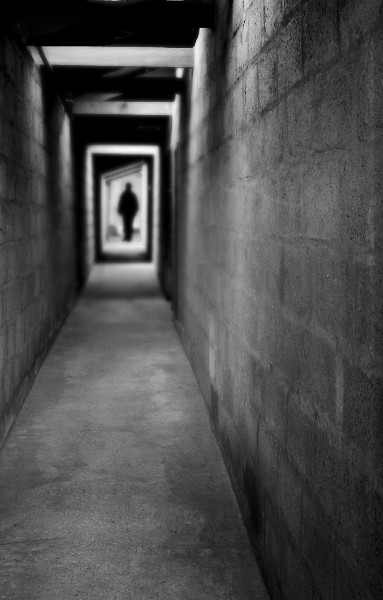
Guys
Something I worked on a while ago as a possible idea for a local band in Cambridge.
What the photo is of:
A disused mineshaft, and a shadowy figure.
When was the photo taken:
May and July 2002.
Where was the photo taken:
Cornwall (mineshaft), Chicago (figure = Kate!).
Why was this composition chosen:
The band wanted something a little eerie, spooky, menacing etc. I discussed this idea, then found a suitable figure to use at the end of the corridor. I offset the corridor crop to make it feel like the viewer was against the side wall (as if staggering and leaning there, looking back at a possible pursuer/assailant), and chose an out-of-focus (more of this below) feel to accentuate that viewer feeling of being drugged or attacked, and to heighten the other-worldly nature. I also cropped it to ensure the figure was top left third, and the corridor led to that from the bottom right (viewer). The black and white was to give more of a menacing feel too. I also wanted it to feel like those dreams where you are relentlessly pursued by a faceless figure, who you know will get you in the end...
How was the photo taken:
Taken with my old Canon Powershot S4 (4MP) point and shoot. No technical data available.
How was the photo processed:
The shaft was cropped and slightly rotated to give the impression of being against the wall, off-centre for the viewer. The figure was extracted (2 pixel feathering) from a shot taken on Chicago "beach", made into a silhouette, and then resized and placed at the end of the corridor. The layers were then flattened, converted to black and white, contrast and levels adjusted, and then a shallow depth of field effect applied using lens blur/gaussian blur in CS2.
Tuesday, April 04, 2006
Cambridge Punt: resubmitted for proper ranking
What is the photo of:
A lone punt on the River Cam, Cambridge, UK
When was the photo taken:
About 07:00, early January 2006.
Why was this composition chosen:
I knew I wanted to come to this part of the river, as it had all the elements of a nice scene: the bridge, the tree, the river and banks with trees to ensure an interesting background. However, sometimes the punts are there and sometimes not. This time, there was only one punt, dutifully obliging with a pleasing angle, in relation to the bridge, tree and bank! In truth, it was slowly rotating round. A series of pictures, with the punt steadily changing it's angle, revealled this one to be the best. I chose this as the best because the punt formed a nice line, in harmony with the bridge and distant treeline. The near tree, although a little ragged, framed it nicely.
How was the photo taken:
With a camera? No. I hand-held at 1/10 sec, f8, ISO 800, using the EF-S Image Stabilised lens.
How was the photo processed:
I converted to black and white, and used a Photoshop black to clear filter to create the graduated effect from top to bottom. This just makes the sky less bland and stops the picture being filled with white at the top. I also cropped it to be horizontal, emphasising the length of the punt, and echoing the bridge and trees in the background. Also, it de-emphasised the sky and original foreground, which were of little interest. I adjusted levels, ensuring a good tonal spread on the histogram, and did an additional blending mode, with a copy of the layer set to screen, with opacity reduced to 40%.
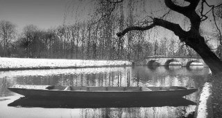
A lone punt on the River Cam, Cambridge, UK
When was the photo taken:
About 07:00, early January 2006.
Why was this composition chosen:
I knew I wanted to come to this part of the river, as it had all the elements of a nice scene: the bridge, the tree, the river and banks with trees to ensure an interesting background. However, sometimes the punts are there and sometimes not. This time, there was only one punt, dutifully obliging with a pleasing angle, in relation to the bridge, tree and bank! In truth, it was slowly rotating round. A series of pictures, with the punt steadily changing it's angle, revealled this one to be the best. I chose this as the best because the punt formed a nice line, in harmony with the bridge and distant treeline. The near tree, although a little ragged, framed it nicely.

How was the photo taken:
With a camera? No. I hand-held at 1/10 sec, f8, ISO 800, using the EF-S Image Stabilised lens.
How was the photo processed:
I converted to black and white, and used a Photoshop black to clear filter to create the graduated effect from top to bottom. This just makes the sky less bland and stops the picture being filled with white at the top. I also cropped it to be horizontal, emphasising the length of the punt, and echoing the bridge and trees in the background. Also, it de-emphasised the sky and original foreground, which were of little interest. I adjusted levels, ensuring a good tonal spread on the histogram, and did an additional blending mode, with a copy of the layer set to screen, with opacity reduced to 40%.
Monday, April 03, 2006
A new angle: go tighter..
Grant
Just a suggestion, but to make the most of the best "cylinder" photo (4), go tighter...

Just a suggestion, but to make the most of the best "cylinder" photo (4), go tighter...

Ivan
Friday, March 31, 2006
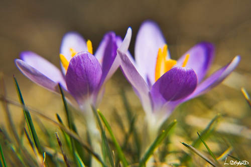
Crocuses - arrival of spring in Nova Scotia
What is the photo of
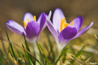
These two photos are of crocuses that have just appeared in my garden, with the arrival of spring in Nova Scotia.
When was the photo taken
29 March, just before noon
Where was the photo taken
The photos were taken in my garden
Why was the photo taken
I was inspired to take these photos because these small colourful plants signal the arrival of spring. Everything around them is brown and ugly and tired after months of winter. These plants bring a dash of colour to an otherwise dull landscape. Of course, this is the type of image that I was trying to capture (spring growth amongst winter's dead) but have so far failed.
Why was this composition chosen
I started shooting from above because I wanted to showoff the colourful stamens against the light blue/purple petals. But then the idea of lying down on the grass to make myself level with the flowers popped into my head; I wanted to achieve a sense of scale and used the grass stalks to achieve that.
How was the photo processed
Both photos were shots in RAW. While shooting, I took a photo of a white plastic tag so I could get a correct white balance reading in Camera RAW. The exposure, shadows, brightness, saturation and curves were all adjusted in Camera RAW. In PS, I then tweaked the levels, adjusted the shadows/highlights to darken the background and lighten the foreground a little, dropped the hue to -2 to bring out the colour in the stamens, and added a slight contrast in curves just to give the whole photo a final boost. I then sharpened the image. To get the signature in each photo, I signed a piece of paper using a sharpie, scanned it in at a high resolution (12oo ppi), imported it into PS and cropped the best signature and adjusted the size. I then made the signature a brush type and recorded an action that basically opens up a new layer and selects that brush. All that is left for me to do is to 'stamp' the signature onto the photo. If you want more details of this process I can try to remember exactly how I did it.
 How was the photo taken
1/160 at f6.3 - I wanted to blur the background
Focal length 44mm
ISO 100
Polarizer filter - to enhance the colour
*10 close-up lens - to get good detail.
 How was the photo taken
1/125 at f5.6 - I wanted to blur the background
Exposure +0.33
Focal length 85mm
ISO 100
Polarizer filter - to enhance the colour
Damian
These two photos are of crocuses that have just appeared in my garden, with the arrival of spring in Nova Scotia.
When was the photo taken
29 March, just before noon
Where was the photo taken
The photos were taken in my garden
Why was the photo taken
I was inspired to take these photos because these small colourful plants signal the arrival of spring. Everything around them is brown and ugly and tired after months of winter. These plants bring a dash of colour to an otherwise dull landscape. Of course, this is the type of image that I was trying to capture (spring growth amongst winter's dead) but have so far failed.
Why was this composition chosen
I started shooting from above because I wanted to showoff the colourful stamens against the light blue/purple petals. But then the idea of lying down on the grass to make myself level with the flowers popped into my head; I wanted to achieve a sense of scale and used the grass stalks to achieve that.
How was the photo processed
Both photos were shots in RAW. While shooting, I took a photo of a white plastic tag so I could get a correct white balance reading in Camera RAW. The exposure, shadows, brightness, saturation and curves were all adjusted in Camera RAW. In PS, I then tweaked the levels, adjusted the shadows/highlights to darken the background and lighten the foreground a little, dropped the hue to -2 to bring out the colour in the stamens, and added a slight contrast in curves just to give the whole photo a final boost. I then sharpened the image. To get the signature in each photo, I signed a piece of paper using a sharpie, scanned it in at a high resolution (12oo ppi), imported it into PS and cropped the best signature and adjusted the size. I then made the signature a brush type and recorded an action that basically opens up a new layer and selects that brush. All that is left for me to do is to 'stamp' the signature onto the photo. If you want more details of this process I can try to remember exactly how I did it.
 How was the photo taken
1/160 at f6.3 - I wanted to blur the background
Focal length 44mm
ISO 100
Polarizer filter - to enhance the colour
*10 close-up lens - to get good detail.
 How was the photo taken
1/125 at f5.6 - I wanted to blur the background
Exposure +0.33
Focal length 85mm
ISO 100
Polarizer filter - to enhance the colour
Damian
Looking from a new angle
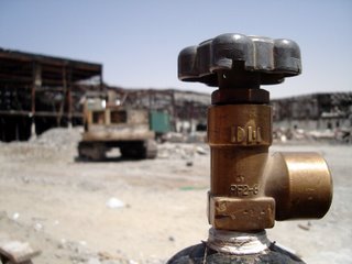
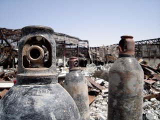
What is the photo of: Industrial debris & gas canisters.
When was the photo taken: Friday 31st March 2006, 2pm.
Where was the photo taken: While out driving around Dubai on a quiet Friday morning (Friday = Sunday in the Middle East) looking for portrait inspiration I was distracted by the scene of a large fire.
The location is the Oasis Center which was gutted last September by fire (Gulf News article). The site is gradually being demolished. As usual in Dubai, safety can be a bit lax. Which in this case meant I was quite free to explore the site.
Why was the photo taken: These shots were taken almost as an after thought and certainly as a focus experiment for myself.
Why was this composition chosen: The light was very harsh, however the location was very unusual. Stark, parched, industrial, metalic and total non-organic. It could have little appeal. However it appealed to me in ways not usually found in Dubai - quiet, uncontrolled, raw and certainly not polished or 5 star...
How was the photo taken: ISO 200, fixed focal in the Sony DSC-S40 point and shoot with the half press and then reposition the shot to try and use the rules of three. White balance set to sun (technical huh?)
How was the photo processed: For speed, these were colour balanced and contrast balanced using Picasa software.
"Picture 1"
"Picture 4"
When was the photo taken: Friday 31st March 2006, 2pm.
Where was the photo taken: While out driving around Dubai on a quiet Friday morning (Friday = Sunday in the Middle East) looking for portrait inspiration I was distracted by the scene of a large fire.
The location is the Oasis Center which was gutted last September by fire (Gulf News article). The site is gradually being demolished. As usual in Dubai, safety can be a bit lax. Which in this case meant I was quite free to explore the site.
Why was the photo taken: These shots were taken almost as an after thought and certainly as a focus experiment for myself.
Why was this composition chosen: The light was very harsh, however the location was very unusual. Stark, parched, industrial, metalic and total non-organic. It could have little appeal. However it appealed to me in ways not usually found in Dubai - quiet, uncontrolled, raw and certainly not polished or 5 star...
How was the photo taken: ISO 200, fixed focal in the Sony DSC-S40 point and shoot with the half press and then reposition the shot to try and use the rules of three. White balance set to sun (technical huh?)
How was the photo processed: For speed, these were colour balanced and contrast balanced using Picasa software.

"Picture 1"

"Picture 4"
Thursday, March 30, 2006
A note: Ranking photos
There was some concern that ranking a photo was leading to more 'work'. I have just ranked Ivan's latest post and I have to say that it was actually easier and cleaner than the more conversive approach of before. It makes you think more carefully about the photo and I think leads to a better critique overall. I also found that one needs to be quite conservative in their scoring. I found myself wanting to score higher but if we do that we are going to end up with all of our photos with 8s and 9s and that is not realistic.
Ranking is still up to the individual but I would recommend a try first.
Damian
Ranking is still up to the individual but I would recommend a try first.
Damian
As Damian says "Expose to the Right..."
An interesting technical article from "The Luminous Landscape" site, which explains the why behind what Damian has stated on this blog about pushing the histogram exposure shape to the right (but not off the scale).
http://www.luminous-landscape.com/tutorials/expose-right.shtml
A good read, and there are many more on the site too. Check it out.
http://www.luminous-landscape.com/tutorials/expose-right.shtml
A good read, and there are many more on the site too. Check it out.
April's Assigment
Guys
I've had a think about this, and I've tried to make sure it's something we can all do, regardless of our geographical or seasonal location. Also, I wanted something that I don't think any of us have a passion for, or shown many examples of that style of work. So, the theme for April is "Portraits".
I want the scope to be as broad as possible, and can include human or animal portraits (this manages to sneak in seals and camels), as long as the face, features and emotion are there and prominent. Any style, colour or black and white, and any location is allowed. I'd like us to submit 2 images at least, and no more than 3, one of which should be something taken in direct response to this assignment, not just one from your archive. Digital manipulation is fine, but please describe what you did and why. Indicate which images are new and which are archive.
When submitting an entry, please give a technical and artistic description, not too long. Also, indicate in the blog post title "April Assignment - Portraits", and make sure we know who it is. Scoring should happen within a few days after the post. Entries should be as large a file as possible, to allow proper judging for sharpness etc. Something in the 500Kb to 1GB range should be fine.
Deadline for submission is 30 April, and the submissions (3 max, at least 1 new) can be judged by the other bloggers in either 1 or 3 sessions from now to the deadline. The scores over Damians to-be-decided catergories will be averaged for each blogger vote, and the average of the two scores used to define the final score. In the event of a tie, the winner is the one who scored the most 10's/9's/8's (in that order).
The "winner" gets to chose the next months assignment. Any questions, just email to all.
So, may the best portrait photographer win!!
I've had a think about this, and I've tried to make sure it's something we can all do, regardless of our geographical or seasonal location. Also, I wanted something that I don't think any of us have a passion for, or shown many examples of that style of work. So, the theme for April is "Portraits".
I want the scope to be as broad as possible, and can include human or animal portraits (this manages to sneak in seals and camels), as long as the face, features and emotion are there and prominent. Any style, colour or black and white, and any location is allowed. I'd like us to submit 2 images at least, and no more than 3, one of which should be something taken in direct response to this assignment, not just one from your archive. Digital manipulation is fine, but please describe what you did and why. Indicate which images are new and which are archive.
When submitting an entry, please give a technical and artistic description, not too long. Also, indicate in the blog post title "April Assignment - Portraits", and make sure we know who it is. Scoring should happen within a few days after the post. Entries should be as large a file as possible, to allow proper judging for sharpness etc. Something in the 500Kb to 1GB range should be fine.
Deadline for submission is 30 April, and the submissions (3 max, at least 1 new) can be judged by the other bloggers in either 1 or 3 sessions from now to the deadline. The scores over Damians to-be-decided catergories will be averaged for each blogger vote, and the average of the two scores used to define the final score. In the event of a tie, the winner is the one who scored the most 10's/9's/8's (in that order).
The "winner" gets to chose the next months assignment. Any questions, just email to all.
So, may the best portrait photographer win!!
Wednesday, March 29, 2006
Standard submission of photos and ranking
To follow is a standard hopefully simple approach to submitting photos and ranking them. Feel free to comment.
Here is a suggestion for a simple standard approach to posting the images. Basically
What is the photo of
When was the photo taken - most importantly the time
Where was the photo taken
Why was the photo taken; what motivated you to take the photo; what was the rational; what did the image say to you
Why was this composition chosen - this allows an insight into the mind of the photographer and why the image was prepared in that particular way
How was the photo taken; describe what equipment you used, how you used the light, the settings you used (basic info such as shutter speed, aperture, ISO, focal length)
How was the photo processed - so what steps were taken in photoshop to process the photo
Ranking
I think it would be good if we could rank the photos but I agree with Grant that we don't want to generate too much work here. So, I am going to suggest some simple categories (this time with more thought) and a scale.
However, ranking photos can remain an option for the user. I will rank photos that I critique but I don't expect the same in return.
I do think though that if we rank a photo it makes us think more about the image and perhaps give it a better critique. It will also force us to give more thought to which photos are posted and hopefully generate more discussion rather than photos. However, I do have a tendency to turn fun things in to work and I want to avoid that here, so I think ranking should remain an option.
There are five categories. Each has a score of 10. The ranking of these photographs is the average of these scores. We should score conservatively because we can expect many photographs over time and for our skill to improve. Thus, we should be aiming for 6's and occasionally 7's. Scores of 8 and 9 should be very rare. A score of 10 implies that the photograph cannot be improved upon.
This is the score board
1 - No effort made -not worth the post it sits on
2 - Little effort made - the image shows serious technical defects, eg. overexposed
3 - Poor - likely to have serious shortcomings in technical skill, composition, subject matter, etc
4 - Below average - likely to have only minor shortcomings in technical skill and composition
5 - Satisfactory - in most regards the photo is acceptable but holds little interest to the eye
6 - Average - creates some interest and the technical skill, composition, etc have been competently handled. Few flaws. This is a good, but not outstanding photograph.
7 - Good - a strong image; it's creation (technical skill, etc) has been handled more than competently. This is an excellent photograph.
8 - Outstanding - this is an exceptional image, one that creates excitement and one that you should feel proud of.
9 - Wow - here is the Wow factor. An image of the highest quality.
10 - The picture cannot be improved. Consider yourself a genius.
And these are the Categories
Impact - this is your immediate impression of the photo. How does it make you feel when you first see the photo. Does it give you a strong feeling of power; does it hold your eye. The score for this category should be immediate. It is your gut feeling.
Composition - Give a photo a high rating if you like the way it looks, if it attracts and holds your attention, or if it conveys an idea well. Consider the following : Is the subject(s) well placed. Has the photographer used the available resources in the image to create a good photograph. Is there a good arrangement of subjects with a symmetry that places objects in the most important areas (e.g., rule of thirds); is there a rhythm to the photo with regards to the color, spaces, moods, etc.
Light/Colour - Has the photographer made good use of the light. Was the photograph taken at the best time of day, under the best circumstances. Does the light add quality to the photo. Consider: Is there an effective balance of colours. Good selection of colour for the subject. Is there a creative use of colour, for example complementary colours, dark against light, strong against weak. Is there dynamic lighting. Does the pattern of light create a strong sense of mood.
Technical skill - this is a broad category. It includes the skill of using the camera/equipment and the skill of using photoshop. Consider: technical skill of using lighting, contrast, colour, the tonal range, focus, sharpness, shutter speed, filter usage, camera position, lens selection. In photoshop consider the use of the different techniques (e.g., levels, curves, etc), whether they have been applied appropriately and whether important steps were missed.
Originality - An original photograph is one that deliberately challenges our normal expectations. Has the photograph dealt with a new subject matter or a new style or approach to taking a genre of photograph (for example, landscape). Has the photographer brought us something new. Technical difficulty may also create originality. Consider: the degree of imagination; how new is the approach; a different style of cropping or use of the subject.
Damian
Here is a suggestion for a simple standard approach to posting the images. Basically
What is the photo of
When was the photo taken - most importantly the time
Where was the photo taken
Why was the photo taken; what motivated you to take the photo; what was the rational; what did the image say to you
Why was this composition chosen - this allows an insight into the mind of the photographer and why the image was prepared in that particular way
How was the photo taken; describe what equipment you used, how you used the light, the settings you used (basic info such as shutter speed, aperture, ISO, focal length)
How was the photo processed - so what steps were taken in photoshop to process the photo
Ranking
I think it would be good if we could rank the photos but I agree with Grant that we don't want to generate too much work here. So, I am going to suggest some simple categories (this time with more thought) and a scale.
However, ranking photos can remain an option for the user. I will rank photos that I critique but I don't expect the same in return.
I do think though that if we rank a photo it makes us think more about the image and perhaps give it a better critique. It will also force us to give more thought to which photos are posted and hopefully generate more discussion rather than photos. However, I do have a tendency to turn fun things in to work and I want to avoid that here, so I think ranking should remain an option.
There are five categories. Each has a score of 10. The ranking of these photographs is the average of these scores. We should score conservatively because we can expect many photographs over time and for our skill to improve. Thus, we should be aiming for 6's and occasionally 7's. Scores of 8 and 9 should be very rare. A score of 10 implies that the photograph cannot be improved upon.
This is the score board
1 - No effort made -not worth the post it sits on
2 - Little effort made - the image shows serious technical defects, eg. overexposed
3 - Poor - likely to have serious shortcomings in technical skill, composition, subject matter, etc
4 - Below average - likely to have only minor shortcomings in technical skill and composition
5 - Satisfactory - in most regards the photo is acceptable but holds little interest to the eye
6 - Average - creates some interest and the technical skill, composition, etc have been competently handled. Few flaws. This is a good, but not outstanding photograph.
7 - Good - a strong image; it's creation (technical skill, etc) has been handled more than competently. This is an excellent photograph.
8 - Outstanding - this is an exceptional image, one that creates excitement and one that you should feel proud of.
9 - Wow - here is the Wow factor. An image of the highest quality.
10 - The picture cannot be improved. Consider yourself a genius.
And these are the Categories
Impact - this is your immediate impression of the photo. How does it make you feel when you first see the photo. Does it give you a strong feeling of power; does it hold your eye. The score for this category should be immediate. It is your gut feeling.
Composition - Give a photo a high rating if you like the way it looks, if it attracts and holds your attention, or if it conveys an idea well. Consider the following : Is the subject(s) well placed. Has the photographer used the available resources in the image to create a good photograph. Is there a good arrangement of subjects with a symmetry that places objects in the most important areas (e.g., rule of thirds); is there a rhythm to the photo with regards to the color, spaces, moods, etc.
Light/Colour - Has the photographer made good use of the light. Was the photograph taken at the best time of day, under the best circumstances. Does the light add quality to the photo. Consider: Is there an effective balance of colours. Good selection of colour for the subject. Is there a creative use of colour, for example complementary colours, dark against light, strong against weak. Is there dynamic lighting. Does the pattern of light create a strong sense of mood.
Technical skill - this is a broad category. It includes the skill of using the camera/equipment and the skill of using photoshop. Consider: technical skill of using lighting, contrast, colour, the tonal range, focus, sharpness, shutter speed, filter usage, camera position, lens selection. In photoshop consider the use of the different techniques (e.g., levels, curves, etc), whether they have been applied appropriately and whether important steps were missed.
Originality - An original photograph is one that deliberately challenges our normal expectations. Has the photograph dealt with a new subject matter or a new style or approach to taking a genre of photograph (for example, landscape). Has the photographer brought us something new. Technical difficulty may also create originality. Consider: the degree of imagination; how new is the approach; a different style of cropping or use of the subject.
Damian
Minnis Bay, Kent
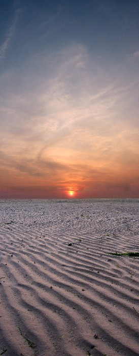
This is a picture I'd value some considered critique, using Damian's new system of categories and scoring. For my part, I'll try to structure the submission too.
Where/When
Minnis Bay, Kent. Summer 2003.
Background and rational to the image
I wanted a panoramic format, since the sunset was spectacular and the shadows it cast on the ground were very graphic in feel. I wanted both elements in the picture.
Composition
Panoramic, but turned vertically, rather than horizontally, to get both the sunset and beach in shot. Horizon in the middle, as both sky and ground elements were very strong and I wanted both to be so. Also, this is an unusual use of the panoramic format, usually reserved for actual vertical structures, like skyscrapers and bridges etc. I searched for a ground pattern to lead into the sunset, which would also have nice shape and strong shadows.
Technical Matters
This was two images taken seconds apart, from the same spot, one of totally the sky, the other of totally the ground. Both exposed for their relative subjects, then merged in photoshop. Saturation boosted a little, contrast, levels and colour balance adjusted. Some distracting beach detritis removed to provide a cleaner graphic pattern. I think if it were now, I'd have picked a cleaner part of the beach and also removed more distracting bits later in PS. Layers merged, final balance, then resized and sharpened.
I still have the original files, and have always wanted to go back and redo, since my PS skills are now better, but this is a reasonable attempt.
Overall
I really like this image, and it turned out just as I had envisaged. Perhaps I need to redo it with my better PS skills, but it's still a shot that pleases me.
Monday, March 27, 2006
Should we rank our photos?
Hello All
Recently, I have signed up to a stock agency and as a result I have my images ranked. This is actually very satisfying because it provides an immediate measure of quality. The scale actually starts at 6 and goes up to 9. If you go below 6 then the image is not suitable. Images of quality 6 should also be deleted unless they show a unique image. Here is the scale in detail:
9 - Wow
8 - outstanding
7 - good
6 - average
The rank is based on composition, colour, sharpness, subject matter, interest, technical skill and originality. So this led me to believe that in addition to the critiques, we should rank the photos that are posted. If we all decide that this is a good idea we can think about how. For example, should we have a mark out of 10 for each of the seven categories above. I thought about 5 but it gives little latitude. Once all the marks have been awarded we simply divide by 7 to get an average score. You can easily set up an spreadsheet in Excel with the titles above in the first row and in the last column have an equation to calculate the average (=average(B1:B7). So our scoring might look something like this (quite difficult to have a description for each mark):
0 - Delete this piece of trash
1 - No effort made -not worth the post it sits on
2 - Little effort made - still not worth the post
3 - Poor - think twice before posting
4 - Below average, not satisfactory, still think twice before posting
5 - Satisfactory
6 - Average
7 - Good
8 - Outstanding
9 - Wow
10 - Cannot get better than this
I would imagine that we will never have a 10 and only occasionally would we reach 9. I have posted 15 images with the stock agency; one is a 6, three are 8 and the remainder are 7. These scores are also based on saleability which does not concern us here, but I would expect most of our photos to have ratings of 7 and 8 with the occasional 6 or 9. Let me know if this is getting to be too much work.
Having a rating system will make you think twice before posting and should stop us (or rather me) from posting too many photos, thus encouraging more discussion for each photo.
What do you all think?
Damian
Recently, I have signed up to a stock agency and as a result I have my images ranked. This is actually very satisfying because it provides an immediate measure of quality. The scale actually starts at 6 and goes up to 9. If you go below 6 then the image is not suitable. Images of quality 6 should also be deleted unless they show a unique image. Here is the scale in detail:
9 - Wow
8 - outstanding
7 - good
6 - average
The rank is based on composition, colour, sharpness, subject matter, interest, technical skill and originality. So this led me to believe that in addition to the critiques, we should rank the photos that are posted. If we all decide that this is a good idea we can think about how. For example, should we have a mark out of 10 for each of the seven categories above. I thought about 5 but it gives little latitude. Once all the marks have been awarded we simply divide by 7 to get an average score. You can easily set up an spreadsheet in Excel with the titles above in the first row and in the last column have an equation to calculate the average (=average(B1:B7). So our scoring might look something like this (quite difficult to have a description for each mark):
0 - Delete this piece of trash
1 - No effort made -not worth the post it sits on
2 - Little effort made - still not worth the post
3 - Poor - think twice before posting
4 - Below average, not satisfactory, still think twice before posting
5 - Satisfactory
6 - Average
7 - Good
8 - Outstanding
9 - Wow
10 - Cannot get better than this
I would imagine that we will never have a 10 and only occasionally would we reach 9. I have posted 15 images with the stock agency; one is a 6, three are 8 and the remainder are 7. These scores are also based on saleability which does not concern us here, but I would expect most of our photos to have ratings of 7 and 8 with the occasional 6 or 9. Let me know if this is getting to be too much work.
Having a rating system will make you think twice before posting and should stop us (or rather me) from posting too many photos, thus encouraging more discussion for each photo.
What do you all think?
Damian
More Graffitti
This image I took sometime ago at an underpass in Canterbury. I loved the symmetry of the structure of the bridge supports and the colours and vibrancy (is that a word?) of the graffitti. I tried to get a good symmetrical image by cropping after taking the original. I also boosted the shadow detail to create a balanced image and then optimised contrast and boosted the colours. Getting front to back sharpness in low-light with a compact point-and-shoot 4MP digicam was tricky..getting enough light in demands a more open aperture, which in turn means shallow depth of field. Using a smaller aperture (higher f) gets the depth of field, but lets in less light, and thus camera shake is an issue. So, I bumped up the ISO to 200, wedged myself into one of the support structures for stability, used a moderate aperture of 5.6 (which on a digital compact with a shorter focal length means greater depth of field than the same aperture on a DSLR), and shot in RAW (yes, it had RAW, which was a major benefit and almost unheard of then on such cameras) to get a sharp image with detail in the foreground and rear. I really like this image.


As ever, comments welcomed from my co-bloggers!
Thursday, March 23, 2006
Final shots of Halifax at night
Here are the remainder of the shots that I took of Halifax at night. They represent different views, with different building compositions, light and reflected light.
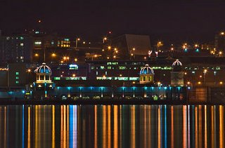 Casino
This is the Halifax casino. I used the 100-300 telephoto lens to focus on the building and the reflections. I tried cropping the image to remove the sky but the photo becomes too much for the eye.
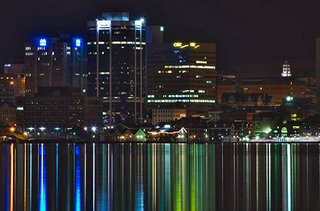 Waterfront and Citadel
I shot this photo because I really liked the two beams of strong blue light. The building composition was interesting too. Again I used the 300m telephoto.
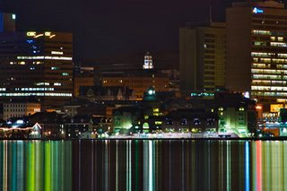 The Citadel
I centered this shot on the Citadel and love the almost pastel colours of reflected light. The buildings of the waterfront create some scale against the tall background buildings.
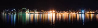 Panoramic
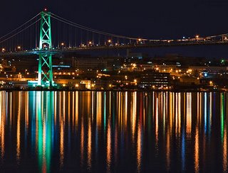 Dancing lights
This photo turned out better than I expected because when shooting I didn't notice the two layers of light. They look like dancing lights similar to the Northern Lights.
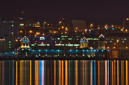 Casino
This is the Halifax casino. I used the 100-300 telephoto lens to focus on the building and the reflections. I tried cropping the image to remove the sky but the photo becomes too much for the eye.
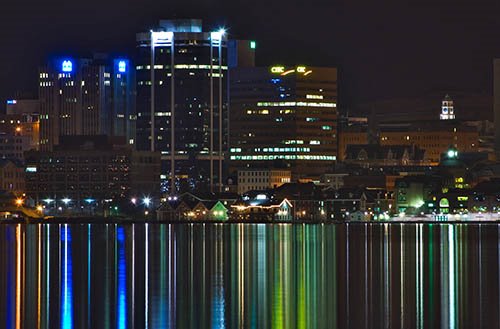 Waterfront and Citadel
I shot this photo because I really liked the two beams of strong blue light. The building composition was interesting too. Again I used the 300m telephoto.
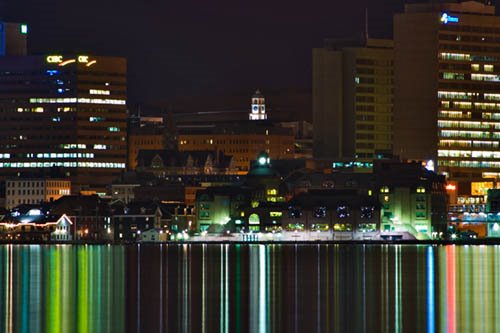 The Citadel
I centered this shot on the Citadel and love the almost pastel colours of reflected light. The buildings of the waterfront create some scale against the tall background buildings.
 Panoramic
 Dancing lights
This photo turned out better than I expected because when shooting I didn't notice the two layers of light. They look like dancing lights similar to the Northern Lights.

Near Wingham, Kent
I took this image on the same weekend I took the ones of Deal Pier. We were out walking, and I saw this nice scene, with curving river, fence, tree, reflection and it all seemed to work. It was not great in colour, due to the harsh light, but I thought it may work in B/W.
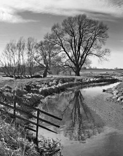
Comments welcomed as usual.
Wednesday, March 22, 2006
Kit and advancement question...
Hi Guys,
A quick question that will be useful to me, but also to others... can you briefly describe your set up?
Camera, lenses, tripods, software, output, choice of printers, medium, paper etc?
How did you make the transition from snaps to time consuming, loving, tempremental, emotional shots?
I am considering jumping from snap happy Sony digital to Canon Eos 350D and Photoshop CS2 (free through my work thankfully).
Will be using Kelby's book "Photoshop CS2 Book for Digital Photographers" (there are no specialist classes out here) to improve processing skills and have started posting on a local site with regular meet ups and field trips to learn from better photographers than myself...
A good way to progress? Comments.
If this thread should be deleted to preserve the image flow, let me know and I'll delete.
Thanks again though...
A quick question that will be useful to me, but also to others... can you briefly describe your set up?
Camera, lenses, tripods, software, output, choice of printers, medium, paper etc?
How did you make the transition from snaps to time consuming, loving, tempremental, emotional shots?
I am considering jumping from snap happy Sony digital to Canon Eos 350D and Photoshop CS2 (free through my work thankfully).
Will be using Kelby's book "Photoshop CS2 Book for Digital Photographers" (there are no specialist classes out here) to improve processing skills and have started posting on a local site with regular meet ups and field trips to learn from better photographers than myself...
A good way to progress? Comments.
If this thread should be deleted to preserve the image flow, let me know and I'll delete.
Thanks again though...
Halifax, Canada - Skyline at Night
I have recently (the past week) been taking loads of shots of Halifax for a local company who wants some pictures on their bare walls. Several blogs will appear in the next few days of this work but here is one shot that I took last night, or rather early this morning (about 1am). I am shooting from across the estuary on the adjacent town of Dartmouth. The night was incredible; very still and for Halifax quite warm (about -2c). This was taken at f9.0 for 30 seconds at 100mm. I have never done this type of work before so I would much appreciate some critical thoughts. Damian on assignment in Halifax.


Tuesday, March 21, 2006
PROJECT: Halifax, Canada - scenes through the day
Here are some more shots of Halifax. They were taken over several days from two vantage points from the town of Dartmouth. I wanted the sunrise (rises in front of the skyline), daytime, sunset (sets to the right), dusk and darkness. The sunrise and sunsets were not spectacular but I got some interesting shots. Most of these shots involved me almost freezing to death since I spent 2-3 hours at each shoot. Sitting still on rocks in freezing temperatures. I also made several visits to find the right exposure and composition. But it was worth it. I think. All shots were taken with a tripod at shutter speeds upto 30 seconds. The exposure needed adjusting to push the histogram over to the right. Most of the shots were taken with the EFs 17-85 mm lens. The last shot was taken by attaching the camera to the underside of the tripod so that it was hanging upside down very close to a rock that was sitting low down on the water's edge. This allowed me to pick up lots of the reflections. Comments greatly encouraged.
Damian
 Morning Rise - 6am
1/6 sec at f5.6 plus 1.67 exposure adjustment
EF-s 17-85 mm
 Morning moon - 700am
1/15 sec at f20 plus 1.67 exposure adjustment
EF-s 17-85 mm
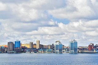 Daytime - 1000am
1/60 sec at f10 plus 1.67 exposure adjustment
EF-s 17-85 mm
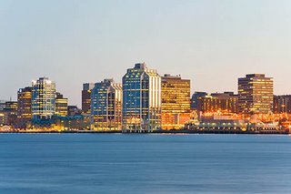 Dusk - 630pm
30 secs at f22 plus 1.67 exposure adjustment
EF-s 17-85 mm
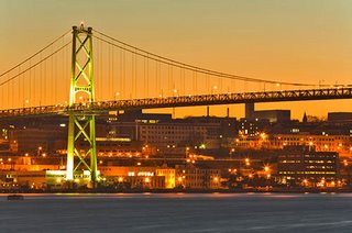 Rush Home Across the Bridge - 700pm
30 secs at f16 plus 1.67 exposure adjustment
EF 100-300 mm
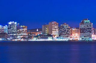 Time for Tea - 720pm
30 secs at f7.1 plus 1.67 exposure adjustment
EF 100-300 mm
 Night time - 1am
30 secs at f7.1 plus 1.67 exposure adjustment
EF-s 17-85 mm
Damian
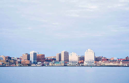 Morning Rise - 6am
1/6 sec at f5.6 plus 1.67 exposure adjustment
EF-s 17-85 mm
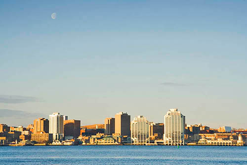 Morning moon - 700am
1/15 sec at f20 plus 1.67 exposure adjustment
EF-s 17-85 mm
 Daytime - 1000am
1/60 sec at f10 plus 1.67 exposure adjustment
EF-s 17-85 mm
 Dusk - 630pm
30 secs at f22 plus 1.67 exposure adjustment
EF-s 17-85 mm
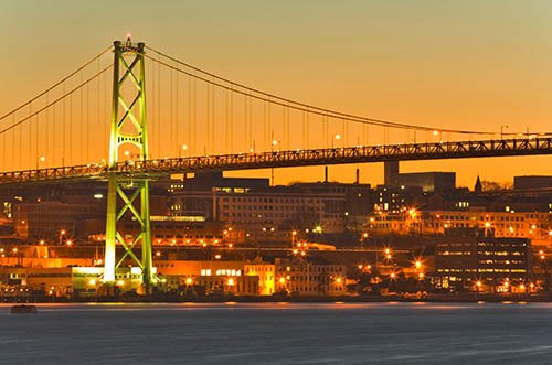 Rush Home Across the Bridge - 700pm
30 secs at f16 plus 1.67 exposure adjustment
EF 100-300 mm
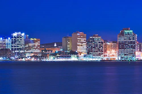 Time for Tea - 720pm
30 secs at f7.1 plus 1.67 exposure adjustment
EF 100-300 mm
 Night time - 1am
30 secs at f7.1 plus 1.67 exposure adjustment
EF-s 17-85 mm
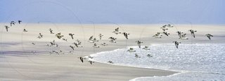
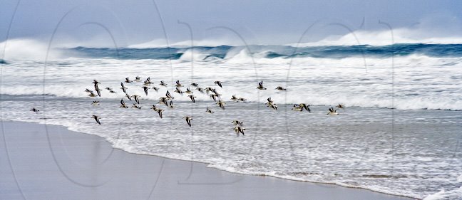
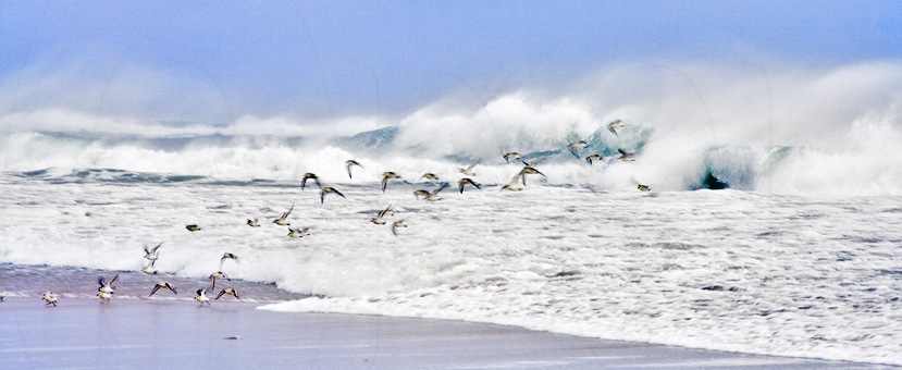
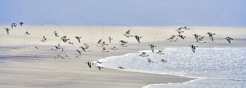
Sanderlings, Sable Island, Nova Scotia
On my drive home from the very east of the island I saw these sanderlings flying up and down the beach searching for some grub. So I stopped and tried shooting a few images. The problem was that it was dusk (so little light for fast shots), the birds were moving fast but there was spectacular surf that I wanted in focus. I decided to focus on the crashing surf rather than the birds. As a result, many shots had birds entirely out of focus but a few worked reasonably well, even though in these shots the birds were not in sharp focus. Here are three.


Subscribe to:
Posts (Atom)