An interesting article regarding snapshots versus art from the Luminous Landscape. I put these things on here, but no one ever comments.....sigh.
Ivan
Wednesday, May 31, 2006


Tuesday, May 30, 2006
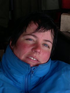
April Assignment 2 - Portrait of Sue
What is the photo of/When was the photo taken/Where was the photo taken
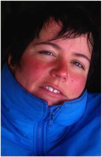
This is a portrait of Sue (aka Dr Budge), taken on Sable Island at East Light in 2003.
Why was the photo taken
Because I thought the colours were great. Sue had just come in from the outside so her face was quite red from the cold and wind which gave a nice contrast against her blue jacket. The blue jacket also brought out the blue in her eyes. Her hair was dark which again added contrast. She had an interesting expression on her face.
Why was this composition chosen
I wanted a tight composition to focus on the face. The slight angle of the head and the direct stare at the camera, I think, catches the viewer's attention. I also liked the lazy left eye because it enhances the stare.
How was the photo taken
Taken with a Nikon Coolpix 4300, JPEG, sRGB, ISO400, 1/30s at f13.4, with a flash
How was the photo processed
1. I first cropped the photo to remove any background distractions.
2. I then adjusted the levels, added contrast using curves, and boosted the saturation and lightened the image a little.
3. Next I used the Magic Wand to select the jacket and boosted the blue by selecting the Blue Channel in Curves and pulling up the mid-section of the curve.
4. I then inverted the selection and boosted the red in the face using the same procedure but this time selecting the Red Channel.
5. Using the Polygon Lasso Tool I selected the left eye, boosted the blue a little and added some contrast, again using the Blue and the RGB channels in Curves. Opacity was set to 75%. I repeated this for the right eye.
6. Again using the Polygon Lasso Tool, I selected the teeth and using the Blue Channel in Curves I removed some of the yellow by pulling the curve up. Opacity was set to 75%.
7. I then selected the dark background and the hair using the Magic Wand and, using Curves, darkened it so to smooth the transition from the dark background to the dark hair.
7. Finally, I sharpened the image.
8. I added another layer and created a border around the photo. I used the Stroke tool to create a 10px wide white border. This was to add make the photo stand out against the black background of the web page.
Original
Processed
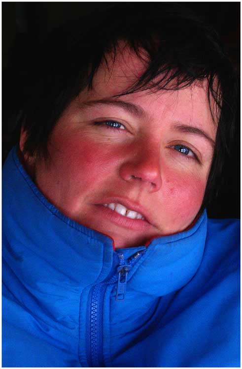
This is a portrait of Sue (aka Dr Budge), taken on Sable Island at East Light in 2003.
Why was the photo taken
Because I thought the colours were great. Sue had just come in from the outside so her face was quite red from the cold and wind which gave a nice contrast against her blue jacket. The blue jacket also brought out the blue in her eyes. Her hair was dark which again added contrast. She had an interesting expression on her face.
Why was this composition chosen
I wanted a tight composition to focus on the face. The slight angle of the head and the direct stare at the camera, I think, catches the viewer's attention. I also liked the lazy left eye because it enhances the stare.
How was the photo taken
Taken with a Nikon Coolpix 4300, JPEG, sRGB, ISO400, 1/30s at f13.4, with a flash
How was the photo processed
1. I first cropped the photo to remove any background distractions.
2. I then adjusted the levels, added contrast using curves, and boosted the saturation and lightened the image a little.
3. Next I used the Magic Wand to select the jacket and boosted the blue by selecting the Blue Channel in Curves and pulling up the mid-section of the curve.
4. I then inverted the selection and boosted the red in the face using the same procedure but this time selecting the Red Channel.
5. Using the Polygon Lasso Tool I selected the left eye, boosted the blue a little and added some contrast, again using the Blue and the RGB channels in Curves. Opacity was set to 75%. I repeated this for the right eye.
6. Again using the Polygon Lasso Tool, I selected the teeth and using the Blue Channel in Curves I removed some of the yellow by pulling the curve up. Opacity was set to 75%.
7. I then selected the dark background and the hair using the Magic Wand and, using Curves, darkened it so to smooth the transition from the dark background to the dark hair.
7. Finally, I sharpened the image.
8. I added another layer and created a border around the photo. I used the Stroke tool to create a 10px wide white border. This was to add make the photo stand out against the black background of the web page.
Original

Processed

Wednesday, May 17, 2006
Interesting articles on "The Luminous Landscape"
Guys (but especially Damian) - the articles under the "May 13" heading on The Luminous Landscape - and particularly the one about being an artist in business - may be interesting. I thought of Damian when I saw this.
Being an Artist in Business Article
Damo - call us before next Tuesday 23rd to make any final arrangements.
Being an Artist in Business Article
Damo - call us before next Tuesday 23rd to make any final arrangements.
Tuesday, May 16, 2006
April Assignment - Fruit Man
Here is my contribution to the the portrait assignment.
I took the portrait assignment very literaly - I went looking for portraits of people. Pure and simple. Why? Because I have never done this. It forces you to think about the person as well as the image I think. With all due respect - an animal is a different proposition - you can get close or take 20 shots and they will not mind. However, walk up to a stranger who doesn't speak your language and get their permission to shove a point and shoot in their face was a learning experience for me. And one that showed the limitations of point and shoot and also the limitation I felt for original shots, it is very difficult to take a photo with a strangers prior permission without it looking staged...
What is the photo of/When was the photo taken/Where was the photo taken
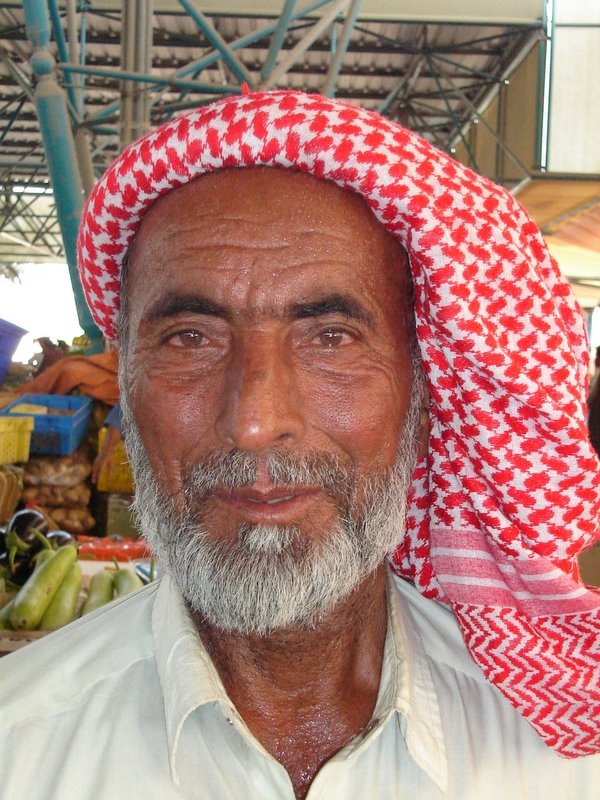
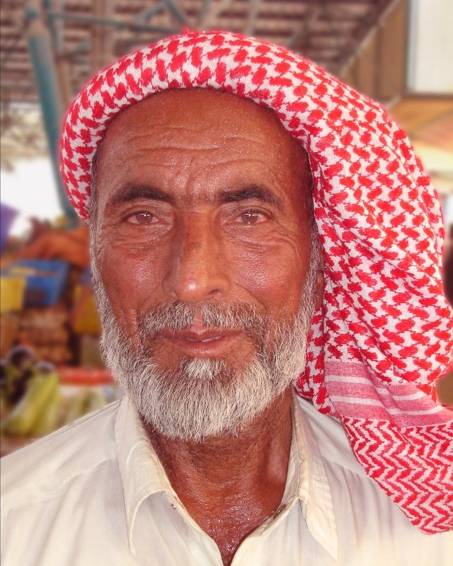
A packer, porter of fruit and veg, Dubai Fruit And Veg Market at Ras Al Khor, April 7th 2006 approx 10.00am.
Why was the photo taken
I was looking for individuals with an expresive and experienced face, one that told some stories. I saw this guy and was taken aback with the stories his face told. Very hot, very tired - making a hard living.
Why was this composition chosen
The original shot was out of necessity. The guy had a huge trolly of produce and was working for probably a few dollars a day. I was this "rich" expat - I just had to take the shot as it was...
How was the photo taken
Sony DSC-S40, 1/200s / f/3.5 / ISO 400 / focal length 9mm
How was the photo processed
Adjusted white balance and colour balance with curves and histogram to identify exact white / black balance. Saturation of the red channel. Decided not to close crop as wanted the entire head dress to remain. However this meant there was a distracting background not adding to the image. Extracted the guy and created a new background layer. Duplicated the extraction several times to sharpen edges and then flattened. The background copy was blurred with gaussian blur to add some definition and depth to the image. Sharpened the guy to bring out the lines and sweat on his face / neck. Slightly lightened his beard and shirt.
Original image:

Processed image:

Grant
I took the portrait assignment very literaly - I went looking for portraits of people. Pure and simple. Why? Because I have never done this. It forces you to think about the person as well as the image I think. With all due respect - an animal is a different proposition - you can get close or take 20 shots and they will not mind. However, walk up to a stranger who doesn't speak your language and get their permission to shove a point and shoot in their face was a learning experience for me. And one that showed the limitations of point and shoot and also the limitation I felt for original shots, it is very difficult to take a photo with a strangers prior permission without it looking staged...
What is the photo of/When was the photo taken/Where was the photo taken
A packer, porter of fruit and veg, Dubai Fruit And Veg Market at Ras Al Khor, April 7th 2006 approx 10.00am.
Why was the photo taken
I was looking for individuals with an expresive and experienced face, one that told some stories. I saw this guy and was taken aback with the stories his face told. Very hot, very tired - making a hard living.
Why was this composition chosen
The original shot was out of necessity. The guy had a huge trolly of produce and was working for probably a few dollars a day. I was this "rich" expat - I just had to take the shot as it was...
How was the photo taken
Sony DSC-S40, 1/200s / f/3.5 / ISO 400 / focal length 9mm
How was the photo processed
Adjusted white balance and colour balance with curves and histogram to identify exact white / black balance. Saturation of the red channel. Decided not to close crop as wanted the entire head dress to remain. However this meant there was a distracting background not adding to the image. Extracted the guy and created a new background layer. Duplicated the extraction several times to sharpen edges and then flattened. The background copy was blurred with gaussian blur to add some definition and depth to the image. Sharpened the guy to bring out the lines and sweat on his face / neck. Slightly lightened his beard and shirt.
Original image:
Processed image:
Grant
Wednesday, May 10, 2006
April Assignment - Seal Portrait
Hello there,
Here is my contribution to the the portrait assignment.
I guess Ivan was right when he thought I would post a seal portrait. I just happened to shoot a lot of seal portraits while on Sable for another project of mine. So here is my contribution.
What is the photo of/When was the photo taken/Where was the photo taken
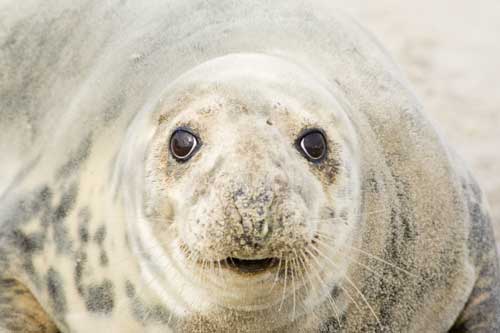
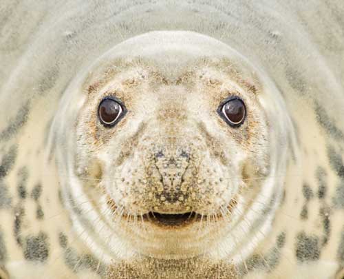
A grey seal female, taken on Sable Island, Nova Scotia on 29 Dec 2005 at 1100am
Why was the photo taken
I was interested in shooting close up of shots of seals. This one looked pretty clean and had an interesting look about her.
Why was this composition chosen
I wanted to fill the image with the seal so I shot very close to her. I waited until she was vocalising at me so that she would look a little more interesting. And I wanted that full-on stare.
How was the photo taken
Canon 350D, EF 100-300mm lens, 1/200th at f8.0, RAW, AdobeRGB, ISO 100, focal length 250mm.
How was the photo processed
I adjusted white balance, exposure/shadows, levels and curves in Camera RAW. I tweaked the levels and curves in PS and added some saturation to bring out the colours, although this female was very light coloured. I then cropped the seal in half vertically and made sure that crop was tight and included only the seal head and a bit of the body. I then duplicated that image, flipped it over and joined that piece to the original crop to create a miror image. I did this because one half was more 'clean' than the other, the crop of the other half was not full of seal, and I wanted to create more of an impact.
Damian
Original

Processed

Here is my contribution to the the portrait assignment.
I guess Ivan was right when he thought I would post a seal portrait. I just happened to shoot a lot of seal portraits while on Sable for another project of mine. So here is my contribution.
What is the photo of/When was the photo taken/Where was the photo taken
A grey seal female, taken on Sable Island, Nova Scotia on 29 Dec 2005 at 1100am
Why was the photo taken
I was interested in shooting close up of shots of seals. This one looked pretty clean and had an interesting look about her.
Why was this composition chosen
I wanted to fill the image with the seal so I shot very close to her. I waited until she was vocalising at me so that she would look a little more interesting. And I wanted that full-on stare.
How was the photo taken
Canon 350D, EF 100-300mm lens, 1/200th at f8.0, RAW, AdobeRGB, ISO 100, focal length 250mm.
How was the photo processed
I adjusted white balance, exposure/shadows, levels and curves in Camera RAW. I tweaked the levels and curves in PS and added some saturation to bring out the colours, although this female was very light coloured. I then cropped the seal in half vertically and made sure that crop was tight and included only the seal head and a bit of the body. I then duplicated that image, flipped it over and joined that piece to the original crop to create a miror image. I did this because one half was more 'clean' than the other, the crop of the other half was not full of seal, and I wanted to create more of an impact.
Damian
Original
Processed
Wednesday, May 03, 2006
April Assignment - Portraits. "Cat"
Chaps,
My first entry into the belated April Portrait Assignment. Now you see why I said it was OK to have animal portraits...I knew I had this image, and was keen to work on it for this assignment. I think it qualifies as a portrait, so no apologies from me. I also knew that D would have some seal shots, and G may have camels...
What is the photo of/ When was the photo taken/ Where was the photo taken
Our next door neighbour’s cat (Jimmy) from our previous rental house in Cambridge. It was taken sometime in Autumn 2005 (October, I think).
Why was the photo taken
I’m not a cat fan (Sorry, G), but this cat won me over. Friendly, affectionate and very cute. He would come round and put his head down on the sill of the open patio door, all cute and expectant. I wanted to get some shots, as we were moving and so was he and his owner. I nearly kidnapped him…
Why was this composition chosen
Like all cats, he chose the composition! He rested his head on the sill of the patio door, and let me get in real close, and fire off lots of shots. I had in mind to do some PS work on it, so I knew I needed lots of shots, to make sure I got just the framing I wanted.
I wanted to crop in tight, and create a really intimate animal portrait, and this was my way of concentrating the attention on the face, the eyes, whiskers etc (more below).
How was the photo taken
I don’t have the camera (EXIF) data to hand, but it was wide aperture, moderate (1/50) shutter speed, lying down on my belly getting close in.
How was the photo processed
I have included the original, so you can see the amount of work that went into the final picture.


I wanted to create the impression of the face coming out of the darkness, so I copied a colour from the black of the cat, and, on a new layer, filled that in with the paintbucket tool. Then, using a blending layer mask, I blended the cat’s face to merge into that shadowy background. I also used various adjustment masks to improve contrast and colour etc, and used some selective masking to bring out the eyes and nose. I also used selective sharpening mask to sharpen the eyes and nose etc to further draw the attention in. I removed some gunk from the left (as you look at it) eye, but should have removed from the right too.
As ever, I await your valued critique.
Cheers
Ivan
My first entry into the belated April Portrait Assignment. Now you see why I said it was OK to have animal portraits...I knew I had this image, and was keen to work on it for this assignment. I think it qualifies as a portrait, so no apologies from me. I also knew that D would have some seal shots, and G may have camels...
What is the photo of/ When was the photo taken/ Where was the photo taken
Our next door neighbour’s cat (Jimmy) from our previous rental house in Cambridge. It was taken sometime in Autumn 2005 (October, I think).
Why was the photo taken
I’m not a cat fan (Sorry, G), but this cat won me over. Friendly, affectionate and very cute. He would come round and put his head down on the sill of the open patio door, all cute and expectant. I wanted to get some shots, as we were moving and so was he and his owner. I nearly kidnapped him…
Why was this composition chosen
Like all cats, he chose the composition! He rested his head on the sill of the patio door, and let me get in real close, and fire off lots of shots. I had in mind to do some PS work on it, so I knew I needed lots of shots, to make sure I got just the framing I wanted.
I wanted to crop in tight, and create a really intimate animal portrait, and this was my way of concentrating the attention on the face, the eyes, whiskers etc (more below).
How was the photo taken
I don’t have the camera (EXIF) data to hand, but it was wide aperture, moderate (1/50) shutter speed, lying down on my belly getting close in.
How was the photo processed
I have included the original, so you can see the amount of work that went into the final picture.
.jpg)
.jpg)
I wanted to create the impression of the face coming out of the darkness, so I copied a colour from the black of the cat, and, on a new layer, filled that in with the paintbucket tool. Then, using a blending layer mask, I blended the cat’s face to merge into that shadowy background. I also used various adjustment masks to improve contrast and colour etc, and used some selective masking to bring out the eyes and nose. I also used selective sharpening mask to sharpen the eyes and nose etc to further draw the attention in. I removed some gunk from the left (as you look at it) eye, but should have removed from the right too.
As ever, I await your valued critique.
Cheers
Ivan
Wednesday, April 26, 2006
Photoshop aids
Here are a couple of resources that you may consider to help your PS skills. They are set up as a daily email blog. Often, there are useful tidbits that you wouldn't find in a textbook...
http://www.planetphotoshop.com
http://www.timgrey.com/
Damian
http://www.planetphotoshop.com
http://www.timgrey.com/
Damian
Tuesday, April 25, 2006
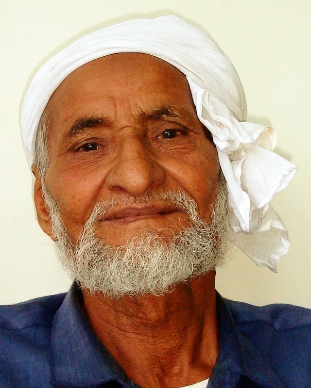
Spinneys Man
What is the photo of
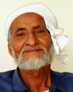
A 70 year old Pakistani gentleman in Dubai
When was the photo taken
31st March 2006, 2pm
Where was the photo taken
In a bank waiting room in Dubai UAE.
Why was the photo taken
In Dubai you see some faces from a far, you see the typical European expat in the malls, however when you really look, you see many more faces. This competition forced me to really look for the shots to take. This charming elderly man was 70 and had been in Dubai for over 30 years. Duabi as we know it today has really looked the way it has for max. 20 years, maybe 10. He has seen it all. And most likely had a hard time of it. His face told all. Yet he was very happy for me to take the shot. I have to say, the very nicest person to meet…
Why was this composition chosen
Simply because it was the only option available. This was an old stranger sitting in 35 degree heat. I had one chance to take a shot and did. The background was thankfully plain, the light was difficult in that extreme sunlight outside, yet dark interior room. Only option I had was to use flash.
How was the photo taken
I really had to think and take the shot fast, I was intruding on his time after all. I crouched down below his eye level, shot up, took one shot and thanked him. The intention was to frame him tight and in detail so as not to have to crop too hard with only a 4.1 meg camera.
How was the photo processed
ISO 200, f/3.5, 1/125s, focal length 8mm Levels balanced using histogram method. Flash shadow removed from behind shoulders. Colour tweaked to bring out colours. Sharpened with smart sharpen. Alternative b&w version created by removing selected colour channels and creating a desaturated layer with 20% opacity to allow a hint of colour to remain.
(This may end up being in the competition,but for now I am assuming I'll take more shots...)
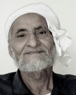
A 70 year old Pakistani gentleman in Dubai
When was the photo taken
31st March 2006, 2pm
Where was the photo taken
In a bank waiting room in Dubai UAE.
Why was the photo taken
In Dubai you see some faces from a far, you see the typical European expat in the malls, however when you really look, you see many more faces. This competition forced me to really look for the shots to take. This charming elderly man was 70 and had been in Dubai for over 30 years. Duabi as we know it today has really looked the way it has for max. 20 years, maybe 10. He has seen it all. And most likely had a hard time of it. His face told all. Yet he was very happy for me to take the shot. I have to say, the very nicest person to meet…
Why was this composition chosen
Simply because it was the only option available. This was an old stranger sitting in 35 degree heat. I had one chance to take a shot and did. The background was thankfully plain, the light was difficult in that extreme sunlight outside, yet dark interior room. Only option I had was to use flash.
How was the photo taken
I really had to think and take the shot fast, I was intruding on his time after all. I crouched down below his eye level, shot up, took one shot and thanked him. The intention was to frame him tight and in detail so as not to have to crop too hard with only a 4.1 meg camera.
How was the photo processed
ISO 200, f/3.5, 1/125s, focal length 8mm Levels balanced using histogram method. Flash shadow removed from behind shoulders. Colour tweaked to bring out colours. Sharpened with smart sharpen. Alternative b&w version created by removing selected colour channels and creating a desaturated layer with 20% opacity to allow a hint of colour to remain.
(This may end up being in the competition,but for now I am assuming I'll take more shots...)

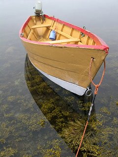
Shelbourne Dory, Grand Manan, Canada
I posted this image a long time ago; I think it was last year. I would like it to be rated because I really like this photo and I did quite a bit of PS work on it.
What is the photo of -
Shelbourne dory
When was the photo taken -
02 August 2005, noon
Where was the photo taken -
Dark Harbour, Grand Manan, New Brunswick, Canada
Why was the photo taken -
I was hiking in this area with my camera and saw these boats. They looked so colourful. This one seemed to be in a great pose.
Why was this composition chosen -
I wanted the bright orange rope to lead the viewer into the picture. This led the viewer to the boat. The position of the boat is such that the eye continues on, sort of on a zig-zag path, to the background. The background fades out so as not to distract the eye away from the boat. There was also interesting seaweed in the water and a nice reflection from the boat so I wanted to capture that too.
How was the photo taken -
Nikon Coolpix 4300. 150th sec at f7.6, exposure bias of -0.3 (to bring out the details in the water); ISO 100; sRGB; JPEG. I shot with a fast shutter speed to blur the background. However, this was quite easy to do since it was a little foggy on this day.
How was the photo processed -
I have included the original photo in this submission because I painstakingly removed a large object; the outboard motor. I was happy with leaving it in but many friends told me to remove it. I think it took me three tries to remove it successfully; perhaps four. This was my first real test of my photoshop skills. I used a combiniation of tools: I cut and pasted areas; I used the spot healing brush set to an elliptical shape to give a smoother 'heal'; and I used the patch tool. After removing the engine, I had to replace the missing section of rope. I used the colour replacement tool to remove the shadow that the engine had created.
A few friends also suggested removing the blue plastic bucket hanging inside the boat. I decided not to because this gives a nice splash of colour.
Once this was completed, I did a slight crop to remove excess water; especially around the vertical sides of the boat. I then did basic adjustments to the photo: adjusted levels, curves, saturation. Shadows and highlights helped to bring out the seaweed a little more. Finally I sharpened the image.
Damian

What is the photo of -
Shelbourne dory
When was the photo taken -
02 August 2005, noon
Where was the photo taken -
Dark Harbour, Grand Manan, New Brunswick, Canada
Why was the photo taken -
I was hiking in this area with my camera and saw these boats. They looked so colourful. This one seemed to be in a great pose.
Why was this composition chosen -
I wanted the bright orange rope to lead the viewer into the picture. This led the viewer to the boat. The position of the boat is such that the eye continues on, sort of on a zig-zag path, to the background. The background fades out so as not to distract the eye away from the boat. There was also interesting seaweed in the water and a nice reflection from the boat so I wanted to capture that too.
How was the photo taken -
Nikon Coolpix 4300. 150th sec at f7.6, exposure bias of -0.3 (to bring out the details in the water); ISO 100; sRGB; JPEG. I shot with a fast shutter speed to blur the background. However, this was quite easy to do since it was a little foggy on this day.
How was the photo processed -
I have included the original photo in this submission because I painstakingly removed a large object; the outboard motor. I was happy with leaving it in but many friends told me to remove it. I think it took me three tries to remove it successfully; perhaps four. This was my first real test of my photoshop skills. I used a combiniation of tools: I cut and pasted areas; I used the spot healing brush set to an elliptical shape to give a smoother 'heal'; and I used the patch tool. After removing the engine, I had to replace the missing section of rope. I used the colour replacement tool to remove the shadow that the engine had created.
A few friends also suggested removing the blue plastic bucket hanging inside the boat. I decided not to because this gives a nice splash of colour.
Once this was completed, I did a slight crop to remove excess water; especially around the vertical sides of the boat. I then did basic adjustments to the photo: adjusted levels, curves, saturation. Shadows and highlights helped to bring out the seaweed a little more. Finally I sharpened the image.
Damian


April's Assignment - a short delay
Guys
Due to bad planning on my behalf, can we extend the timeline for the April Assignment (Portraits) until Friday 05 May? I've not had time to get to it with all the DIY going on in our house, and I have some time off this week too, so no chance of getting in on time for me.
Don't let this stop you all submitting whenever, but perhaps the dearth of entries means we are all up against it a bit...?Let me know what you think (note: as it's my gig this month, I'm taking until 05 May anyway, but this has been dressed up to look like a request....!).
The Critical Eye (as Damo calls me)
Due to bad planning on my behalf, can we extend the timeline for the April Assignment (Portraits) until Friday 05 May? I've not had time to get to it with all the DIY going on in our house, and I have some time off this week too, so no chance of getting in on time for me.
Don't let this stop you all submitting whenever, but perhaps the dearth of entries means we are all up against it a bit...?Let me know what you think (note: as it's my gig this month, I'm taking until 05 May anyway, but this has been dressed up to look like a request....!).
The Critical Eye (as Damo calls me)
Saturday, April 22, 2006
Photo Ratings: Ranking
A quick reference on photos posted and ranked since inception of the ranking system.
Note:
If a post had 2 photos, only the higher ranked shot has been included.
If a photo was ranked twice, the original rank was taken.
The mean average was used, if a photo had 1 rank only then this was used.
Comments? I think this throws up interesting results...
Shadowman – Average score – 7.45
comments
photo
The Old Man And The Sea – Average Score – 7.35
comments
photo
Cambridge Punt – Average Score – 7.25
comments
No link to photo. Ivan - please provide if possible (imbedded in original post I think)
Minnis Bay, Kent – Average Score – 7
comments
photo
Stunted Pine Trees – Cyprus – Average Score – 6.15
comments
photo
Looking From A New Angle (Photo 4) – Average Score – 6
comment
photo
"Crocuses - arrival of spring in Nova Scotia” (Photo 1) – Average Score – 5.8
comments
photo
Dinosaur – Average Score – 5.8
comments
photo
Note:
If a post had 2 photos, only the higher ranked shot has been included.
If a photo was ranked twice, the original rank was taken.
The mean average was used, if a photo had 1 rank only then this was used.
Comments? I think this throws up interesting results...
Shadowman – Average score – 7.45
comments
photo
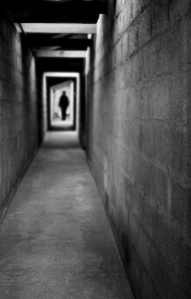
The Old Man And The Sea – Average Score – 7.35
comments
photo
Cambridge Punt – Average Score – 7.25
comments
No link to photo. Ivan - please provide if possible (imbedded in original post I think)
Minnis Bay, Kent – Average Score – 7
comments
photo
Stunted Pine Trees – Cyprus – Average Score – 6.15
comments
photo
Looking From A New Angle (Photo 4) – Average Score – 6
comment
photo

"Crocuses - arrival of spring in Nova Scotia” (Photo 1) – Average Score – 5.8
comments
photo
Dinosaur – Average Score – 5.8
comments
photo

Tuesday, April 18, 2006
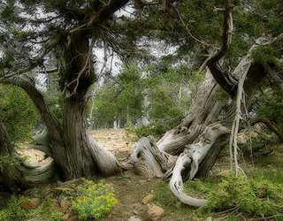
Stunted pine trees - Cyprus
This photo involved more digital manipulation than I am used to. However, I like the end result. I could take it much further but I am not entirely comfortable with that yet. Would love to hear your comments.
What is the photo of
Stunted pine trees
When was the photo taken
June 2005, at noon
Where was the photo taken
Troodos Mountains, Cyprus
Why was the photo taken
There was an immediate appeal; the stunted pine trees looked like they had a story to tell. They looked beaten from the harsh weather. I wanted to capture that.
Why was this composition chosen
The opening of the trees provided an 'eye' into the background, reavealing the other trees and giving a sense of scale and distance. The tree in the foreground provided a nice frame for the image. Although there is another opening to the left, I don't find this distracting. I tried various crops, including one that forced a square crop, but in each case I preferred the original composition.
How was the photo taken
Photo was taken with a Nikon Coolpix 4300. I don't have camera settings. ISO 100; sRBG; jpg format.
How was the photo processed
The levels were adjusted in PS, a contrast curve was added, and shadows/highlights were adjusted followed by a sharpening. I then used the Colour Replacement tool to tediously remove the blue haze around the twigs in the upper part of the photo. I still wasn't entirely happy with the final image (some areas seemed blurred) so I applied the Orton technique as given in the website that Ivan recently directed us too. I applied a screen blend set to opacity 100%. Duplicated the image. For the duplicate I applied a Gaussian Blur set to a pixel radius of 20. I then moved this duplicate over the first image and applied a blend:multiply. I flattened the image and then finally applied another levels set to screen with the opacity down to 20% just to lighten the whole image a little. I also did a little more work on the blue haze around the twigs.
So, let me know what you think. Damian
What is the photo of
Stunted pine trees
When was the photo taken
June 2005, at noon
Where was the photo taken
Troodos Mountains, Cyprus
Why was the photo taken
There was an immediate appeal; the stunted pine trees looked like they had a story to tell. They looked beaten from the harsh weather. I wanted to capture that.
Why was this composition chosen
The opening of the trees provided an 'eye' into the background, reavealing the other trees and giving a sense of scale and distance. The tree in the foreground provided a nice frame for the image. Although there is another opening to the left, I don't find this distracting. I tried various crops, including one that forced a square crop, but in each case I preferred the original composition.
How was the photo taken
Photo was taken with a Nikon Coolpix 4300. I don't have camera settings. ISO 100; sRBG; jpg format.
How was the photo processed
The levels were adjusted in PS, a contrast curve was added, and shadows/highlights were adjusted followed by a sharpening. I then used the Colour Replacement tool to tediously remove the blue haze around the twigs in the upper part of the photo. I still wasn't entirely happy with the final image (some areas seemed blurred) so I applied the Orton technique as given in the website that Ivan recently directed us too. I applied a screen blend set to opacity 100%. Duplicated the image. For the duplicate I applied a Gaussian Blur set to a pixel radius of 20. I then moved this duplicate over the first image and applied a blend:multiply. I flattened the image and then finally applied another levels set to screen with the opacity down to 20% just to lighten the whole image a little. I also did a little more work on the blue haze around the twigs.
So, let me know what you think. Damian

The Competition
Check out this website for some stunning images, and a measure of what really amazing photography is all about....
Cropping the Seal and the Sea
Damian
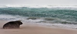
This is what I was getting at - crop out the distracting dull sky, shave a little off the bottom of the featureless beach (leaving enough to show that the seal is sitting on a beach), and you have a more powerful panoramic-style composition. Even if you put this in a standard black matt, you could have a black border top and bottom to blend in with the matt for sale. It would be a shame if picture sizes needed to be standard, and that negatively affected the impact of this powerful image.
This is what I was getting at - crop out the distracting dull sky, shave a little off the bottom of the featureless beach (leaving enough to show that the seal is sitting on a beach), and you have a more powerful panoramic-style composition. Even if you put this in a standard black matt, you could have a black border top and bottom to blend in with the matt for sale. It would be a shame if picture sizes needed to be standard, and that negatively affected the impact of this powerful image.
Sunday, April 16, 2006
The Old Man and the Sea
What is the photo of
An adult male grey seal resting on a beach
When was the photo taken
22nd Jan 2006 1100am, during a storm
Where was the photo taken
Sable Island, Nova Scotia, Canada
Why was the photo taken
When I saw this chap, 'sitting' on the beach, and the stormy looking sea, the image just said something to me. It gave me this feeling of an old fisherman looking out onto the sea where he has spent most of his livelihood. There was a connection between the seal and the sea. Perhaps this is just me. I was going to post this photo earlier and then deleted it because I didn't think it was worthwhile, but each time I look at this photo it just speaks to me. So I am wondering how others perceive it.
Why was this composition chosen
The composition was chosen to emphasise this 'link' between the seal and the sea. So I wanted the viewer to see the whole body and the head of the seal looking out on to the stormy sea.
How was the photo taken
1/160th, f16.0, focal length 80mm. Shot in RAW, Adobe RGB.
How was the photo processed
Pretty basic adjustments. White balance, exposure, shadows, saturation and curves adjusted in Camera RAW. Levels, shadow/highlights, saturation tweeked in PS and a slight contrast added. Finally sharpened.
Damian
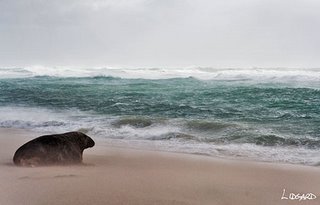
An adult male grey seal resting on a beach
When was the photo taken
22nd Jan 2006 1100am, during a storm
Where was the photo taken
Sable Island, Nova Scotia, Canada
Why was the photo taken
When I saw this chap, 'sitting' on the beach, and the stormy looking sea, the image just said something to me. It gave me this feeling of an old fisherman looking out onto the sea where he has spent most of his livelihood. There was a connection between the seal and the sea. Perhaps this is just me. I was going to post this photo earlier and then deleted it because I didn't think it was worthwhile, but each time I look at this photo it just speaks to me. So I am wondering how others perceive it.
Why was this composition chosen
The composition was chosen to emphasise this 'link' between the seal and the sea. So I wanted the viewer to see the whole body and the head of the seal looking out on to the stormy sea.
How was the photo taken
1/160th, f16.0, focal length 80mm. Shot in RAW, Adobe RGB.
How was the photo processed
Pretty basic adjustments. White balance, exposure, shadows, saturation and curves adjusted in Camera RAW. Levels, shadow/highlights, saturation tweeked in PS and a slight contrast added. Finally sharpened.
Damian

Wednesday, April 12, 2006
Yet another crop - looking at details
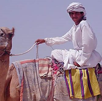
Seometimes, when all else fails, and you can't find a suitable crop per your original thought of the image, go for extreme detail. I've tried this with your camel shot, to focus on the jockey, his hands (both in shot, lucky), rope, cloth detail etc.
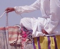
I would appreciate your considered views on this.
I
A Tutorial - My tuppence worth...
Grant, Damian
I agree with Damian about getting in tight to the core interest in the image, but I wouldn't have cropped off half the camel's head. I'd have either left it out totally (and assumed the nature of the man's dress suggests a camel) or - as I think is better still - leave the head and the length of the neck in, cropping in a square format. I tried a few other crops, but this one worked best for me, with the whole camel head and neck.
If I had more time, I'd have cloned out the other small distraction bottom left sticking out of the camels neck, using the clone tool and sampling from the sky. The sky is nice blue and fits in well with the desert/camel theme, so it's fine as a backdrop. Nothing intersects the scene if cropped, and I see you removed the pylons too (nice).
I have not colour balanced the image, but the original is a bit red. Your manipulated images seems a bit the other way (slightly blue), but that could be because all our screens are differently calibrated, so comparisons are not valid on subtleties like this, unless we all have the same monitor profiles.
I agree with Damian about getting in tight to the core interest in the image, but I wouldn't have cropped off half the camel's head. I'd have either left it out totally (and assumed the nature of the man's dress suggests a camel) or - as I think is better still - leave the head and the length of the neck in, cropping in a square format. I tried a few other crops, but this one worked best for me, with the whole camel head and neck.
If I had more time, I'd have cloned out the other small distraction bottom left sticking out of the camels neck, using the clone tool and sampling from the sky. The sky is nice blue and fits in well with the desert/camel theme, so it's fine as a backdrop. Nothing intersects the scene if cropped, and I see you removed the pylons too (nice).
I have not colour balanced the image, but the original is a bit red. Your manipulated images seems a bit the other way (slightly blue), but that could be because all our screens are differently calibrated, so comparisons are not valid on subtleties like this, unless we all have the same monitor profiles.
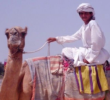
I think cropping square makes good use of the jockey, the camel and it's neck, and the colours of the towel etc. The pose - although clearly posed - is still quite relaxed, and the jockey'a arm makes a nice flow from his head to the camels head, and then the neck takes you - well me, anyway, around the bottom of the image to the colour and textures of the cloth, completing the eye's "review" of the scene. Square format - typically used in medium format film work - has a different spatial dynamic to landscape, portrait or panoramic, and I think this tight circular composition works well in the symmetrical square format.
It's also good that the camel and the jockey are looking at the photographer, and this can't be exploited if half the head is cropped in my opinion. It should either be all in or all out. If the other camels had been positioned differently, I think your horizontal crop - which I like - would have been stronger still. Or, if there had been another jockey or element to balance the image.
Nice picture.
Hope this is useful
Tuesday, April 11, 2006
Response to the tutorial - a tight crop
Grant,
Not sure if this works, but I am being rather daring here in my cropping. I asked myself what is it that appeals to me; what jumps out. To me, the main part of the image is the man's head and the fact that he is sitting on a camel. The camel's head is secondary and so can be cropped. The viewer's eye knows that this is a camel so doesn't need to see the all of the head. By cropping so closely one simplifies the image right down to its core. You can ask yourself the question 'what exactly am I trying to show to the viewer'. What is it about this image that is so appealing to me. Why did I shoot this image. If you have a clear vision, then it is perhaps easier to achieve what you want.
Please tell me what you think. Damian
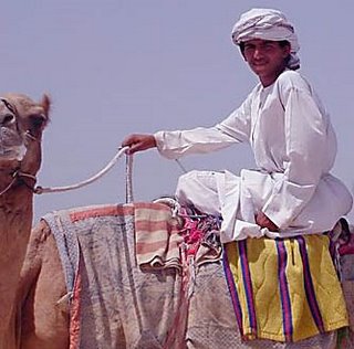
Not sure if this works, but I am being rather daring here in my cropping. I asked myself what is it that appeals to me; what jumps out. To me, the main part of the image is the man's head and the fact that he is sitting on a camel. The camel's head is secondary and so can be cropped. The viewer's eye knows that this is a camel so doesn't need to see the all of the head. By cropping so closely one simplifies the image right down to its core. You can ask yourself the question 'what exactly am I trying to show to the viewer'. What is it about this image that is so appealing to me. Why did I shoot this image. If you have a clear vision, then it is perhaps easier to achieve what you want.
Please tell me what you think. Damian
A tutorial...
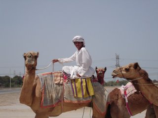
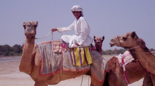
Just a small experiment. One of my first uses of CS2 and also to illustrate a previous question on backgrounds - to take or not...
Please don't feel you have to rate this, it is not 100% finished yet, I am look for a tutorial type reply. Should I have shot this, what could I have done different with the shot or the post process? Is it worth work or am I trying to create something that was not there to begin with...
Original shot from camera:
The worked on shot:
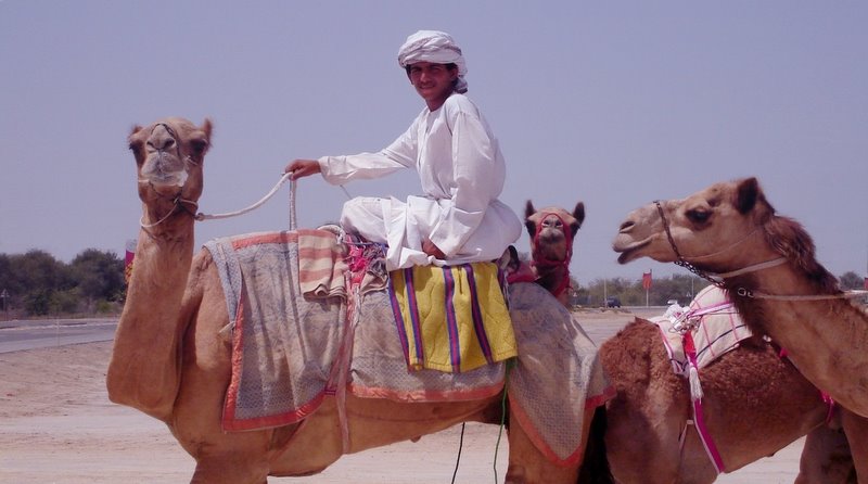
What is the photo of
A camel jockey and his camels...
When was the photo taken
31st March 2006, 1pm
Where was the photo taken
Nad Al Sheba Camel Pens, Dubai.
Why was the photo taken
Out experimenting with locations and shots, trying to get in close, using the point and shot, but having little success with compostions and backgrounds...
Why was this composition chosen
As I mentioned in a previous question, the question was whether to take the shot even though I know the backgroun let it down.
How was the photo taken
The Sony point and shoot, 1/500, white balance sunny, ISO set to 200.
How was the photo processed
Level balanced using highlight and shadow points identified with threshold layer. Slight boost to the curve, cloned out the pylons. Added blue gradient for the sky, dodged out the jockey. Cropped. Should probably sharper using smart sharpen...
Please don't feel you have to rate this, it is not 100% finished yet, I am look for a tutorial type reply. Should I have shot this, what could I have done different with the shot or the post process? Is it worth work or am I trying to create something that was not there to begin with...
Original shot from camera:

The worked on shot:
What is the photo of
A camel jockey and his camels...
When was the photo taken
31st March 2006, 1pm
Where was the photo taken
Nad Al Sheba Camel Pens, Dubai.
Why was the photo taken
Out experimenting with locations and shots, trying to get in close, using the point and shot, but having little success with compostions and backgrounds...
Why was this composition chosen
As I mentioned in a previous question, the question was whether to take the shot even though I know the backgroun let it down.
How was the photo taken
The Sony point and shoot, 1/500, white balance sunny, ISO set to 200.
How was the photo processed
Level balanced using highlight and shadow points identified with threshold layer. Slight boost to the curve, cloned out the pylons. Added blue gradient for the sky, dodged out the jockey. Cropped. Should probably sharper using smart sharpen...
Monday, April 10, 2006
Subscribe to:
Posts (Atom)