Hope all are very well. Can't believe it has been about a year!
I don't want to post shots here that I have already put on the Dubai Daily Photo blog, however I'm interested in your opinions in a couple of recent shots. And yes, one of them features a bloke on a camel...

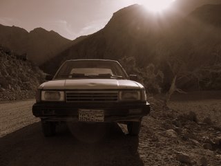
A beat up car in the middle of a deserted wadi. This caught my eye with the sun dropping behind the cliffs.

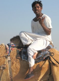
The obligatory bloke on a camel shot - have I improved with the crop and the composition? Interested in comments on this one...

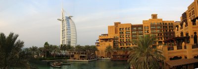
A panorama of the Burj Al Arab in the tourist shot category.
Honestly guys - I will try to post more, but 1 photo a day is a challenge!
Would love any thoughts.
Cheers and best to all,
G - Bluey.
2 comments:
Hi Grant,
I like the last one least. Way too cluttered. Is it of the palm trees, the apartment building, the sailboat hotel? I can't tell. Nice time of the day to attempt the shot but I'd like to see you do it again from a different angle because there's definitely loads of potential there.
Right. Uber-critical hat off - it gets better from here!
Camel man's fine. Light's a bit harsh and it's cropped a bit too close to the top of his head for my liking, but the composition's fine. His legs are great - interlocking triangles are always good.
First shot: I absolutely love it! Contre-jour lighting - never easy to get working successfully, and the temptation to turn this into a silhouette is there, but no, you've got lots of shadow detail and the flare from the sunlight pouring over the top of the ridge is a great touch.
Composition works perfectly for me - how different from the cluttered last picture of the set. Photography redux, broken right down to the car and the cardboard cutout hillsides and the desert. It looks hot and it looks dirty and it looks sweaty. Even the dent in the bonnet of the car is perfect!
Image 1 - brilliant. Love the composition and clever exposure to make sure there is shadow detail and not all silhouette. Great tone to the image, works better than black and white would have. Looks hot and dusty as Gareth says. Nice one. 8/10
Image 2 - agree about the overly tight crop on the top of the head. Like his pose and interesting interaction with the photographer. Clean and uncluttered. Good grab shot. 6/10
Image 3 - if this is a stitched panoramic, it's a good technical job. As an image, it's hard to know what to look at. Foreground is non-existent. The orange buildings and the light on them is interesting - perhaps zoom in on them in another image? Nice exposure and colours, just not sure it's quite there as a working image. Technically 8/10, image "wow" factor 5/10.
The images on your Dubai blog are great too.
Cheers
Ivan
Post a Comment