Tuesday, December 20, 2005

Ivan has invited me to contribute to this fine blog. I feel slightly at a disadvantage here as I am not, repeat, not of the very high standard of Ivan and Damian. Like a lot of people, I love great photography and the power of a stunning shot, well it can simply take your breath away, as some of the shots on this blog have already done.

My shots have been taken in various locations using very standard equipment - a 3meg Minolta Dimage X and laterly a 4.1meg Sony Cyber Pix. No Digital SLRs here (as yet!) Basic photoshop manipulations may have happened, basically these are straight out of the camera.

I'll try to post on occasion and attempt not to lower the fine tone of the blog. If anything I think the best idea is to treat me as a pet project - I'm very happy to receive advice on all aspects of photography.

So, to get us started, here are a few of my shots...


This was taken in Koh Lanta in Thailand in 2002 as the light was starting to head towards the quick dusk. I'd already taken about 8 shots of the boatman and was hoping for the light and the sky to work together. As with a lot of my shots there is no techincal aspect except for framing, composition idea and a little knowledge of the light etc...


This was taken from the Empire State Building in New York in June 2003. As mentioned previously, for me it is currently all about the immediacy of the shot. I just really liked the city details, the traffic, the buildings, the shadows, the iconic water towers and also the feeling that you are an observer, not in the dynamics of the bustle, but somewhere otherly and unseen.


And this final shot for now, again from NY 2003, is very much about the time and the place. Just snapped very quickly on the subway this really appeals to me as an image and again a thought. Is it a joke - a thoughtless throw away tag / graf? Is it a real plea to pray, if so for what, for who? Is it a comment on the authority to stop freedoms... for me, it is too restrained to be thoughtless...

Well - I hope these do not stick out too much on the blog. More to follow from Dubai, Vienna, Scotland and more in the future. Comments very welcome!

Friday, December 16, 2005

Peak District Images

Here are a few images from the beautiful Peak District National Park. I've been there a couple of times, to attend courses run by the Peak District Photography Centre.

Above Crowdecote


This image was a bit of a fluke, capturing the cloud shadow moving rapidly over the field and tree patterns I was actually interested in. The shadow creates a sense of movement and some drama to an otherwise quite interesting scene.

I have adjusted the levels on this one, to accentuate the shadow slightly, but not much. This was taken about 1 hour before the biggest thunder and lightening storm I've seen for ages, and the sky gives a clue to what's coming...

Peak District Tree
This image was taken near The Roaches, which is a well-known local geological landmark. The tree stands alone on high ground, allowing it to be nicely isolated using a mid-range telephoto setting, and works well with the gently curving shape of the stone wall in the foreground.
All comments welcome.
Ivan

Monday, December 12, 2005

Halifax after our first snow

This is very likely my last post before I head out to Sable Island on Tuesday, although the weather is not looking great. When I return (27 Jan) I hope to have several diary entries with photos of my stay out there.

Northwest Arm, Halifax

On Friday night (Dec 9) we had our first snow storm which, for a Brit, was quite exciting. So I went out on the Saturday and took a few pics. Nothing really special here but some nice snowy pics. To balance the colours, I used Hue/Saturation with -2 for Hue to bring more warmth into the picture to balance out the cold look of the snow and blue sky.


This picture is a close up using the same Hue/Saturation. The colour of the wood beneath/next to the sheds comes out really nice with the Hue set to -2.


I was really playing here, but liked this image because of the contrast between the snow and the leaves. It signifies the changing of the seasons from Autumn to Winter. I also liked the cracks in the snow. Again the -2 Hue brought out the bronze colour in the leaves which adds a nice contrast to the snow.


And this is the front of my house. The Hue brings out the colour in the woodwork around the windows. The Shadows/Highlights function was used to darken the sky a little and createa better tonal balance overall.

Friday, December 09, 2005

Black and White photos from Atlantic Canada


Kejimkujik National Park, Nova Scotia


This is a photograph taken while canoeing on the lakes of the Kejimkujik National Park. I used the Channels Mixer with the red, green, blue channels set to 28, 60, and 12 to convert the original colour image to BW. This is roughly similar to the conversion that occurs when you switch modes to greyscale. Levels, Curves and gradient masks were used to adjust the tone and contrast.

Another image from the National Park using the same conversion technique as described above.


Dark Harbour, Grand Manan, New Brunswick


This was taken from Dark Harbour on Grand Manan, an island in the Bay of Fundy. Although I now realise that it is better to take all photos in colour and then convert later to BW in PS (thanks Ivan), this image was orignally taken in BW. The tone/contrast adjusted using Levels. I am still playing with this image a little but I like it a lot.


This is another photograph taken from the same structure above originally in BW. This image does not have the full dynamic range of a typical BW but I like the tones (the histogram shows little highlights).


Again, another image taken from an area close to the structure above. As you may figure, this is a reflection. I realy like it.


Hopewell Rocks, Bay of Fundy, New Brunswick

Lastly this photograph was taken from the shores of the Bay of Fundy in an area called the Hopewell Rocks. These rocks sit on the beach and are partly made of sandstone and are carved by the fierce tides that sweep this area. Again it was originally taken in BW. I deliberately washed out the background to create a strong contrast. The tree on the right adds nicely to the photograph.

Thursday, December 08, 2005

Converting colour to Black and White


This is a photograph that was converted to BW; the original colour photo is below. To do this I used the Channel Mixer and set it to Greyscale and then adjusted the percent values for red, green , blue to 30, 60, 10. I used the Auto function on Levels to adjust the tone. Then I applied another Levels with a gradient mask so that I could bring more tone out in the sky without affecting the lower part of the image. I used a Curves adjustment also with a gradient mask to brighten the lower part of the image.

I would like to know what you think...

Damian

Wednesday, December 07, 2005

Sable Island, Nova Scotia, Canada

Sable Island is a 50km long, 1.5 km wide sand bar sitting in the midst of the Atlantic Ocean, about 300km ESE of Halifax. I have spent 8 winter seasons out there (and one late summer) studying the seal population that breeds on the island between mid-December and early-February. About 300 wild horses also live on the island and have been there since the 1700's. Currently, only a few people live on the island, almost all of which are associated with the Canadian weather station (about 3-4 people). I have taken many many photographs from Sable, most of which rest on 35mm slides. I have, however, in the past few years taken a few digital photos. Here are a selection of those.

Sable Island horses feeding on washed up marram grass

Here are two horses feeding on marram grass that has been washed up by the surf. This photo was a difficult take because the two horses almost merge into one another. I used several tools (Levels, Curves, Hue, Shadows) to adjust the contrast and colour to separate the two horses and bring some colour out in the sea and sand.


Grey seals mating in surf

This is what I spent much of my time looking for on Sable Island during my studies; seals mating. This particular shot (taken with wet feet if I recall) shows a male that has effectively stopped a female escaping to sea and is mating with her in the surf. It's an alternative mating tactic to defending a female for a long period of time and then mating. Although males are successful in siring offspring using this tactic, the success rate is much lower to that achieved by defending females for an extended period. This tactic is also thought to involve forced copulation, i.e. rape, but I am not entirely confident with that thought.

Male grey seal in storm

This shot was taken during a storm. Shooting photos on Sable can be tricky because of the sand blowinig around. But I have decided to shoot in as many conditions as I can since this is when you can create very dramatic photos. The direction of the surf blowing with the wind is the same direction that the seal is pointed in, creating a little symmetry in the photo.


Sable Island horses grazing on marram grass

During the winter months the horses rely on the marram grass for food. This picture shows two horses feeding on the grass. The east end of Sable disappears into the distance. Along the beach you can see the seal colony. I 'warmed' this photo up using hue/saturation. I also used the shadow/highlights and curves to bring more detail outin the horses.


Sunset over freshwater ponds

At the west end of the island there are several freshwater ponds; a grace for the horses that inhabit that part of the island. At the east end of the island, there areno such ponds and the horses have to dig holes to get water.


Grey seal on Sable Island

This is a photo with a grey seal male in the foreground and several in the background. I love this photo because of the colours; they are so clear and bright. To bring the whiteness of the snow out I followed a suggestion by Ivan; I used Levels, blending to Screen, and a gradient mask that brightened the snow at the bottom of the image and left the sky untouched.


Wicken Fen - one of the last true fenlands left...

Just to the north of Cambridge is Wicken Fen Nature Reserve, which is one of the few remaining fenlands of this area. You can read all about it here.

I really like this place, because it's a landscape unlike anywhere else. It's flat, but it's interesting too, and the windmill is a nice focal point for any picture.

I've been there 2 or 3 times since coming to Cambridge, and intend to go back many times more, as the mood of the place changes depending on the time of year, time of day, and the weather.

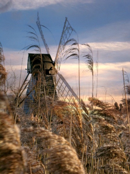
The first shot was taken to try and put the windmill and the fen reeds in close proximity, and to go for a bit of a different composition. I like it, but feel it could have been better with a little more care on the composition. The sky was very bland, so I used another sky - taken in the same location - and blended that in using the multiply mode. I warmed up the colours to fit in to that end-of-day feel. It changes the image dramatically, and I think it looks reasonably natural (although the eagle-eyed among you will see that the sky doesn't seem to be "behind" the windmill blades in places).

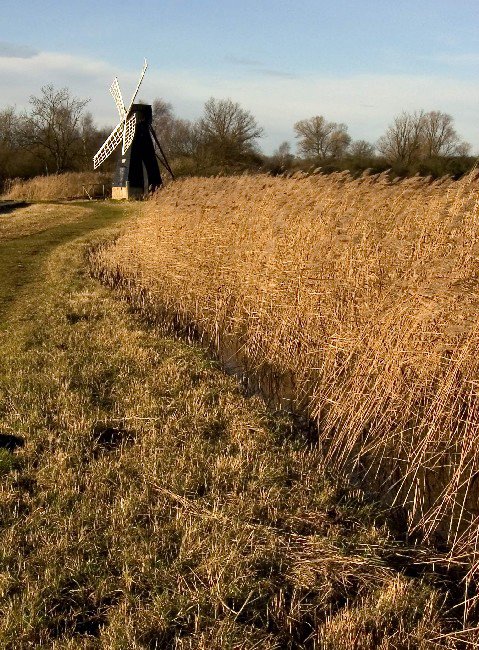
The next one was taken on another day, different time of day, and feel has changed. This one feels more typically like a summer shot, but I wanted to get the shape of the reeds as they curve towards the windmill. The portrait format helps this movement through the picture I think.

The sky wasn't terribly interesting, so I decided on placing the horizon really near the top of the frame, and allowing the shape of the reeds to dominate. Afterwards, I noticed the nice symmetry of the shape of the reeds with the cut section - like the interlinking "yin and yang" symbol.
Should appeal to Damian's love of symmetry.

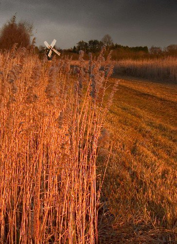
On another visit (right), the sky was really stormy and brooding, and the light was falling nicely on the white blades of the windmill. It lasted only a few minutes, but I knew it was coming (this time) and was there, waiting.

I deliberately tried some different compositions, but in retrospect I think I should have stepped out 2-3 steps to the right, and got more of the line of reeds leading to the windmill - in this shot, your eye isn't sure what to look at: windmill, reeds, sky. It's a bit cluttered and messy, which is a shame as the light and mood is wonderful.

In the next shot, I wanted to emphasis the wide open flatness of this unique area.

Thankfully, the sky was still stormy and added some drama, so I tried to get as much of this in as possible, while using the line of the dyke as a visual device to lead the viewer in.

This picture breaks the old "Rule of Thirds" for composition - but that's OK I think. When there's enough going on, and the interest top and bottom is balanced (but relating to different visual themes), it's OK to split the image in this 50:50 way. If I'd chopped it any other way (cropping the top or the bottom), it would not be as effective a picture in my opinion.

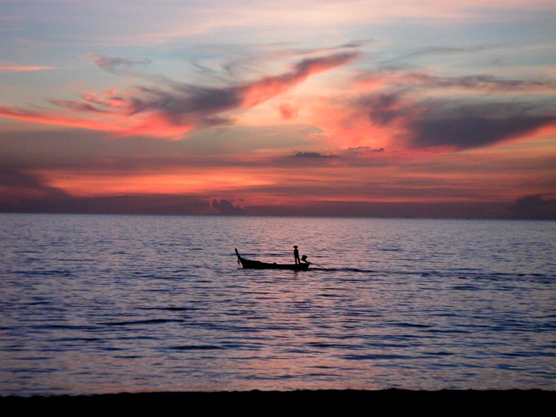
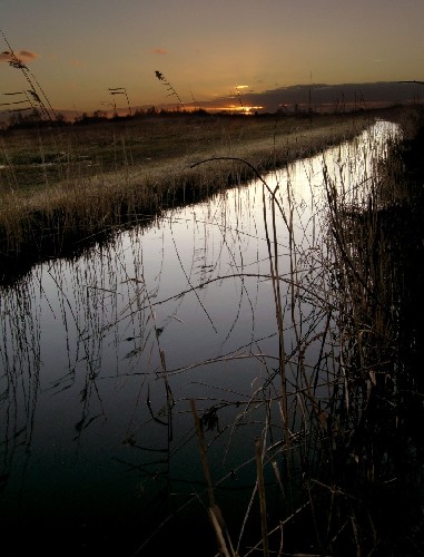
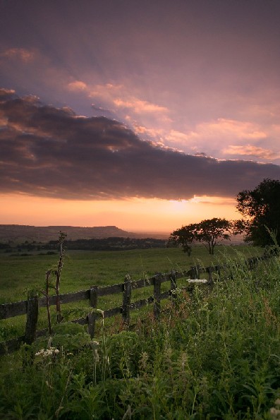
The final image was taken at the end of the day, when the light was really beginning to fade, and I was frozen solid. The dynamic range of the lighting meant that exposing for the sunset led to a pitch-black foreground, and exposing for the foreground led to an over-exposed bland sky. So, I took two pictures, and blended them together in Photoshop. This is the digital equivalent of using a graduated filter to hold the sky in traditional film photography, but the level of control afforded by the digital medium if far greater. I didn't blend these two together that carefully - and I intend to return to this image in the future - but you can see how it leads to a balanced image. Your eye can take in a scene with a far wider dynamic range than film or a digital sensor, so to me this represent a much "truer" representation of what I saw, and thus it's justified as a photographic technique.

Hope you like the pics

Ivan

More Autumn Colours

Here are some more photographs of trees in Autumn.

This is the same tree as shown in the previous blog. I just love the colour of the leaves. I also like the blocks of grass where the tree stands, and the one behind it, as it adds a bit of symmetry to the picture. The eye, or mine at least, likes to see some symmetry in a picture. I also played a little in PS with this photograph. The original image showed quite a bit of darkness in the foreground so I applied an Adjustment Levels, switched the blending mode to Screen (to lighten up the image) and then used a gradient mask to apply the lightness to the foreground rather than the background.


This photograph was cropped to remove the dark, boring grass at the top and to accentuate the sunset light falling on the log and wood chips. The rock to the right adds nice contrast. Levels broadened the dynamic range and the Curves brightened up the image slightly.


This is a tree from close to the park where I live. I like the trunks of the trees shooting upwards with the leaves shooting outwards from it. Almost like a firework. Again, I used Levels to adjust the colour dynamic range, Curves to brighten the image for printing, and hue/saturation to bring out the colours. The hue has only been adjusted by -3 percent. The saturation has been increased by 15% and the lightness level by 4. This adjustment simply accentuates the colours that are already there. Because I saw the 'firework', I decided not to sharpen this image but rather add some blur.

Damian

Autumn Colours in Nova Scotia

Here are some photographs that I took shortly after getting my new Canon EOS 350D (Rebel XT) and the EF-S 17-85mm IS lens. The colours on the trees were changing rapidly so this was a good opportunity for me to grab some pics of the autumn/fall colours.

This is my street, Patricia Street. The house just behind the tree with the bright yellow/orange leaves is my house (sort of yellowish). The trees still had most of their leaves and created a sort of tunnel down the path. Make slight adjustments to the hue/saturation brought out the colours more.


I am not sure what shrub this is but I love the colours of the leaves; its almost like the shrub is on fire. Again I used a slight hue/saturation adjustment to bring out the colour. For the first time, rather than sharpening the image, I added a slight blurring in PS (smart blur) to blend the colours together.


I like this shot because of the different colours and textures in the leaves. I have croppped this picture so that only the leaves are showing, rather than areas of grass, and again used the hue/saturation to bring out the wonderful colours.


This is a park very close to where I live. I cropped the image slightly to the left to remove a car and create the line of trees moving left into the picture. The path takes the eye into the picture too.


Damian

More Photos from Peggy's Cove

Here are some more photographs from my trip to Peggy's Cove, NS


First off, this is another picture of the lighthouse but here the lighthouse is a more dominant feature in the photograph. I used the shallow gulley in the foreground and the interesting rocks to lead the viewer into the photo and to the lighthouse. In photoshop, the first thing I did was adjust the Levels. I find the Auto function usually, but not always, does a decent job of adjusting the dynamic range of the colours. I then adjust the contrast to give it more of a punch. I now, after seeing several of my photos printed, lighten the whole image. I either use a Curves adjustment, pulling the whole curve upwards slightly, or simply add an Adjustment Levels and then switch the blending mode to Screen and adjust the strength or opacity. Afterwards, I use Hue/Saturation to bring out some of the dominant colours (but ever so slightly) and, if need be, I play with the shadows/highlight to adjust the tone. Lastly, I sharpen the whole image.


Here is another granite rock; similar idea to the one shown in the previous blog. You may notice, the rock is positioned above the horizon so that it really stands out. There isn't much else in the fore or background to distract the eye but the colours add some nice contrast. The rock down below in the immediate foreground pleases my eye; it seems to create a flow from there to the high positioned rock. Similar steps in photoshop (as described above) were followed for this photograph.


This photopgraph puts the granite rocks and the lighthouse into perspective. I like the dominant features of the rocks in the foreground; they catch the eye and the eye then follows the rocks into the picture eventually leading to the pennisula and the lighthouse. The tonal quality of this photograph appeals to me. The grey in the rocks, the reddish tones in the ground vegetation, the greens of the trees, and the blues in the water and sky. I also like the light-coloured lichens in the foreground . The main feature is the rocks.
Damian

Monday, December 05, 2005

African Savanna or a Field off the A11..?


Well, no prizes for guessing which!

This is a field off the A11, on my way to work. It's actually the field next to the one with the corn. It had caught my eye several times, as the row of trees on the horizon looked very simple and striking. I knew that if I could get there one lunchtime, I could get a nice image (weather permitting).

On this particular day luck was with me. Not only were there nice interesting fluffy clouds, but they were moving across strong sunlight, causing fast-moving cloud shadows on the ground.

This lasted only the briefest of moments, but I was able to capture a few images with the nice shadow stripes on the field adding much more interest. Later, I cropped the images to get the most out of the composition.


Which works best? Open to comment...

Ivan

Saturday, December 03, 2005

My favourite "Photos of the Week"

Well, I am really pleased with this blogging thing. It encourages you to do more photography, and it's just nice to get some feedback. Great idea, and I hope it will continue as productively as this first week.

These are my favourite photos of the week.


Of the photos Ivan posted, this one is a sure winner because of the beautiful sky, the framing, colour balance, and the forground reminds me of the English countryside.


And this one. Because it just speaks to me. I can see it hanging in my living room above the fireplace.


Next week I hope to take some photographs from some lakes that are around Halifax, and I have a few pics of autumn colours that I took a while back.

Damian

Friday, December 02, 2005

The end of our first week blogging.

What can I say? It's been an interesting week: we set up this blog, and we've started sharing our images and ideas. I got a metaphorical kick up the ass to get out there, and I did - and I was really pleased with the results. Damian's been on a couple of forays, and brought back some really good images. Hopefully more pics next week, and more discussion. Still waiting for our first "outsider" to log a comment...any takers?

I thought I'd nominate my choices for our "Photos of the Week".

Damian's lovely sunrise is stunning, and a worthy recipient.


I am also very pleased with my early morning offering, and I think it's also worth a mention.


I think these images both show why we love doing this so much....

Ivan

Thursday, December 01, 2005

Thoughts

"A film captures one's imagination through a story and many images. The art of photography is to capture one's imagination using a single image." Damian

Sunrise on the North West Arm

This is the North West Arm leading into Halifax. Its pretty much at the bottom of my road. I ran down there this morning because the sunrise through the kitchen window was looking fabulous. This is the best shot. I used the hue/saturation to bring some colour out in the sky, ever so slightly. I set the exposure at the horizon, to the right, to get a decent balance. And I used my manfrotto tripod to help frame the picture.

Damian

Wednesday, November 30, 2005

Peggy's Cove

So, I was not as courageous as Ivan, but I also spent part of the day taking pictures. I left my house at around noon (quite respectable) and headed out to a place called Peggy's Cove which is about 45 minutes from me. It is one of the most photographed places in Atlantic Canada, because of the quaint fishing village and the lighthouse that sits on a granite outcrop. I wanted to take images that showed other sights. The weather was not great. Cloudy. Rather grey. And no sunset even though I sat and waited. I took about 100 pics, deleted quite a few, and these are a few of the best.


Granite boulder, nr Peggy's Cove

Just before you arrive at Peggy's Cove there are 'fields' of granite boulders deposited by glaciers. Some large rocks sit on top of little rocks. I like this pic because the large rock really stands out against the background and the colour of the plants in the background add contrast. I used photoshop to sharpen the rock and adjusted the levels plus hue/saturation to bring out the colour in the background/sky.


Peggy's Cove

I like this picture simply because it draws you right into the middle very quickly. I used the shadows/highlight to bring the colour out in the sky and adjusted the hue/saturation to bring the colour out in the rocks and vegetation. All very slightly.


Lighthouse, Peggy's Cove

This is the famous lighthouse. I wanted a different image. So I accentuated the gorgeous granite rocks rather than the lighthouse. Again, I adjusted the hue/saturation very slightly to bring out the colour in the rocks.


Damian


At The Other End of the Day

I was lucky, this morning, getting that spectacular sunrise. And also reminded of how badly I read the weather. This is something I'll need to get better at, if I want to get more of those really good images.

Attached is a picture I took in the Peak District this summer. I was there on a 2 day digital imaging course, and was out in the evening, nearby, looking for a nice sunset. I had taken a few to little effect, and was driving out by the humourously named Tittesworth Reservoir when I stopped to look at the sun setting nearby a local landmark called "The Cloud" - this is the long wedge-shaped peak in the distance. I thought the scene was nice enough, but then the sun went in behind the actual cloud, and produced, for about 20 seconds, the most dramatic scene ever - rays of light spilling out from behind the cloud, the colours intensified, and - with the sun now less of a direct light source - made the image possible to record in any detail. Again, I should have seen it coming...

I did process the image in Photoshop, slightly lightening the foreground and just balancing up the levels and colour saturation. I think it makes for a pretty special image.

Ivan