I took the portrait assignment very literaly - I went looking for portraits of people. Pure and simple. Why? Because I have never done this. It forces you to think about the person as well as the image I think. With all due respect - an animal is a different proposition - you can get close or take 20 shots and they will not mind. However, walk up to a stranger who doesn't speak your language and get their permission to shove a point and shoot in their face was a learning experience for me. And one that showed the limitations of point and shoot and also the limitation I felt for original shots, it is very difficult to take a photo with a strangers prior permission without it looking staged...
What is the photo of/When was the photo taken/Where was the photo taken
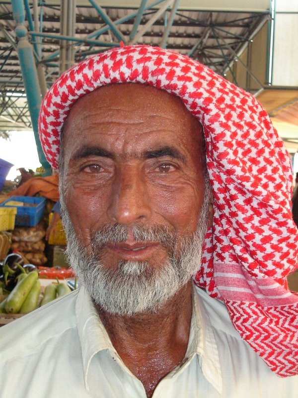
A packer, porter of fruit and veg, Dubai Fruit And Veg Market at Ras Al Khor, April 7th 2006 approx 10.00am.
Why was the photo taken
I was looking for individuals with an expresive and experienced face, one that told some stories. I saw this guy and was taken aback with the stories his face told. Very hot, very tired - making a hard living.
Why was this composition chosen
The original shot was out of necessity. The guy had a huge trolly of produce and was working for probably a few dollars a day. I was this "rich" expat - I just had to take the shot as it was...
How was the photo taken
Sony DSC-S40, 1/200s / f/3.5 / ISO 400 / focal length 9mm
How was the photo processed
Adjusted white balance and colour balance with curves and histogram to identify exact white / black balance. Saturation of the red channel. Decided not to close crop as wanted the entire head dress to remain. However this meant there was a distracting background not adding to the image. Extracted the guy and created a new background layer. Duplicated the extraction several times to sharpen edges and then flattened. The background copy was blurred with gaussian blur to add some definition and depth to the image. Sharpened the guy to bring out the lines and sweat on his face / neck. Slightly lightened his beard and shirt.
Original image:
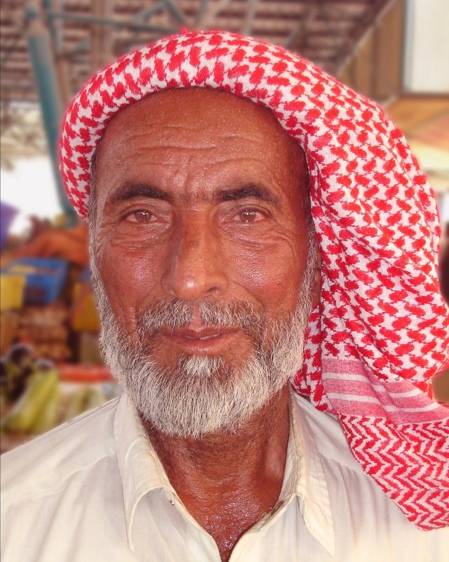
Processed image:
Grant
2 comments:
Impact - 6; He has an interesting face, but the extra stuff in the background distracts.
Composition - 6; straight head and shoulders shot. Let down by the distractions in the background
Light/Colour - 6; face is nicely detailed, and no over/under exposure, but it doesn't add to the face.
Technical skill - 6; extraction etc is tough, but it can be done right down to the detail of individual hairs. This has a blurry halo around the head, and this makes it look unreal to some extent. Also, CS2 has lens blur, which is much better for creating a realistic effect than Gaussian. This is the right idea to get this effect, but it's execution is not quite there yet. Saturating the red channel has led to a red cast on the image; better to boost saturation overall, or use CS2's selective colour enhancement to avoid getting a cast. A Good effort, though.
Originality - 6; head shot, which is the bread and butter of portrait. However, it's street photography, and in context of where he was, so I give it slightly more.
Overall - 6; solid image, with the correct idea but some technical errors that can be easily rectified. I'd have really tried to lose the background (as you'd already extracted the guy, so why not put him into another image..?) and crop in a little more, losing the shirt.
Impact - 5
This did not have much of an impact and I think it was lessened by the similar format from the previous portrait image. Again, I appreciate it is difficult to shoot people.
Composition - 6
Not an exciting composition. I like the use of the headwear and filling the frame with most of the head. I would have preferred a tighter crop to remove the distracting background.
Light/Coloujr - 5
I really don't like the colour. The red saturation has added an odd tint to the face which I find distracting. I would have preferred the original colour perhaps with an overall increased saturation.
Technical skill - 6
I can see that Grant is beginning to experiment with Photoshop and gaining greater skill. Creating the blur in the background is excellent. I would have preferred more sharpness in the portrait and I would have preferred a better use of colour too (re: red tint).
Originality - 5
It is not original. The composition is safe but I appreciate the circumstances the photo was taken in.
Overall - 5.4
Even though the previous submission was similar in style, I much preferred that photo. It was sharper, better colour, cleaner background. This photo might have been better if it were not for the overal redness which I found too distracting. The background was busy and somewhat distracting but creating a blur helped to remove some of that. I could see some interesting shapes and bright colours in the background which perhaps could have been used in a more creative manner. Again, the circumstances make it very difficult to do that.
Damian
Post a Comment