Here is my contribution to the the portrait assignment.
I guess Ivan was right when he thought I would post a seal portrait. I just happened to shoot a lot of seal portraits while on Sable for another project of mine. So here is my contribution.
What is the photo of/When was the photo taken/Where was the photo taken
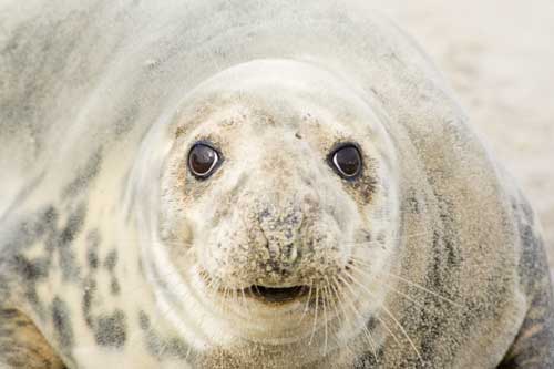
A grey seal female, taken on Sable Island, Nova Scotia on 29 Dec 2005 at 1100am
Why was the photo taken
I was interested in shooting close up of shots of seals. This one looked pretty clean and had an interesting look about her.
Why was this composition chosen
I wanted to fill the image with the seal so I shot very close to her. I waited until she was vocalising at me so that she would look a little more interesting. And I wanted that full-on stare.
How was the photo taken
Canon 350D, EF 100-300mm lens, 1/200th at f8.0, RAW, AdobeRGB, ISO 100, focal length 250mm.
How was the photo processed
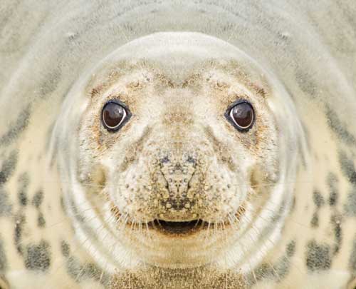
I adjusted white balance, exposure/shadows, levels and curves in Camera RAW. I tweaked the levels and curves in PS and added some saturation to bring out the colours, although this female was very light coloured. I then cropped the seal in half vertically and made sure that crop was tight and included only the seal head and a bit of the body. I then duplicated that image, flipped it over and joined that piece to the original crop to create a miror image. I did this because one half was more 'clean' than the other, the crop of the other half was not full of seal, and I wanted to create more of an impact.
Damian
Original
Processed
3 comments:
Impact - 7; Makes you feel drawn in, so good initial impact.
Composition - 7; tight, and the eyes really get you in. Maybe a tad too much around the edge, but that's being picky.
Light/Colour - 7; subtle tones, photo well exposed. Nice.
Technical skill - 6; Techincal skill is quite high, but it's use is misplaced (for me) here. Faces, be they animal or human, are not symmetrical, and introducing such symmetry (which I know Damo likes) is completely alien here, and looks it. You see an unnatural balance. If you were cleverer with the use of this, you'd have introduced some differences, via Photoshop and the clone/patch tools, to achieve what you wanted (more body) but not at the expense of natural looking effect. As a keen biologist and wildlife lover, applying this effect surprised me, and seemed to be a step too far. So, although well done, I think the application has also to have an element of whether such technical expertise should have been used here. I think not, so I mark it down. Another example would be if Black and White were used in a setting that did not work, however well it's done.
Originality - 7; like my cat image, I like this, and not often done for animals.
Overall - 6.8
Hi,
Thanks for the comments. Symmetry is 'appealing' to the eye because it is suppose to indicate 'good genes'. As I looked at the original image I could see that one side was different to the other, and one side was more appealing to me than the other. So I created this double-image effect. I agree that I probably took it too far and that was me being lazy.
Ivan made a comment about the eyes (I think) which I did not understand - '...and the eyes really get you in. Maybe a tad too much around the edge, but that's being picky.' Not sure what this means...
Damian
Hi Damian
What I meant was that the eyes are a good focal point, and do draw you in, but there's a tad too much body around the edges of the picture, which competes with the eyes for your attention. I'd have cropped in a little tighter, loosing some of the body, and that would also have meant you didn't have to do the symmetry thing, since the amount of seal body you had in the original image would have filled a closely-cropped image anyway.
Post a Comment