Guys, sorry these are so big - blogger won't let me upload them as images for some reason, so they're coming straight from my web hosting and therefore full size already. Hope this doesn't screw up the page but if it does I'll try to delete the post. edited I've created them as clickable thumbnails now.
This is my portfolio selection for the projected image competition at the Camera Club, deadline Monday. Title "Just Blue" - they're all images from Santorini. I chose a square crop which is a bit different. Thoughts?
4 comments:
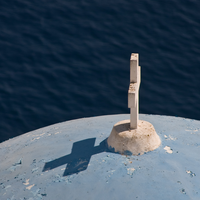
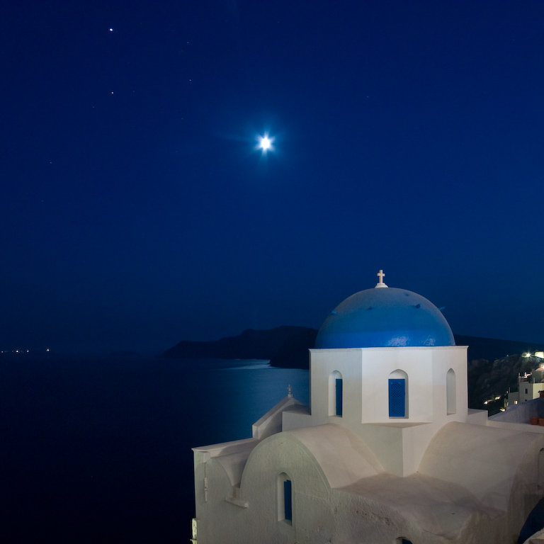
#3 is very nice, but that last one makes me say "wow". It almost doesn't look real. I'd say lose the small point lights around 2/3 down on the left, and *maybe* the two stars in the upper left.
Thanks Colin. The composition of the last one is a little uneasy but I hope it's compensated for by the long exposure/moon turning to a star of bethlehem, etc!
I take your point about losing the small point lights on the horizon - I think I need to leave in the other stars, though, so there's enough in that part of the frame.
G
Need to be brief, as day is busy, so here goes:
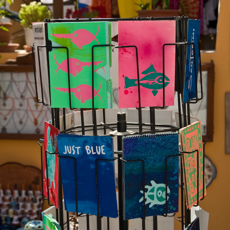
#1 - would have preferred this cropped in, more emphasis on the simple colours and shape of the card carousel. Background distracting for me, and foreground not well separated. Why is this first image? Setting the scene, tourist theme?
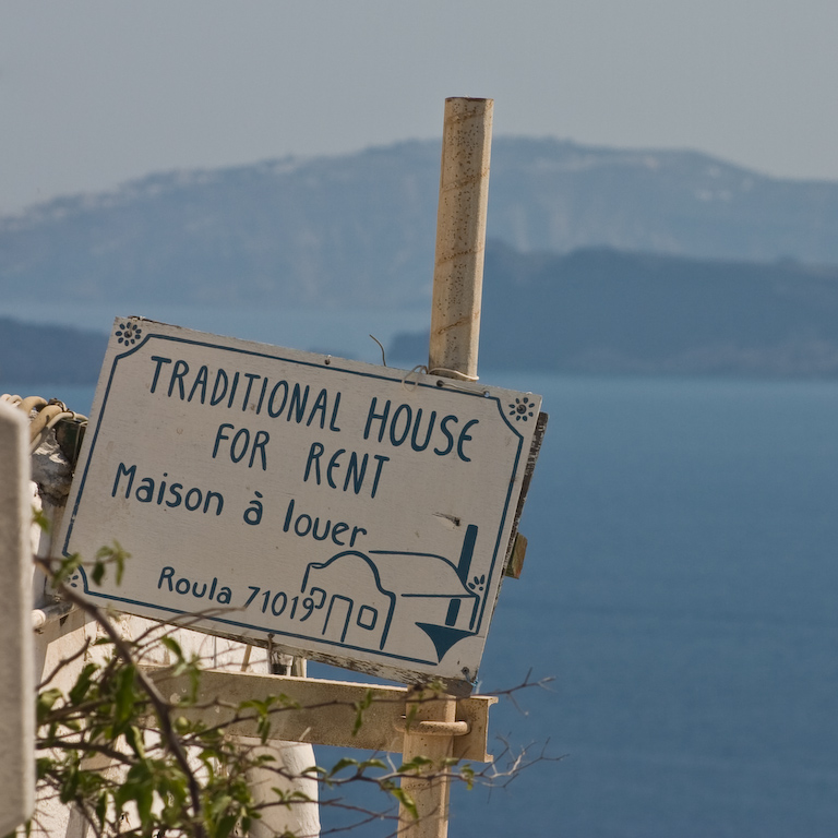
#2 - doesn't do anything for me, sorry. Yes, nice situational reference, so this may validate it's place in the theme/set. But the pole is central and the sign not that interesting for me.
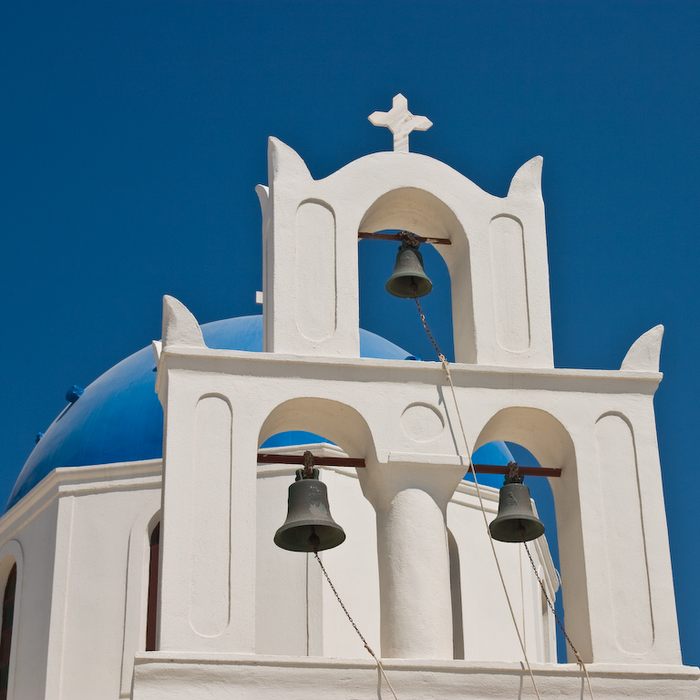
#3 - this is getting better now. Simple lines, graphic shape. Off-centre is good, but this looks a wee bit unbalanced, with elements of grab-shot rather than thoughful composition slightly letting it down.
#4 - great image. Simple, clean, effective. Best so far, and relates to the one above nicely.
#5 - Stunna (as the Sun would say). Great eerie effect and agree with G's assessment of the stars, and also Colin's assessment of the slight distraction of the peripheral small bright lights. Great image. Cracker to end on.
Overall, an interesting set. May get placed, but suspect not. One good (#3), one great (#4) and one exceptional (#5) image may not be enough with the weaker initial two. But, what the hell do I know...eh?
Ivan, the "All Seeing Eye"
Thanks Ivan. I took out the horizon lights from the final one as per yours and Colin's suggestions and I had another look at the second but didn't have enough time to retask it or pick another. You're right to say it's the weaker of the set so we'll just have to see what happens.
I don't agree with you on the first one wrt background separation. What you say is true for the thumbnail, but on the larger one the differential focus gives clear background separation. I chose the angle deliberately as I wanted to emphasise the packed in, touristy feel of the place along with the super-saturated colours. The judge is either going to like it or hate it, I guess!
Thanks for your comments, both.
Post a Comment