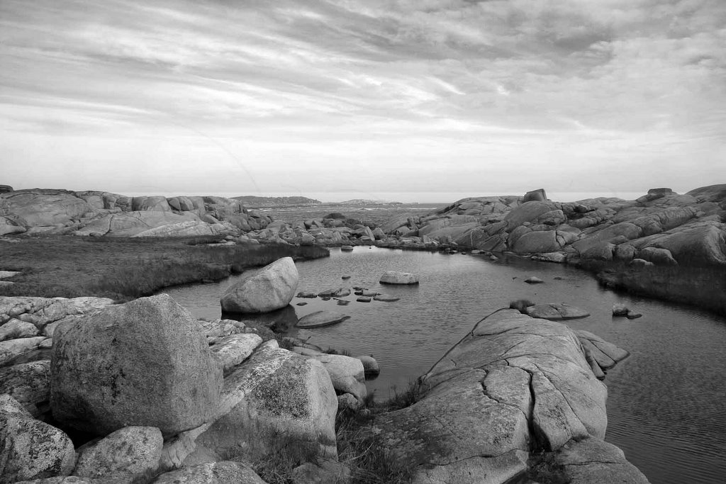
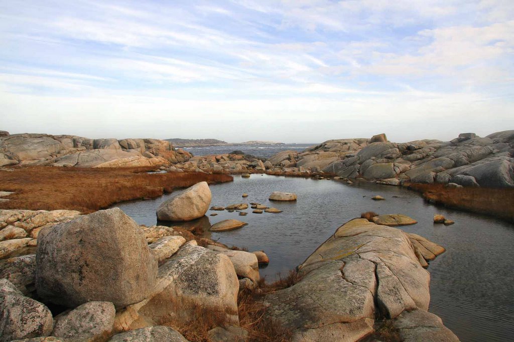
This is a photograph that was converted to BW; the original colour photo is below. To do this I used the Channel Mixer and set it to Greyscale and then adjusted the percent values for red, green , blue to 30, 60, 10. I used the Auto function on Levels to adjust the tone. Then I applied another Levels with a gradient mask so that I could bring more tone out in the sky without affecting the lower part of the image. I used a Curves adjustment also with a gradient mask to brighten the lower part of the image.
I would like to know what you think...
 Damian
2 comments:
Hi Damian
I think it's a nice image, and suits the black and white treatment. It may be my screen, but it still lacks "punch", and to me that's because it doesn't seem to have the full range of tones from pure black to nearly pure white. One thing I do is to find what I think is a mid-tone in the image and, using the gray eye-dropper tool in the levels dialogue box, click on that mid-tone. It will then shift the whole image to make that mid-tone an actual midtone (18% gray to be technical). This is not the method to get a good control over your image final look, but it may assist you in knowing which way to skew it. You can simply exit that dialogue without applying to get back to where you started.
Next, I always try to get as much tonal range out of the colour image first, before moving on to the black and white. By tone, I think I mean shade of light and dark, whereas I think you mean colour by that. I think colour information is the Hue and Saturation modes, and tone is intensity of light and dark. Contrast is the difference between light and dark. Once you have a nicely balanced colour image (having used levels, curves, hue, saturation), then move into the Channel mixer. I think you are right - this is one of the best ways to make black and white, as you can still play with the relative intensities of the colour channels, albeit in Black and white as you tick the monochrome box.
Fine tune using the mixer, and periodically check the spread of tones using the levels histogram. I also use curves, and increase contrast by making a very subtle s-shaped curve from bottom left to top right - as a normal S flows - but very shallow. It nicely ups the contrast, but in a much more subtle way than the contrast slider.
The use of a mask to selectively apply levels to the sky is a good method as you say.
Sometimes, as a final touch after having flattened the image, I create a duplicate layer, and try some dodging (of highlights) and burning (of shadows) to create further interest and much more selective tone adjustments. This can be combined with a feathered selection of an area and then work within that dodging and burning as you like, or applying levels from the top menu bar. As you are working on a duplicate layer, you can discard if you don't like it.
Then, try a test print to see how it transfers to paper - some inkjets still have a colour cast when you think you've ticked the momochrome box on the printer. Some papers produce a better monochrome than others. You can create a monitor and printer profile to use with black and white, but that's a whole other story...
With black and white, I like them punchy. You may prefer them less so, so ignore all this if you like a subtler look to your images.
Cheers
Ivan
PS hope we get one more blog in on Monday before you head off..!
Ivan,
Thanks for the suggestions. I agree that the image lacks punch; its a bit soft. I have been playing around with it. Actually, the first time I tried converting it to BW I used the colour image that had been tweaked with Levels, Curves and Hue/Saturation, but I wasn't really satisified with the product. So I then went back to the original image and converted it to BW straight off and then played around with that. I seem to get better results that way.
Your blog is a useful Blog to have for BW; a good source of info. I have a mag here (Photo Pro) and they list several techniques for converting to BW.
1 Change the mode to Grayscale
2 Use the Channel Mixer and switch to Monochrome and then adjust the red, green, blue Levels. A mix of 30, 60, 10 is similar to the conversion using grayscale.
3 Use Hue/Saturation and lower the saturation to zero
4 Convert from RGB to LAB and discard the A and B channels.
I think you listed these techniques once when I was looking into the BW thing. They also have a more complicated procedure that involves copying the image, switching one to grayscale, and then copying the red, blue and green levels from the colour image over to the Grayscale image. Then you use Layer Masks to adjust the opacities of the red, green and blue layers. It was a bit complicated for me at my current PS skill level.
One day I will use all of the different techniques to see what I get but so far I like the Channels Mixer.
Damian
Post a Comment