 First off, this is another picture of the lighthouse but here the lighthouse is a more dominant feature in the photograph. I used the shallow gulley in the foreground and the interesting rocks to lead the viewer into the photo and to the lighthouse. In photoshop, the first thing I did was adjust the Levels. I find the Auto function usually, but not always, does a decent job of adjusting the dynamic range of the colours. I then adjust the contrast to give it more of a punch. I now, after seeing several of my photos printed, lighten the whole image. I either use a Curves adjustment, pulling the whole curve upwards slightly, or simply add an Adjustment Levels and then switch the blending mode to Screen and adjust the strength or opacity. Afterwards, I use Hue/Saturation to bring out some of the dominant colours (but ever so slightly) and, if need be, I play with the shadows/highlight to adjust the tone. Lastly, I sharpen the whole image.
 Here is another granite rock; similar idea to the one shown in the previous blog. You may notice, the rock is positioned above the horizon so that it really stands out. There isn't much else in the fore or background to distract the eye but the colours add some nice contrast. The rock down below in the immediate foreground pleases my eye; it seems to create a flow from there to the high positioned rock. Similar steps in photoshop (as described above) were followed for this photograph.
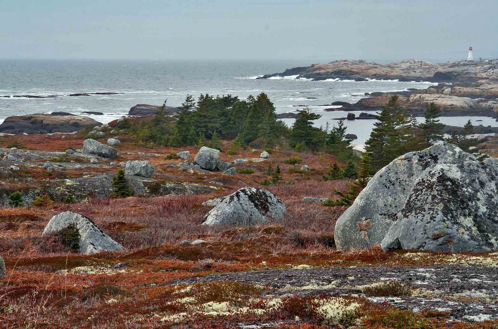 This photopgraph puts the granite rocks and the lighthouse into perspective. I like the dominant features of the rocks in the foreground; they catch the eye and the eye then follows the rocks into the picture eventually leading to the pennisula and the lighthouse. The tonal quality of this photograph appeals to me. The grey in the rocks, the reddish tones in the ground vegetation, the greens of the trees, and the blues in the water and sky. I also like the light-coloured lichens in the foreground . The main feature is the rocks.
Damian
1 comment:
Damian
Nice shots. I particularly like the ones of the lighthouse (which is more of a feature now) and the rocks and distant peninsula. The first one works much better than your original post, as the rocks and lighthouse balance out much better. The bottom image is a nice composition, and the weather/sea looks quite lively!
The one in the middle with the rock - looks like you have tried to selectively bring out the sky with levels or curves. Good idea, but you have a "halo" around the rock, which looks unnatural. If you have a bland sky that is much lighter than your foreground, you can select it with the magic wand. You may need to try various settings for the selectivity, and make sure the additive option (two overlapping small squares) is checked. Then you can select all the sky, and (once you have expanded and feathered your selection by 1-2 pixels)you can then more accurately adjust your sky levels. Or, you can do it via a Levels adjustment mask, and carefully brush away/paint in as required.
Post a Comment