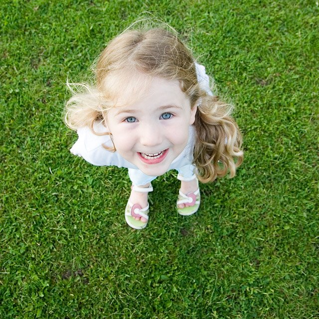
I had a play with some square cropping over the weekend, attempting to reproduce the compositional constraints and strengths of 6x6 medium format, while trying to keep the basics still there. This is my four-year-old daughter, particularly pertinent as I'm expecting a flood of baby photos from Ivan.
Now I want an MF camera...
4 comments:
Gareth
I really like this shot - it's simple, close-in composition is also really unusual, but perfectly suited to a child's portrait. Almost like a flower, if you squint, her head the flower against a grassy backdrop.
You have captured her cheeky smile, and there is good eye contact. Her feet poking out the bottom is a nice touch too.
What processing do you use, as there is a kind of high key look to a lot of your images, this included.
I may have been tempted to make the image totally square, and place her bang in the centre. It's slightly off to my eye, and this may just provide a little more symmetry and strength, but it's a great shot and very unusual.
I didn't want to put it through our formal scoring system (as shown by Damian's analysis of my flower meadow image) unless you are comfortable with that. If not, or if you'd prefer, I can just provide the kind of general comments above - scores are kind of irrelevant sometimes, but it helps us measure if we have progressed. Perhaps we can move to the First, Second, Third, Highly Commended and Commended system that the CCC use? D, G - what do you think?
If I were to use this, I'd say that this was a strong, original, fun image that has good impact. I'd give it a "Second", because it was very good, but didn't get me in a way that a First would.
Ivan
Good feedback, Ivan - thank you! I'm happy if you want to use the scoring system as well, if it helps to guide the analysis. I've also realised that I'd not followed your scheme for posting the other details on the image, so here goes:
What is the photo of; where was it taken?
My daughter, Ellie, at the recreation grounds at Barton, Cambridgeshire
When was the photo taken
23 Sep 2006 16:00
Why was the photo taken
The kids are willing subjects. I find square format to be an interesting way to think about images which differs from what I'm used to, and I wanted to try something different. The lighting was fairly even and the colour temperature was acceptable, so I felt it would be a good starting point for an experiment.
Why was this composition chosen
I shot the subject small in the frame to give me a variety of cropping options. I chose a wide-angle lens to distort the perspective and to give the "big head, big eyes, tiny feet" effect which works so well on cute kids.
Noting Ivan's point about putting the subject in the centre, I chose not to do this because I was concerned that doing so would make it too static. Putting her eyeline on the top third creates a tension which gives her space to "fall into". However, in hindsight I can see that it would have been better for her to have been at the horizontal centre as being slightly to the left is awkward.
It's easier to see why thirds work on rectangular aspects because something in the middle of a rectangle looks very static. But I still think it's necessary to create tension on the square.
How was the photo taken
f6.3 @ 1/200 sec, ISO 200, lens (Sigma 18-50 EX DC)@18mm, shot on RAW.
How was the photo processed
Import to Photoshop CS2 via Adobe Camera RAW. Tweaking of levels there. Some dirty sensor dust removed with the clone tool/healing brush, together with a nasty scratch on her nose.
I favour a high-key approach (and often use low DOF) for portrait work - not blowing highlights completely, but raising the upper midtones significantly, just in curves. I generally pin the midpoint, leave the black and white points untouched and raise the right-hand (highlight) section of the curve, and then adjust the shadows depending on how much detail I'm prepared to lose as a trade-off for adding saturation and punch.
I should add that I'm quite badly colour-blind so tend to super-saturate most of my images - that's the world as I'd like to see it, which I appreciate is a bit OTT to many!
To temper this, although I've not done it here, I often use channel mixer to then desaturate the image, but only to 80%. This, together with the S-curve, produces an interesting result which I rather like. A few examples:
here
here
here
here
Hi Gareth,
Apologies for the late posting. I have two impressions of this photo. Initially, when I saw the photo I found it very striking. The green, green grass is very striking and creates a strong image with the bright clothes of the child and her big smile. So, the composition, colour and light work very well. However, after that striking impression, I am left with this rather odd looking child with a huge head and no body. That, for me, becomes stronger the more I look at it.
Damian
Thanks Damian. Odd-looking is exactly what I was after!
Post a Comment