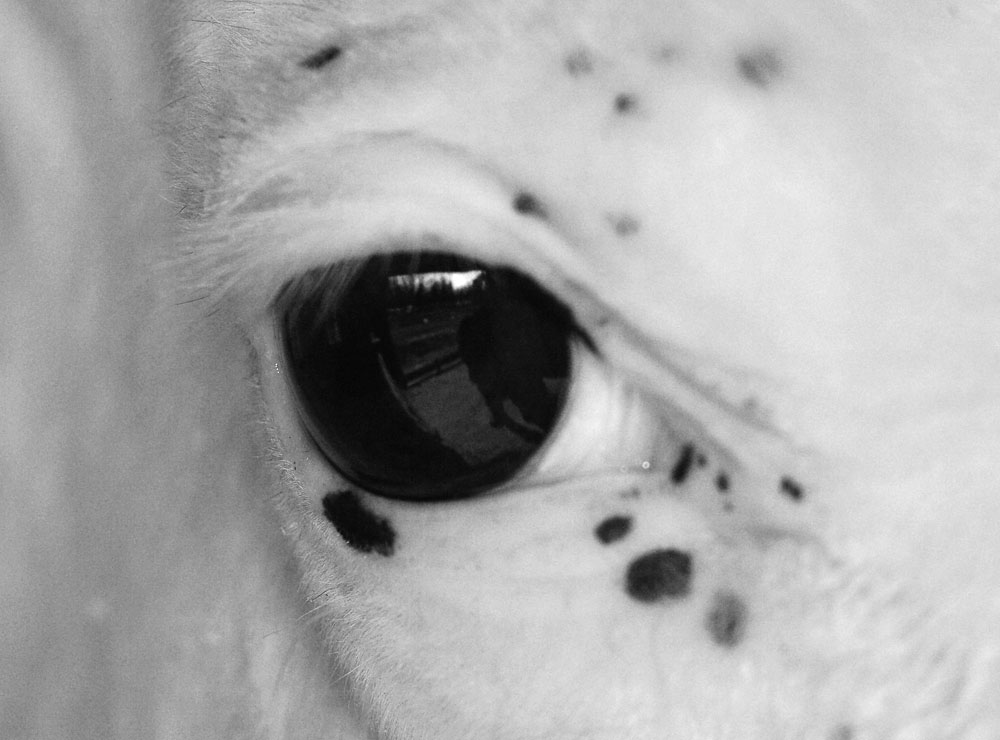
Here is my "vision". I was going to leave the colour in but I found the pinkness off-putting. I was then going to create a strong black and white contrast but that didn't fit with the softness that the original image had. That is, the pinkness, to me, implies more delicate tones rather than harsh tones (comes from the pinkness in albinos). Anyway, I used black and white and attempted to create a soft and pure image.
Enough with the la-di-da arty-farty stuff. Here it is:

3 comments:
Am I allowed to comment?
Well I thought if other people wanted to have a crack at their own edits first...
I agree with removing the pink. the softness is not only pleaseing but draws the viwers attention to the horses eye (which is agood thing).
Post a Comment