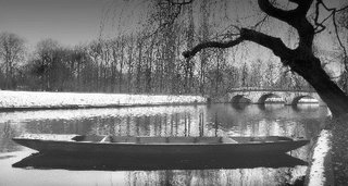
A lone punt on the River Cam, Cambridge, UK
When was the photo taken:
About 07:00, early January 2006.
Why was this composition chosen:
I knew I wanted to come to this part of the river, as it had all the elements of a nice scene: the bridge, the tree, the river and banks with trees to ensure an interesting background. However, sometimes the punts are there and sometimes not. This time, there was only one punt, dutifully obliging with a pleasing angle, in relation to the bridge, tree and bank! In truth, it was slowly rotating round. A series of pictures, with the punt steadily changing it's angle, revealled this one to be the best. I chose this as the best because the punt formed a nice line, in harmony with the bridge and distant treeline. The near tree, although a little ragged, framed it nicely.
How was the photo taken:
With a camera? No. I hand-held at 1/10 sec, f8, ISO 800, using the EF-S Image Stabilised lens.
How was the photo processed:
I converted to black and white, and used a Photoshop black to clear filter to create the graduated effect from top to bottom. This just makes the sky less bland and stops the picture being filled with white at the top. I also cropped it to be horizontal, emphasising the length of the punt, and echoing the bridge and trees in the background. Also, it de-emphasised the sky and original foreground, which were of little interest. I adjusted levels, ensuring a good tonal spread on the histogram, and did an additional blending mode, with a copy of the layer set to screen, with opacity reduced to 40%.

3 comments:
Ivan,
This ranking will be based upon the initial review, with, hopefully, my first impressions intact.
Impact - 8
This photo had a big impact on me when I first saw it. The part of the photo that lowered the impact was the dark trunk in the foreground. I seem to remember having a bit of trouble with this part of the photo.
Composition - 8 (from the original comment). There is lots to see in this image. The boat strikes first and to someone who isn't terribly familiar with punts it really draws the eye straight into the photo. Then its the light; the perfect light. The snow on the grass in the background and the highlights on the water draw the eye further in. Then the beautiful bridge, followed by the interesting trees in the background that actually become taller from left to right. Finally, for me, the tree in the foreground is what strikes last. I am not quite sure what to make of the tree though. It certainly fills that part of the frame but there is something about it that I find distracting. It might be the vertical trunk which branches at the top. I find that once I have looked at the image, this part of the tree (at least I think it is this part of the tree) distracts my eye from the rest of the image. But, having said that, I am not certain of it.
Light/Colour - 9
I thought about this quite a lot before scoring. I think the photo deserves a score of 9 for light. When I look at the photo the light is brilliant in all parts of it. The snow is white white, the reflections on the water are wonderful, the light in the sky adds drama to an otherwise calm scene. The punt is well illuminated as is this the bridge.
Technical skill - 8
Great composition, a sharp image despite the slow shutter speed, good depth of field, well exposed, appropriate adjustments made in photoshop.
Originality - 5
The photo isn't original, even though it is nicely framed and well taken.
Overall - 7.6
I really like the photo and want to get it to an 8. The originality lowers the score. It's very well composed, the light is great, good impact, but I feel that it is a safe shot that lacks originality. It is the best shot ranked so far with the Minnas Bay shot coming in on a close second.
Damian
By the way, the aspect of the photo that also lowered the score was the tree trunk in the foreground. I find it too dominating. If it was lighter and thus less strong it might blend in more. It adds nice framing but it shouldn't distract the eye.
Damian
Guys
Thanks very much for your well-considered opinions. I agree that the originality is lacking: Cambridge, river, bridge, punt...it's been done a million times before. I think it is important to have an originality criteria, and for it to be marked down if something is not. That makes us think more about what is original, or to accept that we can strive for excellence within an unoriginal theme (as here). Grant's image of the cylinders was less "beautiful", but much more original and rightly scored as such.
I'm pleased it scored so well with both of you on all other scores, especially pleasing are the impact and composition scores, something I try hard to optimise in my pictures. I feel myself that this is a strong image, and getting this confirmed is confidence building - thanks.
I
Post a Comment