Guys
Something I worked on a while ago as a possible idea for a local band in Cambridge.
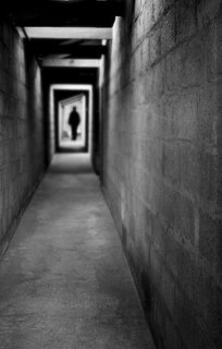
What the photo is of:
A disused mineshaft, and a shadowy figure.
When was the photo taken:
May and July 2002.
Where was the photo taken:
Cornwall (mineshaft), Chicago (figure = Kate!).
Why was this composition chosen:
The band wanted something a little eerie, spooky, menacing etc. I discussed this idea, then found a suitable figure to use at the end of the corridor. I offset the corridor crop to make it feel like the viewer was against the side wall (as if staggering and leaning there, looking back at a possible pursuer/assailant), and chose an out-of-focus (more of this below) feel to accentuate that viewer feeling of being drugged or attacked, and to heighten the other-worldly nature. I also cropped it to ensure the figure was top left third, and the corridor led to that from the bottom right (viewer). The black and white was to give more of a menacing feel too. I also wanted it to feel like those dreams where you are relentlessly pursued by a faceless figure, who you know will get you in the end...
How was the photo taken:
Taken with my old Canon Powershot S4 (4MP) point and shoot. No technical data available.
How was the photo processed:
The shaft was cropped and slightly rotated to give the impression of being against the wall, off-centre for the viewer. The figure was extracted (2 pixel feathering) from a shot taken on Chicago "beach", made into a silhouette, and then resized and placed at the end of the corridor. The layers were then flattened, converted to black and white, contrast and levels adjusted, and then a shallow depth of field effect applied using lens blur/gaussian blur in CS2.
3 comments:
Ivan,
Here is my assessment
Impact - 6
The photo has an impact but it doesn't hold my interest for long because there isn't much to look at.
Composition - 9
The photo is well composed; well thought out. The figure at the end creates a very eerie feeling to the whole photo. The two 'beams' that are illuminated and the bright rectangle of light at the end of the corridor help to take the eye through the corridor. The floor and left wall also take the viewer in.
Light/Colour - 8
The light is well done and Ivan seems to have used the light to bring the viewer into the photo which is very neat. The B/W is very suitable for this type of image.
Technical skill - 8
A lot of skill was used in this photo, both at the camera and later at the computer. Ivan clearly knew what he wanted the image to be and used his skill to achieve it.
Originality - 9
The shot is clearly original. Very arty. Very spooky. It makes you feel a little wierd when you look at it. The dark figure and the long corridor creates these feelings. Very atmospheric.
Overall - 8.0
I like this photo, despite the creepy feelings it gives me. The impact it had on me when I first saw it did not last long, mostly because the image is very simplistic. But I like it, its well composed, good light, lots of technical skill was required to make it work and its original.
I hope I don't have nightmare tonight...
Damian
Guys
Thanks for your comments. I agree that there could be more impact with a different choice of the figure, but I thought that the static nature of the figure I chose would impart a kind of controlled menace, a bit like Hannibal Lecter or something...I did think about perhaps making the image angled, as if the viewer was staggering, and then perhaps adding some radial blur, coming out from the shadowman, to focus more attention? As a final thought, how about seeing the hand of the viewer, outstretched in front, as if in some kind of hopeless self-defence? I may try and take your comments on board and see if I can beef this image up a bit. It'll be a bit like a homework exercise, see how I can improve by trying out the comments! Thanks!
Ivan,
For me, my focus is entirely on looking down the corridor toward the figure. If you had not told me, I would not have thought about the 'story' of the viewer, leaning against the wall, staggering down the corridor. That does not come across to me at all. So, if the foreground was changed in order to bring that aspect in, I would probably like the photo less. But, you never know...
I like the photo as is because of the atmosphere it creates; calmn yet eerie.
Damian
Post a Comment