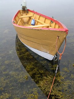
What is the photo of -
Shelbourne dory
When was the photo taken -
02 August 2005, noon
Where was the photo taken -
Dark Harbour, Grand Manan, New Brunswick, Canada
Why was the photo taken -
I was hiking in this area with my camera and saw these boats. They looked so colourful. This one seemed to be in a great pose.
Why was this composition chosen -
I wanted the bright orange rope to lead the viewer into the picture. This led the viewer to the boat. The position of the boat is such that the eye continues on, sort of on a zig-zag path, to the background. The background fades out so as not to distract the eye away from the boat. There was also interesting seaweed in the water and a nice reflection from the boat so I wanted to capture that too.
How was the photo taken -
Nikon Coolpix 4300. 150th sec at f7.6, exposure bias of -0.3 (to bring out the details in the water); ISO 100; sRGB; JPEG. I shot with a fast shutter speed to blur the background. However, this was quite easy to do since it was a little foggy on this day.
How was the photo processed -
I have included the original photo in this submission because I painstakingly removed a large object; the outboard motor. I was happy with leaving it in but many friends told me to remove it. I think it took me three tries to remove it successfully; perhaps four. This was my first real test of my photoshop skills. I used a combiniation of tools: I cut and pasted areas; I used the spot healing brush set to an elliptical shape to give a smoother 'heal'; and I used the patch tool. After removing the engine, I had to replace the missing section of rope. I used the colour replacement tool to remove the shadow that the engine had created.
A few friends also suggested removing the blue plastic bucket hanging inside the boat. I decided not to because this gives a nice splash of colour.
Once this was completed, I did a slight crop to remove excess water; especially around the vertical sides of the boat. I then did basic adjustments to the photo: adjusted levels, curves, saturation. Shadows and highlights helped to bring out the seaweed a little more. Finally I sharpened the image.
Damian


2 comments:
Impact - 8; As G said, lovely simple image, immediately grabs the attention and pulls you in. Very nice indeed.
Composition - 8; again, near faultless. Rope lead-in, nice large hull of boat, almost 3D in it's effect, zig zag rope, then boat, then nice non-distracting hazy background. Seaweed showing through too. Excellent. Fuck it, it's that good - make it a 9.
Light/Colour - 8. Lovely delicate lighting, nice saturated colours, glass-like reflection on the water. My only minor gripe (hence 8 not 9) is I personally find the reflection a little distracting. It's great to see through to the seaweed below, but there's a line where the reflection ends, and I can't help seeing that, and finding it a little less than ideal. Being reeeeeally picky here.
Technical skill - 7; Outboard well removed, although this is from memory of seeing a larger version of the image. Other basic manipulations done well. I think this section may become redundant except for the most exceptional work of PS, since basic colour and (even) cloning should become tools of the trade. Photo well taken, but I marked it down a bit as water is always tricky, and the reflection is just that little bit too "there" for me...
Originality - 5; Simple and effective, but not really original in either subject matter or composition, although very very well executed. Seems harsh to mark down,but it's excellence within a non-original framework.
Overall - 7.4.
Hi there,
Thanks for the two reviews. I am very happy with the ratings, as I am with the image. I like the reflection of the boat in the water and don't find it too distracting, but of course this is personal taste. Actually, there is nothing that I don't like in this image.
Damian
Post a Comment