What is the photo of
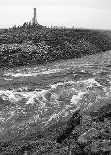
The ruins of a wharf or boat taken from the otherside of a river
When was the photo taken
2nd August 2005 at 1300
Where was the photo taken
Dark Harbour, Grand Manan, New Brunswick, Canada
Why was the photo taken
When I saw this ruin it immediately reminded me of the backbone of a dinosaur. I took several photographs, including one that isolates the ruin from the surroundings, but I like this shot because it adds other elements: the seaweed along the bank, the raging river, the different colouration in the pebbles and the finally the ruin itself. I am a little concerned that there is too much in this photo.
Why was this composition chosen
I wanted to add a certain depth to the photo, rather than isolate the ruin itself. There were so many neat elements in front of me but I chose three to lead the viewer toward the ruin: the seaweed bank, river, ruin.
How was the photo taken
I shot the photograph in B/W at 1/1000 sec at f2.8 with a Nikon Coolpix 4300.
How was the photo processed
Levels were adjusted, a slight curve added to boost contrast. Another layer (using levels) was created and the blend mode set to Multiply at opacity 25. A gradient mask was added to this layer so that it only darkened the sky. The whole image was sharpened. A crop was applied which removed a slice of the left vertical part of the image. This created a horizontal flow to the image, moving from left to right; this works well with the river and the ruin. A crop was also applied to the bottom of the image to remove some of the seaweed/bank.
Damian

2 comments:
Impact - 5; It doesn't hit me as a particularly striking image when I see it. The sky is washed out, and the other tones seem all huddled in the mid-grey range. The interesting structure is too far away, and foreground and mid-ground don't make up for that.
Composition - 6; Main elements on the thirds, with a cross-section of layers running across the image is interesting, but this image may have worked better horizontally (note: I know Damian has a horizontal version of this, much closer in that I think is stronger than this).
Light/Colour - 5; As this is black and white, I'll score this as Light and Tone. Light is quite flat, and the sky uninteresting. The other tones are not punchy enough, meaning that the foreground merges into the rocks etc.
Technical Skill - 6; Sounds like Damian knows what he is doing, but not sure it's really done too much to beef this particular image up enough. Multiply would not do anything for the bland sky; much better to do levels and selectively mask to bring out the sky and other areas.
Originality - 7; definitely original in the composition and subject matter, but could have done more to give it impact.
Overall - 5.8, but I'll round up to 6, since I think it deserves it. Creates some interest and the technical skill, composition, etc have been competently handled. Few flaws. This is a good, but not outstanding photograph.
Ivan,
I was expecting that. I like the ruin and, as you mention, I have isolated that in another photograph. In this photo there are other elements (e.g., the river) but they do steal the focus away from the ruin but don't give much in return. The river has a lot of energy in it but there is too much of it.
Damian
Post a Comment