Cambridge Punt
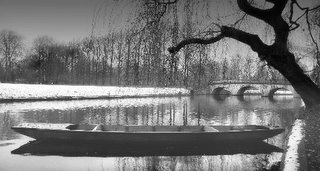
This first image was a bit lucky. I knew I wanted to come to this part of the river, as it had all the elements of a nice scene: the bridge, the tree, the river and banks with trees to ensure an interesting background. However, sometimes the punts are there and sometimes not. This time, there was only one punt, dutifully obliging with a pleasing angle, in relation to the bridge, tree
 and bank! In truth, it was slowly rotating round. A series of pictures, with the punt steadily changing it's angle, revealled this one to be the best. Shortly after, a group of swans came by and this completely changed the scene. I was pleased to get this. I converted to black and white, and used a Photoshop filter to create the graduated effect from top to bottom. This just makes the sky less bland and stops the picture being filled with white at the top. I also cropped it to be horizontal, emphasising the length of the punt, and echoing the bridge and trees in the background. Also, it de-emphasised the sky and original foreground, which were of little interest.
Bench
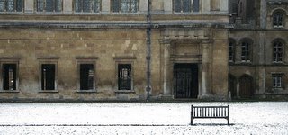
This was taken on the same outing, after the punt shot above. I liked the isolated bench, set
 against the backdrop of the college building (not sure which one...shame on me!). I cropped this to take out the riverbank and other distracting elements, and to place the bench to one side, rather than in the middle. I also did a "portrait" format version of this, but I think this one works best. The path in front of the bench can be seen, which is also a pleasing element in line with the other horizontal features of this composition. You can imagine someone sitting on there, thinking about life or the day ahead.
Any/all comments welcomed.
3 comments:
Hi Ivan,
I absolutely love this image. When I first saw it I actually gasped. Then I thought, 'damn, I thought I was a half-decent photographer until bloody Ivan posted this'. There is lots to see in this image. The boat strikes first and to someone who isn't terribly familiar with punts it really draws the eye straight into the photo. Then its the light; the perfect light. The snow on the grass in the background and the highlights on the water draw the eye further in. Then the beautiful bridge, followed by the interesting trees in the background that actually become taller from left to right. Finally, for me, the tree in the foreground is what strikes last. I am not quite sure what to make of the tree though. It certainly fills that part of the frame but there is something about it that I find distracting. It might be the vertical trunk which branches at the top. I find that once I have looked at the image, this part of the tree (at least I think it is this part of the tree) distracts my eye from the rest of the image. But, having said that, I am not certain of it.
The second image is great too. Because its simple and yet there is detail to look at. And you can envisage yourself or someone sitting there. The only thing I don't like about this image is the different colour of the upper part of the building starting from the left. Its distracting. The image screams simplicity. Its almost monotone. But the different colouration prevents it from becoming so. If this colour was darkened I think the image would work better.
Its great work from the mighty italian scot...
Dams
Damian
Thanks for the comments - really nice to get such positive feedback!
I think I know what you mean about that tree. Perhaps it's too dark in relation to the other, more sublty toned parts of the image, like the punt. I may try and work on it a bit more, but I was pleased with it myself.
I can't see what you're referring to in the other image: the RHS of the building is darker for sure, but the left - looks v similar to me. Can you further elaborate?
Cheers
Ivan
Hi Ivan,
The RHS of the building is fine. The part of the building that I am referring to is the upper part of the building that is immediately behind the bench. More specifically, the brickwork that surrounds the upper row of windows. To me, the brickwork looks lighter than that surrounding the lower row of windows. This is a minor point; I am being quite critical. But when I first looked at the image it was this difference in the colouration of the brickwork that caught my eye. It also might be my monitor or the low resolution of the image.
Damian
Post a Comment