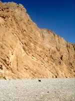
 A collection of trees from a recent trip we did to an amazing place called Wadi Bih (approx 1 hour from Dubai). A wadi is essentially a dry river bed. Although this falls far short of the majesty of this valley that runs through the most dry and stark landscape... to illustrate here is a small goat dwarfed by the cliffs.
So - on to the reason for this post. A collection of 3 images of trees from this trip. I found the trees stunning in their ability to exist in such an environment, 50 degress C plus for a couple of months in the year...
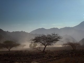
 This first shot reminded me of a savanna scene. The dust was kicked up with a convoy of Jeeps that had just passed and the mountains in the backdrop had differing shades of blue that were delicate and dramatic.
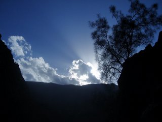
  This one is from the heart of the valley, I was hopeing for this silhouette effect, although it is too strong I think. Perhaps with the wonders of Photoshop it can be improved...
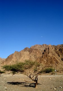
 And the final shot of the trilogy is this survivor. I really like the deep blue of the sky with the full moon visable at 3pm. Not completely happy with the image, I feel that the tree should have been in sharp focus with the background less so, however auto-focus is my enemy in this case...
So, once again, very keen to have any comments, advice or criticisms.
4 comments:
Hi Ivan,
The first photo is my favourite. Nice composition, nice light, the dusk adds a sense of movement, the rocks add to the foreground and the mountains provide an interesting backdrop but do not distract the eye from the main part of the scene, i.e. the trees. The sky has a nice blue colour but again does not distract the eye. Also, you get a feeling of space because the trees are scattered through the depth of the photo. There is lots for the eye to look at, but there is a flow to it. Excellent job.
The second photo has a great sky with the light penetrating from the side and the silhouette of the tree but there is too much dark foreground. Unfortunately, I think that even if the foreground was cropped to provide the nice frame, there wouldn't be enough in the photo to interest me.
The third image. The tree is excellent and so is the sky with the moon. But thats about it. The wall of rock in the background prevents the tree from really standing out (same colour). The shadow of the tree and the object to the right of it near the rock are also distracting. So I agree that a blurred background created by shooting really fast, would have sharpened the tree and made the tree stand out more. Its just unfortunate that the background (rock) is the same colour as the branches of the tree.
Damian
Damian
This is actually Grant who posted these images. You can tell by the "Bishopsindubai" name at the bottom of the post.
Ivan
Yes, my mistake. Sorry. So, that comment is for Grant.
Grant
I like the misty one best, but I'd crop it to achieve a more horizontal format, by losing some off the top, and some off the bottom, as the main interest are the three trees in the mist. Also, with the silhouette one, I'd crop out the LHS, as it adds little to the image. Photoshop could add more drama with "Levels", but the burnt out highlight in the cloud can't be reclaimed. However, it's not too bad. The last one has the nice moon, but it's small and the tree itself is a little lost into the clifface behind it, as Damian notes. Misty trees, if cropped, a definite winner. I'll post the cropped pic to the blog to show what I mean...
Cheers
Ivan
Post a Comment