I agree with Damian about getting in tight to the core interest in the image, but I wouldn't have cropped off half the camel's head. I'd have either left it out totally (and assumed the nature of the man's dress suggests a camel) or - as I think is better still - leave the head and the length of the neck in, cropping in a square format. I tried a few other crops, but this one worked best for me, with the whole camel head and neck.
If I had more time, I'd have cloned out the other small distraction bottom left sticking out of the camels neck, using the clone tool and sampling from the sky. The sky is nice blue and fits in well with the desert/camel theme, so it's fine as a backdrop. Nothing intersects the scene if cropped, and I see you removed the pylons too (nice).
I have not colour balanced the image, but the original is a bit red. Your manipulated images seems a bit the other way (slightly blue), but that could be because all our screens are differently calibrated, so comparisons are not valid on subtleties like this, unless we all have the same monitor profiles.
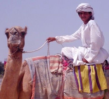
I think cropping square makes good use of the jockey, the camel and it's neck, and the colours of the towel etc. The pose - although clearly posed - is still quite relaxed, and the jockey'a arm makes a nice flow from his head to the camels head, and then the neck takes you - well me, anyway, around the bottom of the image to the colour and textures of the cloth, completing the eye's "review" of the scene. Square format - typically used in medium format film work - has a different spatial dynamic to landscape, portrait or panoramic, and I think this tight circular composition works well in the symmetrical square format.
It's also good that the camel and the jockey are looking at the photographer, and this can't be exploited if half the head is cropped in my opinion. It should either be all in or all out. If the other camels had been positioned differently, I think your horizontal crop - which I like - would have been stronger still. Or, if there had been another jockey or element to balance the image.
Nice picture.
Hope this is useful
5 comments:
I came up with the same cropping as Ivan and I did like it, but felt like it needed something even tighter. Partly beacuse I was concerned that the camel's head was not in sharp focus and so making the jockey's head the focal point diverts the eye away from that.
At the end of the day, it is our view/idea of an image that will create different compositions. I still like the tight crop and think it works, but that is just my view.
Damian
Does it really divert the eye away, it being half in, half out of the picture? To me - and as you say, this is all personal opinion - it's more of a feature because it's half in half out. It creates it's own tension, that is not in harmony with the relaxed nature, pose and shape of the jockey. To really focus on the jockey, why not cut the camel out totally? I can't tell at this resolution how sharp the camel's head is.
I love these differences of opinion - it's boring when we all agree, and the brilliant thing is, no one is right!
Yes, I also love to agree to disagree...I too love being able to argue a view knowing that nobody is right...
D
Grant
Perhaps you could cast your opinion on your image and how we have cropped (crapped?) it up?
Have a good holiday weekend (fyi: it's Easter Friday and Monday hols here! Yippee!).
Back on line Tuesday 18th.
I have two candidates for the portrait shots that I will try and post next week, along with my de novo shot too.
Ivan
Post a Comment