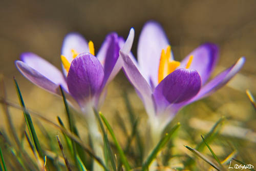
These two photos are of crocuses that have just appeared in my garden, with the arrival of spring in Nova Scotia.
When was the photo taken
29 March, just before noon
Where was the photo taken
The photos were taken in my garden
Why was the photo taken
I was inspired to take these photos because these small colourful plants signal the arrival of spring. Everything around them is brown and ugly and tired after months of winter. These plants bring a dash of colour to an otherwise dull landscape. Of course, this is the type of image that I was trying to capture (spring growth amongst winter's dead) but have so far failed.
Why was this composition chosen
I started shooting from above because I wanted to showoff the colourful stamens against the light blue/purple petals. But then the idea of lying down on the grass to make myself level with the flowers popped into my head; I wanted to achieve a sense of scale and used the grass stalks to achieve that.
How was the photo processed
Both photos were shots in RAW. While shooting, I took a photo of a white plastic tag so I could get a correct white balance reading in Camera RAW. The exposure, shadows, brightness, saturation and curves were all adjusted in Camera RAW. In PS, I then tweaked the levels, adjusted the shadows/highlights to darken the background and lighten the foreground a little, dropped the hue to -2 to bring out the colour in the stamens, and added a slight contrast in curves just to give the whole photo a final boost. I then sharpened the image. To get the signature in each photo, I signed a piece of paper using a sharpie, scanned it in at a high resolution (12oo ppi), imported it into PS and cropped the best signature and adjusted the size. I then made the signature a brush type and recorded an action that basically opens up a new layer and selects that brush. All that is left for me to do is to 'stamp' the signature onto the photo. If you want more details of this process I can try to remember exactly how I did it.
 How was the photo taken
1/160 at f6.3 - I wanted to blur the background
Focal length 44mm
ISO 100
Polarizer filter - to enhance the colour
*10 close-up lens - to get good detail.
 How was the photo taken
1/125 at f5.6 - I wanted to blur the background
Exposure +0.33
Focal length 85mm
ISO 100
Polarizer filter - to enhance the colour
Damian
6 comments:
Picture 1 (ground level):
Impact - 5: two nice flowers, but nothing of real impact for me.
Composition - 6: ground level is a nice twist, and the flowers have a good symmetry to them.
Light/colour - 6: nicely executed shot. Lighting is a little flat, but works fine.
Technical skill - 5: the front petals appear in focus, but the interesting stamens not. May if this was the intention, then I could raise the score, but a slightly longer depth of field would have brought both into view, with still a blurred background.
Originality - 6: hard to be original with a flower shot, but this has made a good effort.
Overall for picture 1: 5.6 (Satisfactory)
Picture 2 (looking down):
Impact - 4: the pattern and colours are not that strong for me.
Composition - 4: pattern not that strong, and the edges are distracting; needs a closer crop.
Light/colour - 5: light is diffuse (which is fine) and the colours are not that amazing in the flowers themselves, though nicely done.
Technical skill - 6: seems nicely in focus.
Originality - 7: again, a flower shot, but with a bit of a fresher approach to the composition. Not fully executed, but good intention.
Overall for picture 2: 5.2
Sorry Damian - seems harsh, and maybe I just don't like flower shots...I
Mmmm, I guess you don't like flowers. Come on Ivan, connect with your feminine side!
In the first photo I deliberately pushed everything out of focus except for the front petals to create a sort of dreamy effect. So I didn't want the stamens in focus. I was looking for something a bit more original.
In the second shot, I agree with the cropping. The blurred background does create a bit of a distraction.
Good comments. The ranking really adds a new dimension to the critique.
Thanks
Damian
Damo
Flower shots are always this way, with short depth of field and a kind of abstract feel, so this is the "standard" rather than anything that new. Also, usually the central stamen is in focus, with the petals forming a blurry frame, with perhaps one or two sharper. Making the plain petals the focus is different, but I didn't think it worked. The grass in the shot was different - you don't usually see that. Maybe the scores could be rounded up to a 6, but I wouldn't go higher than that. Flowers have been so extensively done that it needs to be either a perfect example of the genre to be scoring higher. 6 is reasonable for such a much-shot subject matter. Scoring seems so personal, it's not meant to be! I think I just don't like flower shots unless there is something unique about them.
I also found the grass a little distracting, kind of erratic, and there is a blurry grass strand right across a part of the lower left of the frame, which doesn't sit comfortably. I think flower shots (especially if you are using a macro adaptor) need to be right in there, almost totally abstract. Kind of other worldly - these didn't seem that way; they seemed a little like grabbed shots from your back garden, which is fine cos that's what they were! Again, sounds harsh, but I want us to really push each other....!
I
Ivan,
I agree with what you are saying. The shots of the crocuses are my first attempt at photographing flowers. Taken some shots before but never really seriously. As my garden blooms (last frost in Nova Scotia is early May!) I hope to fine tune my flower photography skills.
D
Grant,
Thanks for the rating. I think we have to be harsh and honest to encourage us to improve. I do find the ranking system more of a 'in-your-face critique' than the conversive approach but, I think, provides a greater benefit in the long run. The good thing about this blog is that we can be highly critical, thus encouraging improvement, but without being personal. Thanks again for the comments.
Damian
Post a Comment