It's been a while since my last... post. Can I just say how much your recent shots have impressed me. Damian's sand high-sided tunnel is stunning, the seal's are captured so dramatically and Ivan's revisiting of Deal pier is a leason for me in how to frame and use light... well done guys.
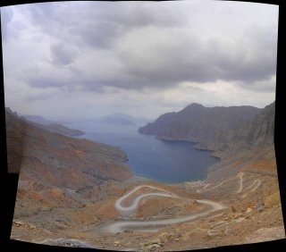
So, on to the advice corner. Here are a few shots from a trip to Musandam a few days ago. Musandam is part of Oman that has been called the Norway Of Arabia. It has stunning mountains plunging down into ffyord like inlets. Only recently opened up to tourists it is unspoilt and beautiful in a rugged way...
Posting a few here... should be more restrained, however just keen for input. Most shots are un-altered and straight from the camera.
The pano is my first. Used a great free bit of software called autostitch - though I guess you guys know it already...
Thanks again.
2 comments:
Hi Grant
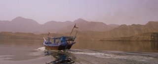
Love the panoramic image with the boat. Nicely cropped, and the wake behind the boat leads nicely to the boat and the horizon of peaks. Great. I'd work on this more, as there's a stunner in there, with better punch to the output. Digital cameras, from basic snapper to DSLRs, all output fairly bland flat images that are meant to be optimsed for tone, contrast, colour and sharpness. All nicely done in 5 mins in Photoshop.
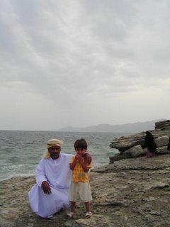
The one of the chap and the child is good too, but I'd crop out the sky and keep the distant lady, as the foreground duo and she fall nicely on "thirds" of the image and provide a good balance and interest. The sky is fairly bland and slightly over-exposed, leading to the people being slightly under - boost up your levels after cropping and the image will really come to life. The stitch image is great, but just needs cropping to be square/rectangular as you prefer (square good for this, to get foreground and depth), but watch that the colours match (see join on the left, middle).
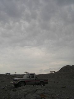
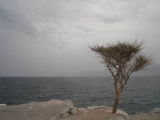
Hard to see the one of the Jeep, and the tree images loses impact since there is little foreground and the tree bisects the horizon. Maybe a portrait orientation, with interesting rock detail in foreground leading to tree would work better?
Good stuff. Try mucking around with some basic manipulations of levels, contrast (curves), saturation and sharpness and you'll be amazed, in conjuction with creative cropping, how the images develop. Even the great Ansel Adams worked on his black and white negs to make sure he had all the "zones" from darkest black to near white, and this tonal spread works equally for colour too.
Hi Grant,
Of the five images posted, the image of the boat is a clear favourite. To me, the image creates a sense of mystery, the reflections in the smooth water are excellent, the boat's direction leads you into the photo, the boat itself is interesting, and the mountain range and simple colours finish the photo. Great. If one can come away from a 'photo trip' with an image like this, then I think one can't complain.
The other photos say much less to me. The tree starts to tell a story of bleakness and isolation with the single tree standing there and the vast sea beyond, but it's not supported by a nice sky or foreground or anything else. Its like drinking a tasty wine which leaves no aftertaste.
The patch photo job needs cleaning up but has potential for an interesting image.
The photo of the boy and man is too staged for my liking.
A few months ago (perhaps 8 or so) I was starting to send photos to Ivan for some critique. The images I sent were straight out of the camera. Ivan, like he has done here, suggested some tips in Photoshop to clean up the photos. I followed his advice and am very pleased that I did. I now know the basics of photoshop and have greatly improved my photographs as a result and better understand what a digital image really is. It's definitely worth spending the effort and time getting to know photoshop.
Damian
Post a Comment