Using the lowest ISO setting of 100, a narrow aperture of f22, and a tripod, I was able to get exposures from 2-20 seconds throughout the morning. This renders the sea a smooth, almost silvery surface, akin to mist.
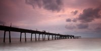 Using 2 ND grads (0.3 and 0.6) with an 81B warm-up filter meant I could balance the sky with the sea, and achieve a pleasing colour to the images.
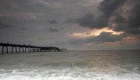
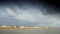
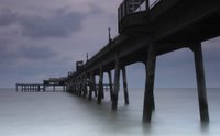
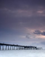
I took loads between 0600 and 0730, and I've put the best on here. I also took some when the sun was fully up, looking back on Deal seafront from the end of the pier. Using the ND grads again achieved more drama in the quite stormy sky.
2 comments:
Hi Ivan,
First off, well done for getting out of bed so early! It really paid off. I like these photos a lot. They are all as good as each other.
The view of the town works very well with the stormy sky and there is nice contrast with the colour of the buildings. I also like the way the beach curves around at the far right.
The sea in the pier images is very smooth and wisp like; a very nice effect. And the darkness of the pier works well against it and against the sky. The sky creates a very interesting atmosphere.
OK. So if I was to be really critical, it would not be valid because my only critiscm is with the composition of some shots but these shots are looking at the pier from different viewpoints. My favourite would be the first image; of the pier and the colourful sky. It is well balanced with not too much pier, nice sky and nice sea. Well balanced. The image to the right, has a bit too much sea for me but there is an interesting sky and the silky smooth waves breaking on the shore adds to the shot. The shot beneath that is heavily focused on the pier structure. It's a good angle but it might work slightly better if the shot was wider so there was more perspective. The image of the town seems to tease me. I just can't see enough detail in the buildings and they all look interesting so they draw the eye in. Obviously, I am looking at a small image. There is also a tad too much sea in the foreground for me.
But, what can I really say? They are all really great images.
Damian
Damian
I agree with all your comments - the first one is the best compositionally and with the colour etc.
The others I am less happy with - you are right, I wanted to have the silky sea and the interesting sky in the other pic, but it puts the pier in a funny position. The one nearly under the pier needs more wide angle - I have some like that, so will try to work on those. The town is far away, and I wanted that vastness to come across. I have some in which the sea has been cropped out, so will post those. Agree that there is too much sea, but hard to crop it down and for it to still be a viable part of the picture. Good comments though.
Post a Comment