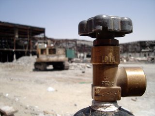
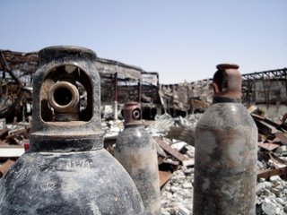
When was the photo taken: Friday 31st March 2006, 2pm.
Where was the photo taken: While out driving around Dubai on a quiet Friday morning (Friday = Sunday in the Middle East) looking for portrait inspiration I was distracted by the scene of a large fire.
The location is the Oasis Center which was gutted last September by fire (Gulf News article). The site is gradually being demolished. As usual in Dubai, safety can be a bit lax. Which in this case meant I was quite free to explore the site.
Why was the photo taken: These shots were taken almost as an after thought and certainly as a focus experiment for myself.
Why was this composition chosen: The light was very harsh, however the location was very unusual. Stark, parched, industrial, metalic and total non-organic. It could have little appeal. However it appealed to me in ways not usually found in Dubai - quiet, uncontrolled, raw and certainly not polished or 5 star...
How was the photo taken: ISO 200, fixed focal in the Sony DSC-S40 point and shoot with the half press and then reposition the shot to try and use the rules of three. White balance set to sun (technical huh?)
How was the photo processed: For speed, these were colour balanced and contrast balanced using Picasa software.

"Picture 1"

"Picture 4"
5 comments:
Grant,
I am going to choose what I consider are the best two photos and rank those.
Photo 1:
Impact - 4
This photo did not have a huge impact on me but the top of the gas bottle hits you as soon as you open the photo so there is some impact. However, this doesn't hold the eye long enough to create a big enough impact.
Composition - 4
The composition is interesting. However, I find the gas tap to dominate the photo so there isn't much else to look at. The background is completely blurred so you are not that certain what the objects are. The viewer needs to understand what the photo is about without being told.
Light/Colour - 6
The light is good, balanced, illuminating the main object of the photo (the tap) thus bringing out the necessary detail. The sky is not washed out, there is no over exposure. The colour is fairly simple.
Technical skill - 5
The shot has been taken well. The foreground is in sharp focus, and the background is blurred to focus the eye on the tap. As I said above, the photo is too dominated by the tap. There is a shadow running across the tap that on the one hand obscures detail but on the otherhand adds depth.
Originality - 5
The subject is original, even though the framing isn't.
Overall - 4.8
An initeresting image, well shot, but doesn't hold my interest.
Photo 4:
Impact - 5
This image has a great impact. The three cannisters are almost comical because they look like people. That draws my eye in. My eye remains focused on these three cannisters because the background doesn't steal the show from them.
Composition - 5
The position of the first cannister is good. It grabs the eye immediately, and then the other two cannisters take you further in. The last cannister is starting to get a bit lost in the background. It is obvious what this photo is all about so the eye is satisfied. Not sure about the sky though, but it's hard to say. It does add a scale to the photo.
Light/Colour - 5
The light is well balanced, illuminating the main objects and the photo is not washed out. The sky has a blue colour that deepens which balances the colour.
Technical skill - 5
Focused, not overexposed, sharp. I might have tried black and white since it would appear that colour is not that important here.
Originality - 6
Again, original subjects and the orientation adds a human aspect to the photo.
Overall - 5.2
Again, an interesting photo but just not sure about using colour and not entirely satisified with the composition. They are original subjects though seen in a different way.
Damian
I think photo 4 is the best, so I'll concentrate on that one for now.
Impact - 7: It immediately looked like three old robots having a chat. The informal nature of the composition is very well done.
Composition - 7: without this thoughtful and deliberate "humanising" of the three gas cylinders, this is a photo of little interest. The positioning and the angles of the cylinders makes it. Background (unavoidable) is a little distracting and bisects the group - always bad.
Light/colour - 6: done well with the harsh conditions.
Technical skill - 6: good foreground focus, bringing the eye in. Nicely done.
Originality - 8: very original composition and take on an otherwise dull scene.
Overall: 6.8. Nice work! It appeals to me.
Ivan
Grant,
I probably won't do this again but I feel that I was too harsh on your picture 4. I have gone back and changed the scoring to that below which I think is more fair:
Impact - 7
Composition - 5
Light/Colour - 6
Technical Skill - 6
Originality - 8
Overall - 6.4
The real differences are the impact and the originality scores.
Damian
D/G
I think it's OK to stick with original scores, since this is how we felt on first view, and often any "consumers" of our "work" will make an instant decision to either like or not like (or feel neutral). Thus, D, I'd say don't change scores, but rather make an assessment in isolation and stick to it. It's the variety of views that will make us consider all positions and opinions and make us better. I am crapping myself for a bad score, so I am really thinking about what I submit, but I am ready for that inevitable bad score...there's no right or wrong, anything like this is so subjective that it's what you feel inside, and I'd say ones first reaction is usually pretty close. This is going well, I think.
I
Ivan,
Yes, I think you are right. I guess I felt bad for being a harsh scorer, but I think that is the way I am. As long as people consider me fair then that is OK.
Damian
Post a Comment