Friday, October 27, 2006
Miksang-ed out
After some thought, when I really should be working, I have come to a decision. I have tried to portray a different style of photography that is called Miksang, Tibetan for 'good eye'. However, I seem to be generating frustration and confusion. And now I understand why: it is not about the image, it is about the experience. I cannot submit a Miksang photo and hope others to see what I see.
I am going to join Michael Wood (instigator of the teachings of Miksang) in failing to portray this style of photography to fellow photographers. Oh well...I did try....
But I commend Ivan on trying...perhaps when I am in England again we will go for a little walk with our cameras...
Damian
Interesting articles
This is Part 2, but there is a link to Part 1 in the text
http://www.luminous-landscape.com/tutorials/digital%20focusing%202.shtml
Ivan
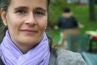
Miksang - Level Two - People
We did this by splitting our small 4 person class into 2 groups
Each group sat at a table, with each person sitting in front of the other
In a park in Halifax
One person was the photographer and the other just sat there and looked at the camera
The photographer had to capture the moment when the person looking was completely relaxed, not posing or playing with the camera
When the true 'ness' of that person came out for a brief second...
The photographer could only capture this moment, if he/she was 'in the moment' and feeling the other person...
This is Helen....
Damian
Miksang - after Level One - Colour
Miksang - Level Two - Sidewalks
In Miksang, you do not attempt to do anything...
You simply 'open' yourself to seeing without any barriers...
Barriers such as the concepts of photography...
or the labelling of an object as something...
or an opinion on an object, for example whether you like it or not...
In a sense, you are meditating...
Keeping everything still, letting eveything in, and seeing something that resonates with you...
To be honest, without some training, I doubt one could really capture a Miksang photo...
----
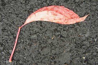
In this assignment, we went out the door and tried to capture the 'ness' of sidewalks....
We walked along sidewalks, looking down, and then stopping when something jumped out at us...
This is one example....
Don't judge it...just look at it. Damian
Wednesday, October 25, 2006
"Miksang" it up a bit...
As resident Miksang Expert, is the following image Miksang? I wanted to capture the graphic simplicity of this string of lights, with the attached ribbon blowing in the wind.
Miksang rating out of 10?

Ivan
Sign of the Times...?
Picture of the Houses of Parliament and Big Ben taken some time ago in London (obviously).
I deliberately exposed for a silhouette, and tweaked, cropped and curved in PS.
Comments?

Tuesday, October 24, 2006
Monday, October 23, 2006
Feedback from last week's Judge...
Guys
Following Gareth’s lead (and because I was not there in person last week), I too asked the judge for his critique and rationale for how he graded each image. It’s useful to know, but I fear the way shadows are depicted on the projector is different from how my monitor is set up: not sure how to mitigate for this, other than risking over-lightening images or not submitting images with a lot of shadow elements, for fear of them coming over as lacking in detail. That’s also what happened to my punt image from the first competition.
His comments are below:
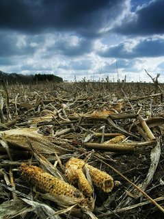
“I gave the cornfield second place because of the unusual angle the image was taken from, the super depth of field and the sky. Loved the 2 husks in the foreground. All worked for me.
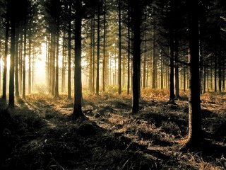
The forest whilst a good looking picture suffered from exposure problems. Your friend was spot on, I didn't select it because of shadows on the tree trunks being too dark and showing no detail. It's a classic image for a tripod and two exposures which can then be blended in Photoshop. Expose for the shadow area and then expose another shot for the highlights. That's the only reason I rejected it.”
Ivan
Sunday, October 22, 2006
Old Man in St. Mark's Square - Cloned and Repaired...
As promised, I have tried to remove the table and improve the image per the discussion on previous post.
I still have the working Photoshop file, so I may further refine (I think I see some patterns emerging in my cloning). Combination of cloning, cut and paste and transform/blending of layers used to remove and repair.
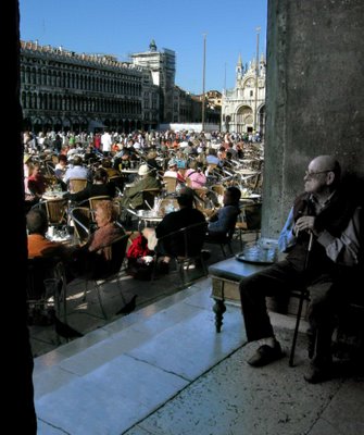
Comments?
Not sure why, but I can't get the bigness to work. Hopefully does this time.
Ivan
Saturday, October 21, 2006
Cardington Airship Hangars
Full-crop image, channel-mixed to monochrome, curves to boost contrast and then split-toned. What do you think? (click for bigness)
Friday, October 20, 2006
Reculver (Kent) Sunset
An end-of-the-week posting from me, just to get our reviewing juices going.
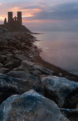
Techy bit: curves, saturation, levels and cropping all tweaked, but little else. A bit of cloning to remove some distracting elements (signs, debris).
Comments, suggestions (and yes, it IS a similar format to others - I was going through a phase; kind of still there, really....).
Ivan
Thursday, October 19, 2006
Happy camper
Hi Gareth,
Thanks for the email and of course I don't mind giving you some additional
feedback. Firstly, do remember that judging is just one person's opinion. If
you put the same pictures in next week's competition and another judge
arrives they may love the image and give it first place. In many cases
images are subjective and it's down to personal taste.
Horses shots.
I'm not a lover of the wide angle lens used close up on this sort of shot, I
much prefer image 51 of yours
(http://www.marlow.org.uk/pblog/index.php?showimage=51 )
and I would have given that a commended or
highly commended.
Image 405 with the ear of grass is superb
http://www.marlow.org.uk/pblog/index.php?showimage=405
and I do really like that and I
love image 48 of Luke writing a great shot.
http://www.marlow.org.uk/pblog/index.php?showimage=48
I'm not so keen on 313
http://www.marlow.org.uk/pblog/index.php?showimage=313
as the
sun is a little too bright and drags the eye from the silhouette. I do like
the silhouette it's just battling with the sun that causes me a problem.
Your tractor shot 'we plough the fields'
http://www.marlow.org.uk/pblog/index.php?showimage=173
was in fairness a very close call
and I did waver on that. The only thing that pushed my to drop the shot was
the lack of colour in the sky I felt it was a little too bland. I didn't
mind the amount of sky as this added to the scale of the image, it was just
a little flat in colour. You could try adding some black to the blues in
Photoshop (use the select colour feature in the adjustment layers and add
about 80% black to the blues and cyans this would boost the blues that are
present and give the sky a little more depth.
Hope this helps and don't be disheartened you have some great shots in your
portfolio.
Wednesday, October 18, 2006
Learning to See
All
I have posted a link to this essay on the “Luminous Landscape” (my favourite landscape photo site) since it has some reminders to us all about the necessity of “seeing”, pointers about how to see and some nice quotes about the essence of seeing.
Not revolutionary stuff, but a salutary reminder…
http://www.luminous-landscape.com/essays/learning-to-see.shtml
Some of the other essays on this site are definitely worth a browse.
Ivan
PS – Damo (and Sue); thanks very much for the bunny ear hat and card!
Tuesday, October 17, 2006
Sorry Damian - couldn't resist....!!
Monday, October 16, 2006
Camera Club tonight
Unfortunately, the judge dismissed the forest light photograph for similar reasons to the punt image - the shadows on the tree trunks had lost any detail when projected, so he rejected it on that technicality. Annoying and frustrating as the detail's definitely there.
As for my stuff? He just didn't like it. No technical comments whatsoever, he just felt that the main horse was too large in the frame and the tractor one... he just didn't like. No comments at all, he just didn't think it was strong enough.
The winner? A macro of a grasshopper on a reed. A well-executed image for sure, but I'm at a bit of a loss as to where to go from here because there's nothing I'd have changed about either image.
Onwards and upwards!
Friday, October 13, 2006
Miksang: Level 2
I just wanted to let you chaps know that I am in the midst of Level 2 of Miksang. Gareth and Bishop may find this 'double dutch' and Ivan may sigh. For Gareth and Bishop, I can direct you to the website which will tell you all - www.miksang.net. Ivan, just bear with me.
Anyways, the course runs through to Monday eve. so I will post some images during and after the course.
Damian
High Dynamic Range (HDR) images
With Ivan having posted some blended images recently, I thought you might be interested in this blog post I found today about producing HDR images in Photoshop. This guy's technique produces much more "natural" looking results.
http://backingwinds.blogspot.com/2006/10/how-to-create-professional-hdr-images.html
Thursday, October 12, 2006
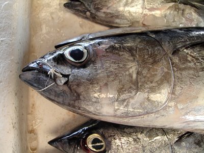
Tuna
Hello again.
I've been gone for a while... Why? Because you're all too damn good! I can't keep up, yet! I've got a new point and shoot Canon A530 which is nice and very flexible and am getting a Sony A100 in Dec (or should I go for the Canon 400D, this is the question?) and I've been busy with the the other blog...
Gareth - I have you on my blog reader and have seen all your new shots - without gushing too much or fawning - brilliant. I love your views. More comments soon.
Ivan & Damian - sorry that I kind of abandoned Critical Light - It's just 'cos I didn't feel I'm in the same league and when we started to really analyse with the ratings it was demoralising, this is what I meant when I originally commented that I was worried it would be too much "work".
Anyways - I will post from time to time and I love what you guys do. If you can point me in the right direction I'd love it.
One thing I want to ask - please invite me to join Critical Light again so I can join as DXBluey instead of bishopsindubai....
Cheers to all.
And do you like my fish?
Kent Sunset
I love this image. Another blended exposure to make sure I got some detail on the foreground plants...

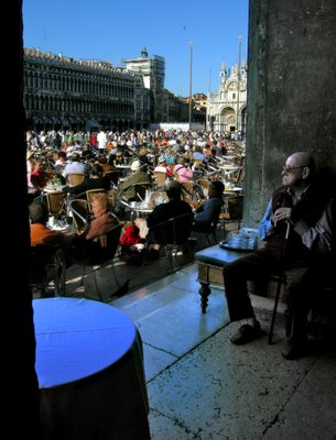
Old Man in St Mark's Square, Venice
It was two exposures, as he was in great shadow, and the square was bathed in harsh sunny light. Thankfully, he didn't move in the 2-3 seconds between shots. I blended both exposures in Photoshop, trying to make the scene look as close to that seen with the eye. I need to do a little further work, as the eagle-eyed will see some fringing along the side of the wall he has his back to, delineating the edge of each exposure. I may try and redo it, as I think my skills are better now than 2 years ago when this was done.
Anyway, your valued comments on the image, it's composition, impression and technical aspects are eagerly awaited. I may enter this in the last Projected Image competition (I nearly did for this one coming, but decided to play "safe" with some landscapes).
Ivan
Wednesday, October 11, 2006
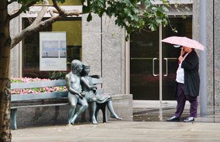
Lady with Umbrella: tighter crop?
I can see what you were doing, but not an image I can easily connect with as is. It seems more static than your discription, so maybe I don't get it.
I'd crop right down, tighter, eliminating as many distracting elements as possible, and concentrating on the identified dynamic between the subjects. Shame there is so much background clutter - it distracts a bit.
However, a nice observational "life" shot.
Example below (you know how I like to crop...)!

Cheers
Ivan
Lady With Umbrella
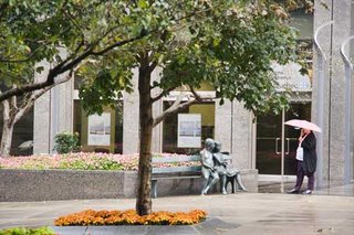
A lady smoking in the rain, holding an umbrella in front of Le Banc du Secret
When was the photo taken
10 October 2006, Tuesday 10am
Where was the photo taken
Montreal, downtown
Why was the photo taken
I was standing waiting for the rain to stop and I saw this lady smoking standing in front of the Sculpture. I had tried to photo this sculpture earlier but was not happy with the result. I felt that there was an intimiacy between the lady smoking (animate) and the sculpture (inaminate) and that stopped me and raised my camera. There was also a similarity between the colour of the umbrella and the colour of the flowers in the bed. The action of the lady smoking seemed to emphasise this connection.
Why was this composition chosen
It was chosen to emphasise the connection between the lady and the sculpture. The original photo included a lot more and this was removed through a tight crop to focus the eye on what really matters.
How was the photo taken
Due to the rain, there was little light. I also needed to use my lens at its full focal length.
Raw. Adobe RGB. ISO 1600. 1/60th atf 5.6 85mm focal length.
How was the photo processed
White balance, exposure, brightness, contrast and saturation were adijusted in Camera RAW. In PS, I cropped the image tight and sharpened it.
Your critical comments are welcome.
Damian
Original
Processed
Monday, October 09, 2006
2nd Projected Image Competition Entries
Chaps
After much deliberation, my selections for the next Projected Image competition (deadline this evening) are posted below. I have used small, lower res versions for the web.
The first, "Forest Light" I really like, because I think I got the exposure spot on, and captured detail in shadows and highlights. A bit of PS post-processing, but only on curves, levels, a bit of shadow/highlight and some minor cropping. I really conveys to me the peace and beauty of that moment.
The next "Cornfield" is one you'll either love or hate, but I love the textures and detail of the decaying corn husks and the dark brooding stormy sky. I used a 0.6 Grad filter to get the sky detail, and only did some minor PS tweaking (saturation, levels and curves).
Thoughts, as always, welcome...
Gareth - depending on how trying the baby has been during the day, I'll hopefully see you this evening.
Cheers
Ivan
Sunday, October 08, 2006
Two for the next competition
Monday, October 02, 2006
Projected Image Portfolio competition
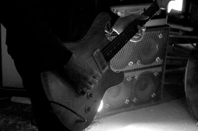
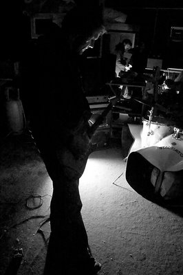
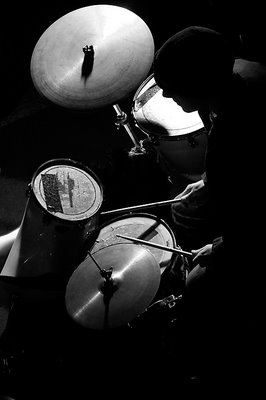
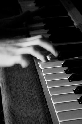
Chaps,
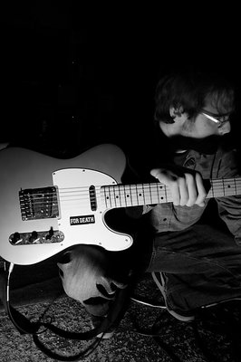
Last-minute Lucy as ever, I've just had a panic to sort out a portfolio of images to submit for tonight's Camera Club deadline. The only rules are that five images must be selected, with a consistent and identifiable theme. I eventually went for this series of shots I took for a mate's band - we had a single halogen spotlight and I was shooting handheld at high ISO so I chose to exploit that in the PP by increasing the contrast even more.
The only frustration with myself that I'm having now is that #4 is landscape, and seems incongruous next to the other four portrait shots.
It's my first entry attempt - I doubt I'll do as well as Ivan's first shot, but here's hoping that I get at least a "commended".

