Hello again.
I've been gone for a while... Why? Because you're all too damn good! I can't keep up, yet! I've got a new point and shoot Canon A530 which is nice and very flexible and am getting a Sony A100 in Dec (or should I go for the Canon 400D, this is the question?) and I've been busy with the the other blog...
Gareth - I have you on my blog reader and have seen all your new shots - without gushing too much or fawning - brilliant. I love your views. More comments soon.
Ivan & Damian - sorry that I kind of abandoned Critical Light - It's just 'cos I didn't feel I'm in the same league and when we started to really analyse with the ratings it was demoralising, this is what I meant when I originally commented that I was worried it would be too much "work".
Anyways - I will post from time to time and I love what you guys do. If you can point me in the right direction I'd love it.
One thing I want to ask - please invite me to join Critical Light again so I can join as DXBluey instead of bishopsindubai....
Cheers to all.
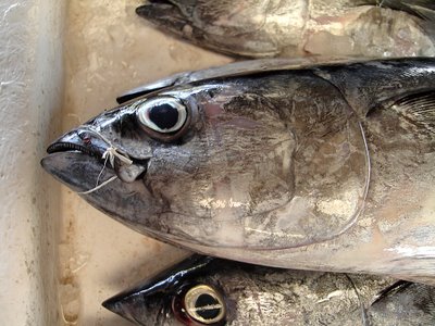
And do you like my fish?
3 comments:
I wish I'd taken this shot. I'd like to see more from you, and I hope you keep posting.
I'd say go for the 400D, but that's because I've gone down the Canon route myself (although with the now-ancient 300D). My Dad has the Minolta 5D and he's very pleased with it, and the A100 seems to be a good advance from that model, so I'd guess you'll be happy with whichever you go for.
Hi there,
I am also happy to see you back. I hope you start posting regularly.
I really like this image. For lots of reasons. First I love the colour. THe grey, browns, whites, blacks. There is a good dynamic range and just lovely tones. Second, it is sharp. Third, a nice tight crop (Ivan should like that) but with interesting things to look at along the top and bottom edges. Fourth, composition is spot on. It grabs you immediately when you see the image and holds you there because of the above points. And the left egde adds a certain quality to the shot; it doesn't make the shot full of fish, but adds some relief for the eye.
Excellent. I would frame it and hang it in my kitchen or something. Just so simple. I would definitely give this a rating in the 8's; I will rate it soon.
Good job.
Damian
Grant
Nice image - like it a lot, and (yes, D) I do like the close crop. Nice muted palette, lots to look at and, importantly, the eye nice and sharp and glassy still.
Good work. Post more. Don't feel intimidated.
Ivan
Post a Comment