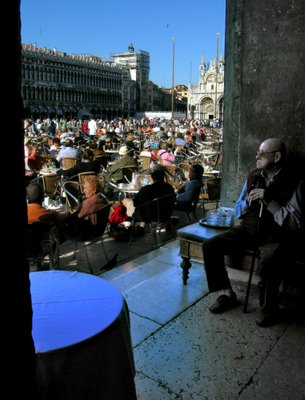
It was two exposures, as he was in great shadow, and the square was bathed in harsh sunny light. Thankfully, he didn't move in the 2-3 seconds between shots. I blended both exposures in Photoshop, trying to make the scene look as close to that seen with the eye. I need to do a little further work, as the eagle-eyed will see some fringing along the side of the wall he has his back to, delineating the edge of each exposure. I may try and redo it, as I think my skills are better now than 2 years ago when this was done.
Anyway, your valued comments on the image, it's composition, impression and technical aspects are eagerly awaited. I may enter this in the last Projected Image competition (I nearly did for this one coming, but decided to play "safe" with some landscapes).
Ivan
4 comments:
Chaps
I can't get any of my posted image thumbnails to link to a larger version of the image - I posted this one as a 1MB file, but the thumbnail appears non-clickable. I used the large thumbnail as suggested by Gareth too. Any suggestions what's going on?
Ivan
Hi Ivan,
A beautiful city, and one of the most photographed collections of buildings on the planet, so you've done very well to get an original twist. This is definitely entry-worthy.
The post-processing is very good - one of the more natural blended exposures that I've seen. I can't see the fringing that you've referred to - maybe because of the small size (and no, I've no idea why it's not working for you :( ). The two exposures are spot on - and pulling off a nicely-lit shot in what looks like pretty harsh circumstances is some feat.
I'm very keen on environmental portraits, particularly wide-angle shots, and I think you've got the balance between subject and environment perfect here. He's large enough in the frame that the detail shines through - a bit of character - but the scene outside is one which is instantly recognisable.
Framing him in a reflected L reads the eye to him and also frames what he's looking at, so double points there.
The only thing which frustrates me about the image is that table smack bang in the immediate foreground. It's so bright, and large, that it distracts. The sheer geometry of it, and the curved triange of its shadow, are dominant elements, and undesirable ones at that. He's also a touch too far to the right for me.
I wonder if you've got enough data for a crop and clone, perhaps to a square format? Lose the dominance of the table, focus a bit more on him while still providing the balance and obvious geographical context?
I don't appear to be able to upload in a comment, so I'll try to another post.
Gareth - very useful. Good critique and I agree about the table. If only I had CS2 - with the clone perspective tool - I likely could clone it out and make a square crop as you suggest. I will give it a try anyway - using a combination of cloning and transform tool - and perhaps re-post if the results are suitable.
Ivan
Hi there,
I wonder if 1MB is just too big for a clickable image. Perhaps try 850KB and see what happens?
This is a shot I like a lot. There is so much character here. The energy from the large crowd adds a great contrast with the silence and meditative state of the old man. THere are other qualities too. The fact that the old man likely lives there and knows the 'scene' while the people in the crowd might be visitors and experiencing something new.
The blend of the two images is great, as far as I can see. The buildings in the background add interest and shouldn't be cropped as in the other image, which I like much less for that reason. The sky is also nice and finishes off the photo.
As for the distracting table or whatever it is. You could try cropping more on the left and then cropping some of the bottom and a little of the sky. I wouldn't take too much though from either; the stone floor is really nice and I find leads the eye to the old man. There is a nice textural quality to it. You could also try darkening the table to remove the glare and the blue cast that seems to be there. The blue cast is nice but adds distraction.
Great photo
Damian
Post a Comment