Chaps,
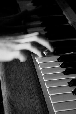
Last-minute Lucy as ever, I've just had a panic to sort out a portfolio of images to submit for tonight's Camera Club deadline. The only rules are that five images must be selected, with a consistent and identifiable theme. I eventually went for this series of shots I took for a mate's band - we had a single halogen spotlight and I was shooting handheld at high ISO so I chose to exploit that in the PP by increasing the contrast even more.
The only frustration with myself that I'm having now is that #4 is landscape, and seems incongruous next to the other four portrait shots.
It's my first entry attempt - I doubt I'll do as well as Ivan's first shot, but here's hoping that I get at least a "commended".
6 comments:
Hi Gareth
I like the mood of these images – kind of dark (obviously) and brooding, raw and reportage in nature. Has a late-night feel about it, a jam session rather than a full on practise. Faces largely obscured, adding to the anonymous generality of the images – could be any garage band in the country, practising to make it big.
The one landscape image does sit a little uncomfortably with the other portrait style.
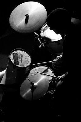
For me, the best image is the drummer – no space is “wasted” in the image, and it flows really well from top to bottom, including a nice silhouette of the drummer himself.
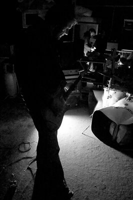
The full body shot of the guitarist is next – good form and shape, flow and structure, and a nice use of shadow too. Also , the light source is not directly seen.
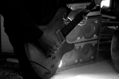
The edge of the source creeps into the detail shot of the guitar, and detracts a little. Also, the neck of the guitar points to another bright spot that detracts from the structure. This is your landscape image, and is the least strong for me.
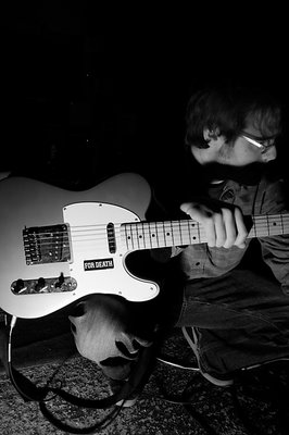
The guitarist crouching is interesting, having a clearly defined face, but I am not sure it works in portrait – perhaps landscape would have allowed the full length and shape of the guitar to work better..? Also, large black area dominating upper left.
The piano/keyboard hand is least effective for me – the other hand and top half of the image is very dark, too much so against the almost hi-key lower 2/3. The hand is blurred, which I know adds to the movement, but it seems almost lost on it’s own for me.
Overall, I’d give the drummer a FIRST, and the full on guitarist a COMMENDED, but I would not place the other three. The two noted above are much stronger, and I guess a portfolio needs to be consistently strong throughout.
I may be way off on this
Thanks again for the comprehensive reply, Ivan. (by the way, do you guys get emails of comment notifications for the blog to save you having to keep coming back to check?)
I should also say that blogger posted these in a different order from the upload order - it should have been "drummer, full body guitarist, crouching guitarist, landscape guitar, keyboard". I chose that order in part to top and tail with what I thought were the best images. I think we can all agree that the drummer is the stand-out one of the set but I differ with you over the keyboard - perhaps it's because it's too small to do it justice in that view? (or perhaps we just disagree on this one: that's allowed!)
I take your point about the crouching guitarist maybe not working well as a portrait (and also, I'd not noticed what you'd said about them all being anonymous apart from that one).
In all, I was looking for a set with a consistent theme, in terms of subject material and suitability of post-processing, and I think I achieved that. It does go to show how subjective the whole thing is, which is great - if it wasn't, we could just completely define the rules about what's going to work as a photograph and leave nothing to chance, luck and judgement.
So I guess I'm hoping for a sympathetic judge on Monday :)
That's the fun, because it's not an exact science, and we do have different feelings about all the shots. What I omitted to say - and I actually meant to - was that I thought they showed a good degree of technical skill, shooting in such unusual lighting conditions at high ISO. Not easy, especially as you likely were not using a wide open, fast prime lens..?
They do hold together well as a related set, and I was being my usual ultra-picky (please, be that back to me, it really helps). Damian doesn't call me the "Critical Eye" for nothing.
As I said in my opening line, I do like the mood of the images and I think you'll do well with these. Not sure how it works with a portfolio judging, but I'd be amazed if you didn't get placed somehow - hard to tell how, since certain types of image may/may not appeal to a specific judge. My landscape of the flowers was "safe" compared to these, and therefore more likely to please.
All things being equal, I'll be there this Monday.
PS how do you do the notification thing to alert to new postings/comments - is this this RSS thingy...?
Cheers
Ivan
These were taken back in February, and I was convinced at least some were with my 50mm f1.8 - but looking back at the EXIF data, no - they were with the (now gladly superceded) EF-S 18-55 f3.5-5.6.
I now have the Sigma 18-50 f2.8 which is much better quality, as well as being faster. Sadly, this means that I rarely dig out the 50/1.8 which is a shame as it has beautiful bokeh.
Comment notifications - on other blogs I've used (inc the photoblog), the system generates an email to me to let me know if a comment's been posted - that way I don't need to check. Doesn't appear to be the case with blogger though :(
Hi Gareth,
Overall, I like the black and white, strong contrast, approach of these images. They are different to what I have seen and create an immediate impression; something new. Because of the strong contrast, one needs to look into the photo and study the details to see what it is about and I like that too.
First image: the light is great striking the guitar and the guy holding it and everything else is blackened out. I like that. But what I find distracting in this photo is his knee. Its sort of odd, but my brain wants me to think that his knee is his other hand and strangely creates the image of his arm coming over the guitar. Yes, it is very odd but distracts me from seeing the image for what it is.
Second image: this doesn't do much for me I am afraid. The light doesn't focus the eye, there is a distracting bright spot and other distracting objects such as the speakers. But overall, the quality and use of light is not as good as in the other images. The horizontal format does not bother me.
Third image: Overall I like this image. I do find the guitarist a tad too dark for me, but I really like the quality of light in the background. Not too strong to be distracting but enough to see some details. There is also a good depth of field which is a feat given the low amount of light available.
Fourth image: This is my favourite image of the five. Tight cropping; great light exposing the drums and the drumsticks; the silhouette of the drummer; one can feel the action of drumming. Wonderful. Great image. Like it a lot.
Fifth image: Well, I play keyboards and so I am immediately drawn to the image of a keyboard. The keys are wonderfully lit as is the wood of the piano. But there isn't much here to hold my interest. I find the blurness from the motion of the hand distracting. I guess I would have preferred to have seen more detail in the hand. However, given the light conditions, I understand that this would be difficult to achieve.
Overall. Due to the light conditions, I think you have done really well to create a series of interesting images. So great job. The drummer is the best image for me followed by the third image of the guitarist.
Damian
Thanks Damian. I used to be a keyboardist myself, once upon a time. They're still in the garage, waiting to be set up again...
Post a Comment