
 Here are my two entries for the Projected Image competition, deadline tomorrow. No time to write any notes at the moment - Ivan, did you make a final selection for yours?
A forum for discussions and views on photography, the creative photographic process, digital image making techniques, software and equipment.
3 comments:
Hi Gareth
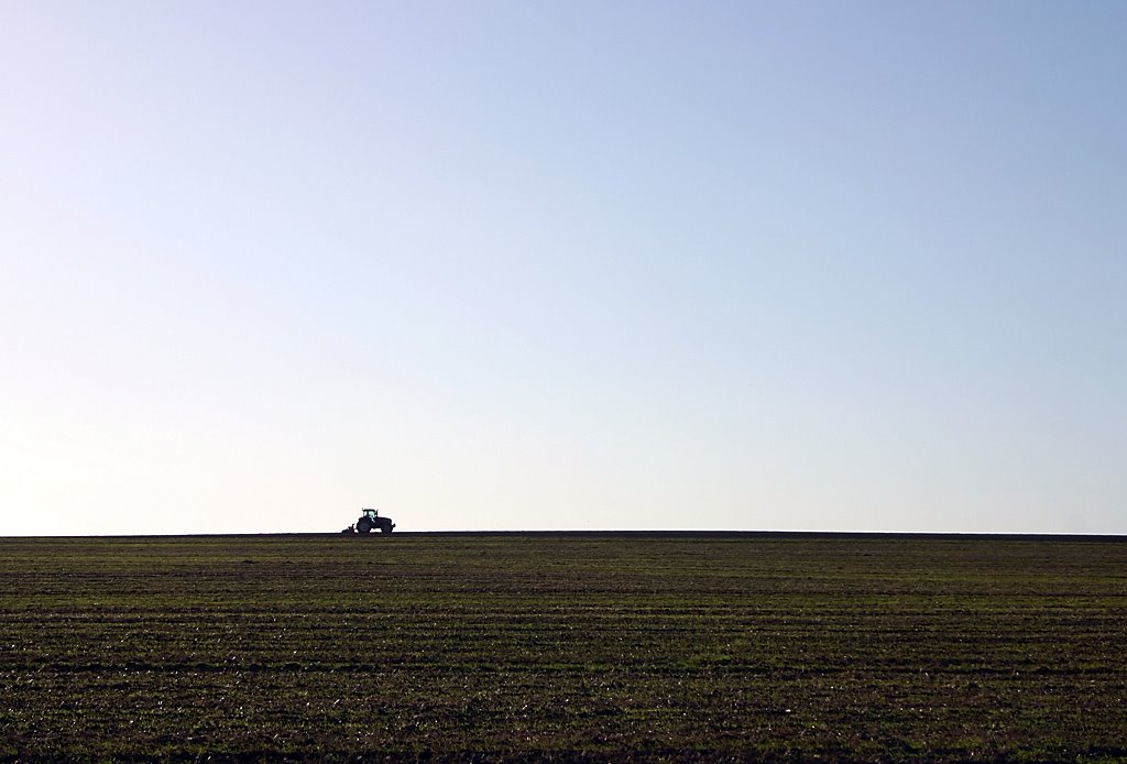
I've seen both of these on your photoblog, and I really love the simplicity of the tractor. The exposure (which looks tricky) is spot on and I love the solitude and loneliness that this conveys about the unseen and essential world of the farmer. The 1/3 horizon, with the tractor towards the left, indicates the size and space of the outdoors, the loneliness of the job and the movement of the tractor across the field. Very simple - nothing intrudes, but it's powerful. I'd have said definite placing for this, and, if it strikes the same chord, at least a Second and possibly a First.
The horses I like, but less so. The main horse is beautifully framed and detailed, but there seems to be a slight dark halo around the head, where it crosses the sky. Is this a sharpening artefact? If so, watch out. Not sure it'll come out in the judging, but just in case. The horses are nicely positioned within the scene, but the image doesn't really speak to me in the same way as the other. Also, the horizon crosses behind the main horse and the fence wire is also a slight distraction. It is a nice image, and may get placed, but it'll depend on how many other images of a similar quality are there on the night. Judging by last time's overall quality, I'd have thought a placing was possible if not definite. If placed, I'd say "Commended". Again, hard to say.
Hope this is useful.
Cheers
Ivan
Thanks Ivan - definitely helpful. I think as time goes on, we'll both get a better feel for what the judges will be looking for and I'm as "in the dark" as you are :)
With the judge from last time, horses would get a first - doubtless she'd be wittering on about their cheeky personalities shining through, etc!
Not sure I understood your question about the horizon - one significant thing is that the horizon here is *very* wonky and that I find distracting. The cut-out effect around the horse's head is just down to light reflecting from the ridge rather than a sharpening halo, but you're right - that's what it looks like! I wonder if the effect of that can be diminished with a little local smudging? We'll see how they look on screen.
Hi Gareth,
Being a zoologist, the first image immediately grabs me and grows on me. If gives a different perspective on horses. THe quality of the light is wonderful. Good contrast with nice bright and dark areas but nothing 'blown out'. There is alot of interest in the two horses; the first being in the foreground and the other bending around with a nice shadow. THe slant of the horizon does not bother me at all; it actually looks quite natural to me.
The second shot also appeals to me, but slightly less so. The composition is wonderful and really adds feeling to the photo. But eventually I find the dark ploughed field lessens the impact of the photo; there is not much colour, not much to look at and it doesn't complement the sky. The sky however, is wonderful; a nice gentle gradient of blue.
Damian
Post a Comment